The network for creativity
Join 1.25M professional creatives like you
Connect with clients, get discovered, and run your business 100% commission-free
Creatives on Contra have earned over $150M and we are just getting started
Back to feedPost

Came across Playful today, and it made me rethink something about building apps.
As an independent developer, I usually start by thinking about the market: Who would use this? How would I find users? Is there enough demand?
But Playful approaches it differently.
What if you built an app just for yourself, your family, or a few friends?
You already know who it's for. And even if only five people ever use it, it might still be exactly what they need.
I find this idea really interesting — bringing all those small, personal software needs together on one platform.
Sometimes a different starting point changes how you see the whole problem.
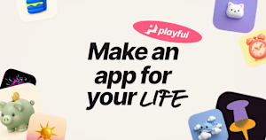
playful.app
Playful - Make the app you wish existed
Playful is homemade software. Make an app for the people and routines in your life, and share it with a link. Your first apps are on us.
The network for creativity
Join 1.25M professional creatives like you
Connect with clients, get discovered, and run your business 100% commission-free
Creatives on Contra have earned over $150M and we are just getting started


Related posts

Some ideas look perfect on a moodboard and fall apart the second they hit a real website.
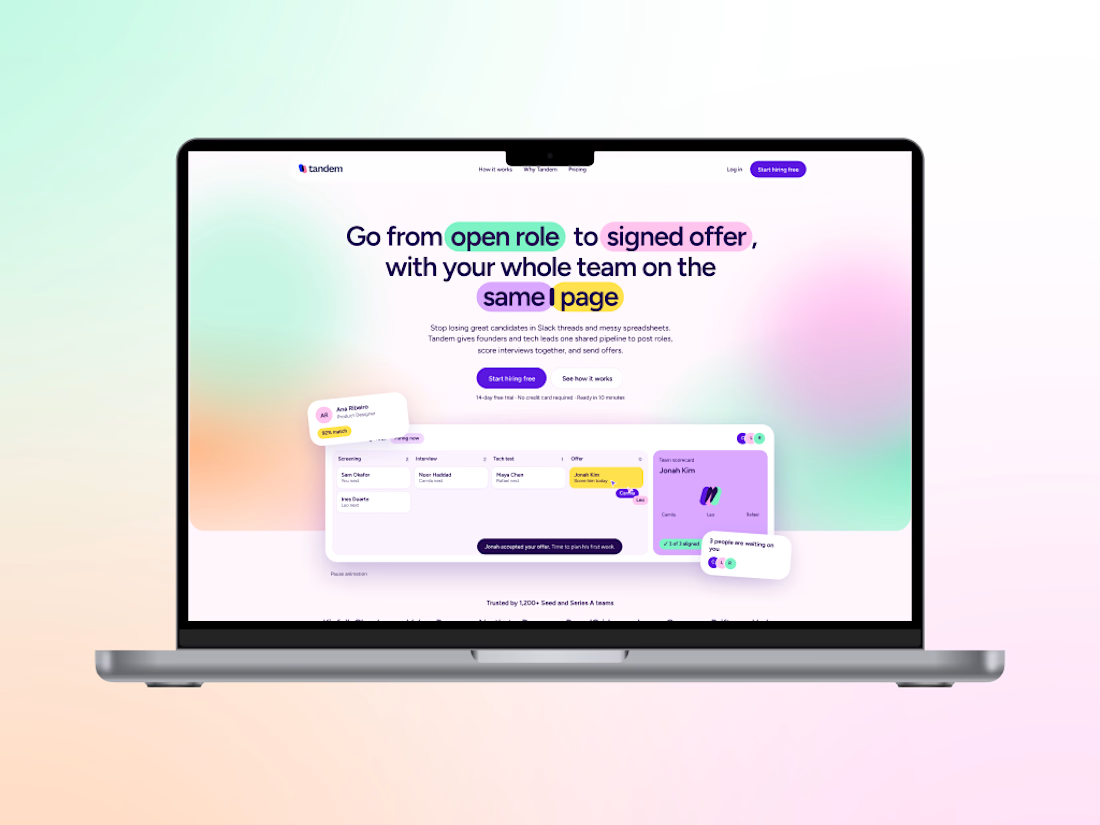
That happened to me on Tandem, a concept brand I made for a hiring app for small startups.
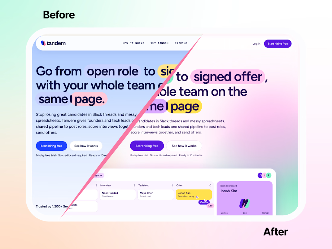
I had a direction I loved. In my head it made total sense. On the actual site? Flat. No energy. It looked like a brand that needed a nap. 😴
I tried fixing it. A little brighter here, a new shade there. It didn’t help. So I did the painful thing and started over.
Funny thing is, most of the ideas stayed. The pills still highlight the headlines (my favorite: in “same page,” one sits right between the two words). What changed was the palette. Soft colors melting into gradients, a dark violet holding everything together, and suddenly the characters and product screens had something to pop against.
Same bones, totally different energy.:
Honestly, starting over hurt for about an hour. Then it was the best decision on the project.
Fix it or start over: how do you decide?



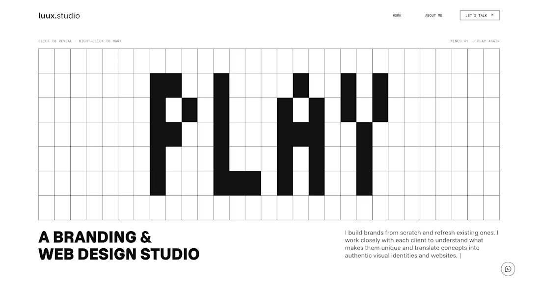
The new luux.studio website is live.
I rebuilt my site around one idea that guides how I work:
⚡️ every project starts by bringing light to what’s hidden ⚡️
So the homepage is a game.
A full-screen minesweeper where you explore the grid, read the clues and, eventually, find the spark. Hit a mine and it explodes, literally, into a “Start your project” button.
What else is new:
→ Three clear services: Brand Strategy, Visual Identity and Website & E-commerce
→ A work index where every project comes to life on hover
→ One person behind it all, from the first idea to launch
Designed and built in Framer, with a few custom code components for the game and the details.
Go play: luux.studio
How many clicks did it take you to find the spark?
Please, leave your feedback below 🫶🏻

Good work, very polished.

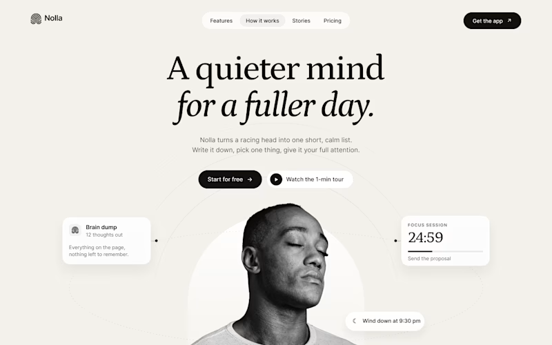
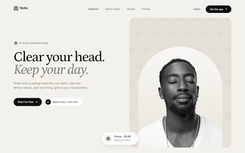
Started a new concept this week: Nolla, a small app for people whose heads won't stop running.
Same words, same brand kit, two hero layouts.
A puts everything in the middle. He sits inside an arch taken straight from the logo, and his to-dos orbit around him.
B is a split. Words on the left. On the right, the logo mark repeats into a quiet pattern behind him.
Fonts are Petrona and Inter.
Which one would make you download the app?

19 votes
Ends in 2h

Split feels more balanced to me!