The network for creativity
Join 1.25M professional creatives like you
Connect with clients, get discovered, and run your business 100% commission-free
Creatives on Contra have earned over $150M and we are just getting started
Back to feedPost

Some ideas look perfect on a moodboard and fall apart the second they hit a real website.
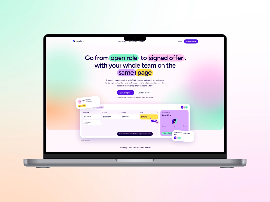
That happened to me on Tandem, a concept brand I made for a hiring app for small startups.
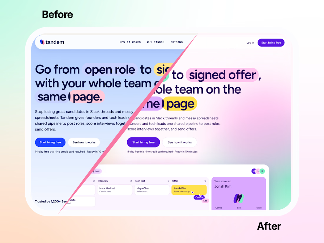
I had a direction I loved. In my head it made total sense. On the actual site? Flat. No energy. It looked like a brand that needed a nap. 😴
I tried fixing it. A little brighter here, a new shade there. It didn’t help. So I did the painful thing and started over.
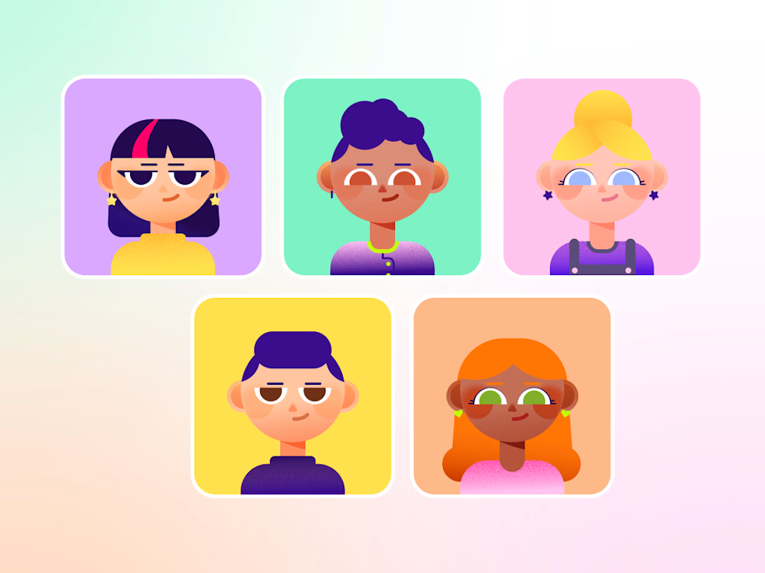
Funny thing is, most of the ideas stayed. The pills still highlight the headlines (my favorite: in “same page,” one sits right between the two words). What changed was the palette. Soft colors melting into gradients, a dark violet holding everything together, and suddenly the characters and product screens had something to pop against.
Same bones, totally different energy.:
Honestly, starting over hurt for about an hour. Then it was the best decision on the project.
Fix it or start over: how do you decide?


The network for creativity
Join 1.25M professional creatives like you
Connect with clients, get discovered, and run your business 100% commission-free
Creatives on Contra have earned over $150M and we are just getting started


Related posts


The colorful spines on the wood shelf under the big TOKYO STYLE title feel like a real bookstore. When a book slides out, does the shelf close the gap or leave a space?

This year we rebranded a 28 year old studio that builds immersive experiences for Netflix, Bloomberg, LEGOLAND etc.
Seeper’s work was world class. But their brand hadn’t kept up with it, so people were judging them as a dated studio before they ever saw what they do.
And they knew it... but when you’ve built something for that long, letting go of the logo you started with is hard.
So we gave them two options -> keep the logo and refresh the rest, or start again from scratch.
They went ALL in.
The new identity launched at a major international industry event and people kept telling them it was the best stand they’d seen. Within weeks, senior people in their industry were saying they were “worth taking notice of now.”
Their marketing director put it like this: “We’ve gone from being seen as a dated studio to a serious creative force in the industry.”
Same work as before... people just see it completely differently now.
If your business has outgrown your brand, DM me “REBRAND”.


Impressive! How did you start working with them?

A few months ago I got to work with Coderhouse, one of the leading education brands in Argentina, and the place where I took several courses myself.
So this one feels like a full circle. A brand that shaped my career and helped me grow as a designer, and now I got to design for it.
The funny part is Chris had no idea I was a former student when he reached out. I was really happy when that message came in.
I built a visual system for their 60+ course covers, made so their team can keep producing them on their own. Today it lives across their app, website and Meta ads.
Thanks Chris for trusting my work and for the opportunity 🧡 And thanks @Contra HQ for making connections like this one possible.


This looks great


