The network for creativity
Join 1.25M professional creatives like you
Connect with clients, get discovered, and run your business 100% commission-free
Creatives on Contra have earned over $150M and we are just getting started
Back to feedPost

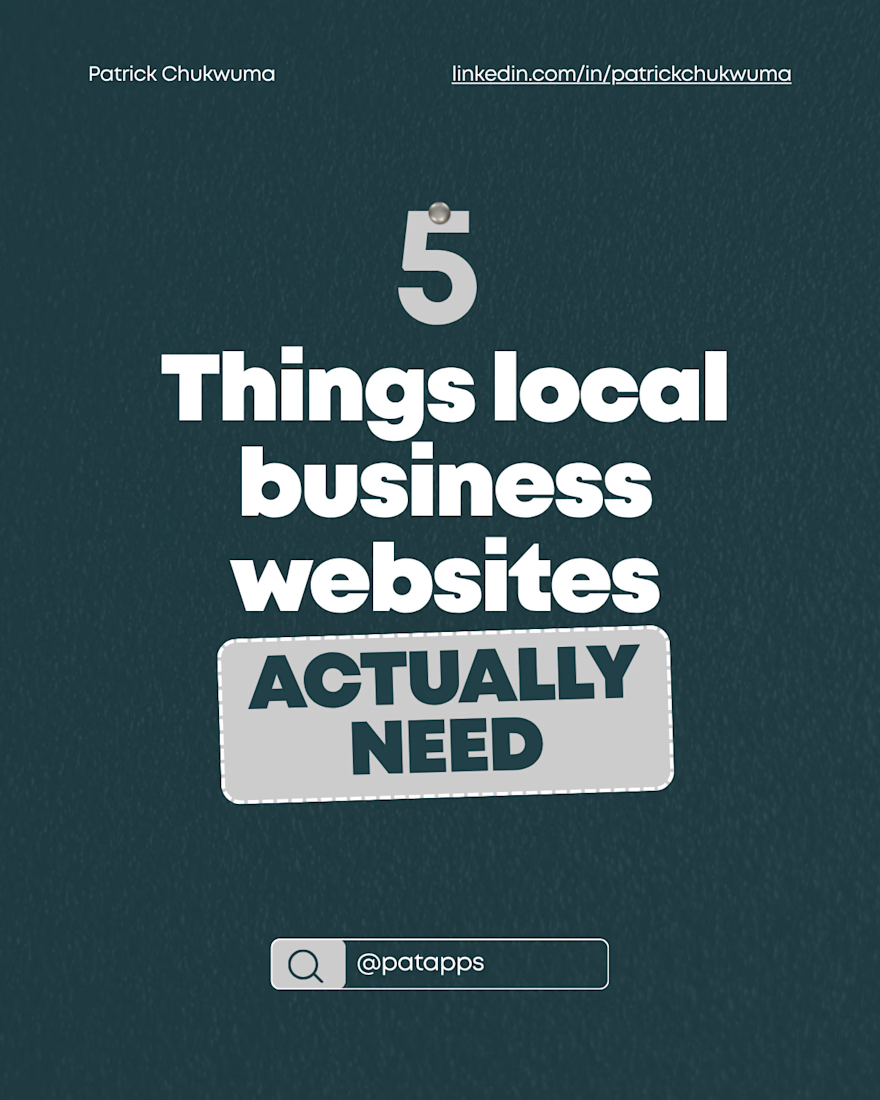
Most local business websites have the same problem. And it's not what most people think.
The assumption is usually that local businesses need a better looking website.
Nicer colors. A modern font. A hero image that doesn't look like it was taken in 2009.
And yes, those things matter. But they're not the real problem.
The real problem is that most local business websites aren't built for the person actually visiting them.
Here's what I mean:
The typical visitor to a local business website isn't browsing leisurely. They're on their phone, in the middle of something, trying to answer one of three questions as fast as possible:
"Is this business legit?"
"Do they serve my area?"
"How do I contact them right now?"
If your website doesn't answer all three within the first few seconds.. you've already lost them.
Here's what actually moves the needle for local businesses:
Trust signals above the fold
Reviews, years in business, certifications, client logos... whatever proves you're real and established. These need to be visible immediately, not buried three scrolls down.
Crystal clear service area
Local visitors want to know you serve them specifically. A vague "serving the greater area" isn't enough. Name the locations, the neighborhoods, the cities. Be specific.
One obvious next step
Call now. Book online. Get a quote. Pick one primary action and make it impossible to miss on every single page. Multiple competing CTAs create confusion and kill conversions.
Mobile first, always
Over 70% of local search traffic comes from mobile devices. If your website isn't fast, clean, and functional on a phone.. the desktop version is almost irrelevant.
Load speed
A local business website that takes more than 3 seconds to load on mobile is actively sending potential customers to a competitor. This isn't a nice-to-have. It's table stakes.
The businesses that get this right don't just look better online. They convert better, rank better, and grow faster.
A beautiful website that doesn't answer those three questions quickly is still a broken website.


The network for creativity
Join 1.25M professional creatives like you
Connect with clients, get discovered, and run your business 100% commission-free
Creatives on Contra have earned over $150M and we are just getting started








Related posts


Fresh case study 🚀🚀🚀
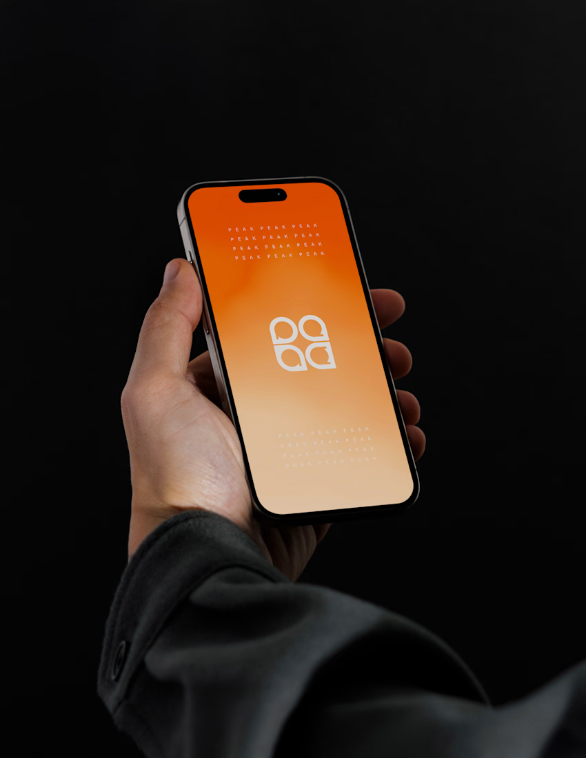
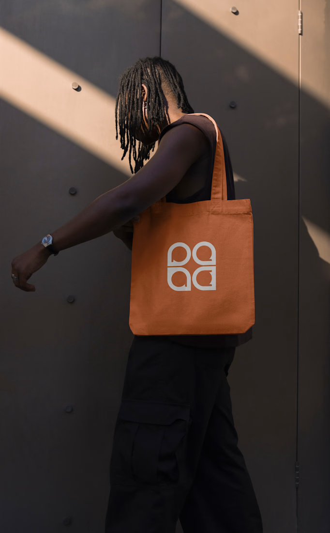
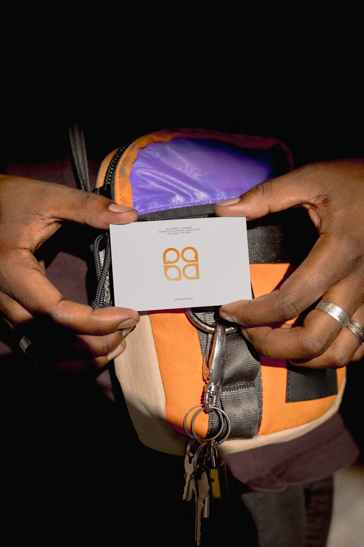
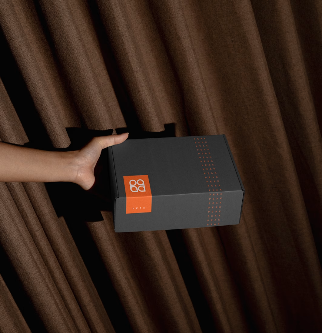
Brand identity for Peak, an all-in-one website builder for WordPress that I design and build. A four-letter mark, a warm paper-and-ember palette and one system that runs from the favicon to the packaging.


A four-letter mark that has to hold from favicon to packaging is a tough constraint. Did you draw one letterform first and build the other three from it, or design them together as a set from the start?


new work is live. quite proud of this one!


I like this

Beautyy


