The network for creativity
Join 1.25M professional creatives like you
Connect with clients, get discovered, and run your business 100% commission-free
Creatives on Contra have earned over $150M and we are just getting started
Back to feedPost


One of the first questions I ask a client during a project briefing is, "What's the deadline?"
It determines our approach and the scope of work. More often than we'd like, the answer is, "Yesterday."
We all know how that story goes. Sometimes you just have to accept it. The only option is to deliver as much value as possible in the time available.
That's when all the experience we've collected over the years starts to matter. You reach for patterns, components, structures, and templates that have already proved themselves.
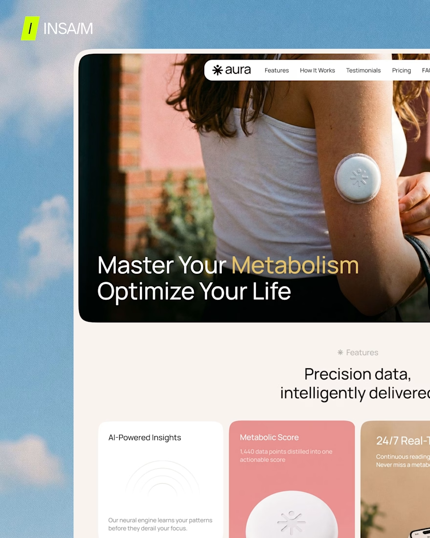
Aura is one such example.
It's a free SaaS & Health App Landing Page Template for Framer that we've developed and tested across multiple projects. And we want to share it. A free, fast and customizable starting point for the moments when time is working against you.
Check it out → https://www.framer.com/community/marketplace/templates/aura-healthtech-app/



Amazing work 🔥

Looks great

Stunning!


Haha love the copy for the post ad how well the template is made

Beautifully done! ❤️🔥

Awesome!


"yesterday" lol every single time

Honestly I've stopped being surprised when the answer is yesterday, at this point I just build the timeline conversation into the first call. Turning that pressure into a reusable template like Aura instead of just gritting your teeth through it each time is a smart move, how...

CREATIVE WORK

So true about tight deadlines. How do you usually convince clients to cut scope without feeling like they’re losing value?

“Yesterday” is way too real 😂
Love the template. 💯

The network for creativity
Join 1.25M professional creatives like you
Connect with clients, get discovered, and run your business 100% commission-free
Creatives on Contra have earned over $150M and we are just getting started







Related posts


Another exciting project wrapped up! ✨
This time, we worked on Olympian by Design – a premium one-on-one coaching brand focused on personal transformation and high performance.
Our goal was to create more than just a beautiful website. We wanted the entire client journey to feel connected – from the first landing page visit to purchasing the program and going through the coaching experience.
We designed three custom pages from scratch, built them in Kajabi, created a branded member area, set up the coaching program, and refreshed the app with new onboarding screens.
All wrapped in a bold, dark, luxury-inspired design.
Because great design shouldn't stop at checkout. It should follow the client through the entire experience.

Great project

Built this 2-page dental clinic website in Framer.
On desktop, the hero section includes service cards that move into place as you scroll and reveal information about each service.
On tablet and mobile, I placed the cards in the services section below the hero instead.
There simply isn't enough space to fit the same interaction without making the hero too crowded, so I kept the layout simpler on smaller screens.

Great Work and the thought behind responsiveness without trying to fit things and simply letting them be a part of the layout without unnecessary animations was a good choice. Just a suggestion the reveal effect with a slight stagger would look great on the mobile i think 😁😁

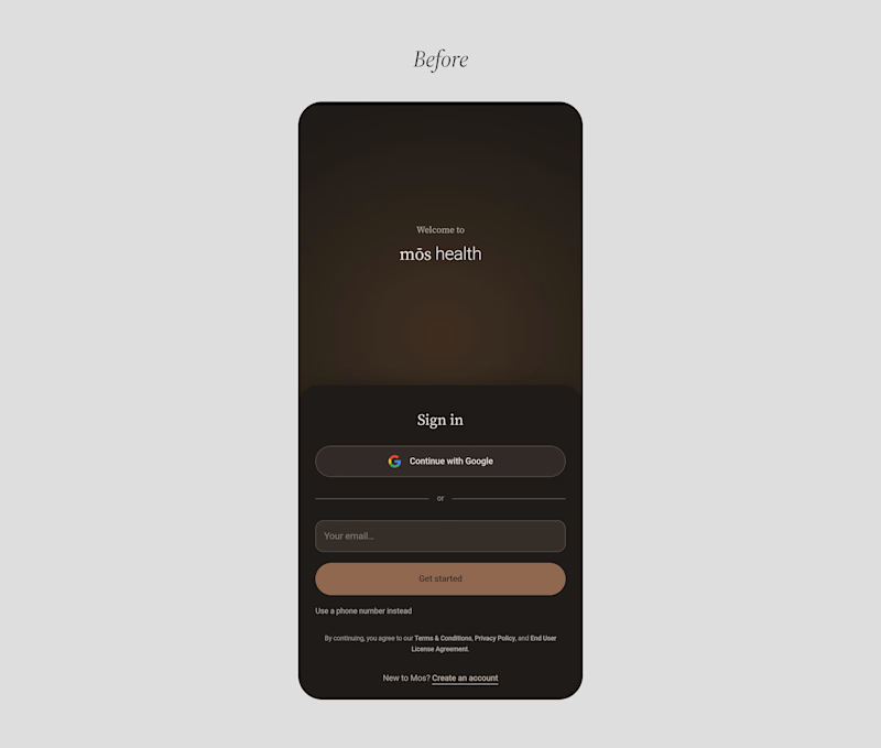
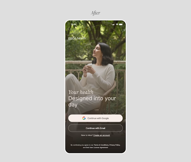
A founder ask me for a feedback on there product, so i started reviewing the healthcare app, and something felt off.
The website felt warm and welcoming. You could tell there were real people behind the brand.
But once you opened the app to sign up, that feeling was gone.
And honestly, for something as personal as healthcare, that matters. People need to feel comfortable before they trust you with their health.
So I worked on the onboarding screen to bring that feeling back.
Nothing complicated. I added a human touch through imagery and kept the screen simple, while making the app feel more connected to the website.
Sometimes, it's not about adding more to a screen. It's about making what's already there feel right.
Which would make you more comfortable signing up:
Before or After?
4 voted
14%
25 voted
86%
29 votes
Closed

Good catch on the disconnect between the website and signup flow. Carrying that human warmth into onboarding feels especially relevant for healthcare. Have you had a chance to test the redesign with new users?

