The network for creativity
Join 1.25M professional creatives like you
Connect with clients, get discovered, and run your business 100% commission-free
Creatives on Contra have earned over $150M and we are just getting started
Back to feedPost

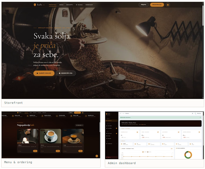
A coffee shop that could only sell across the counter. Now customers order online and reserve tables, and the owner sees orders, reservations, messages and reviews in one place instead of four.


The network for creativity
Join 1.25M professional creatives like you
Connect with clients, get discovered, and run your business 100% commission-free
Creatives on Contra have earned over $150M and we are just getting started

Challenges
View all


Related posts

This happens to me pretty often…
A client asks for a more modern website.
At first, it sounds like a visual problem. But once I look beneath the interface, I may find that:
→ The offer is difficult to understand.
→ The strongest proof is buried.
→ The navigation reflects the company, not the user.
→ The CTA appears before enough confidence has been built.
At that point, changing the layout won’t solve the actual problem.
The work becomes defining what users need to understand, what will make them trust the business, and what should help them take the next step.
The brief says redesign.
The project says strategy.
Fellow designers: what’s the most common problem you discover hiding behind a redesign request?


Always bad positioning disguised as a visual problem. Clients think they need new UI when they really need clear messaging and proof.

A smart QR-based digital menu platform for modern restaurants.


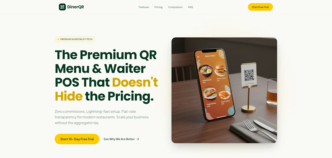

The menu-first framing makes the value proposition easy to grasp, and the phone-plus-table setup grounds the product in a real restaurant context. I’d be interested in how the ordering flow handles edge cases like sold-out items.

Aavalynx — dispute intelligence for law firms.
Designed in Figma, interactions built with GPT Astra 6.

