The network for creativity
Join 1.25M professional creatives like you
Connect with clients, get discovered, and run your business 100% commission-free
Creatives on Contra have earned over $150M and we are just getting started
Back to feedPost

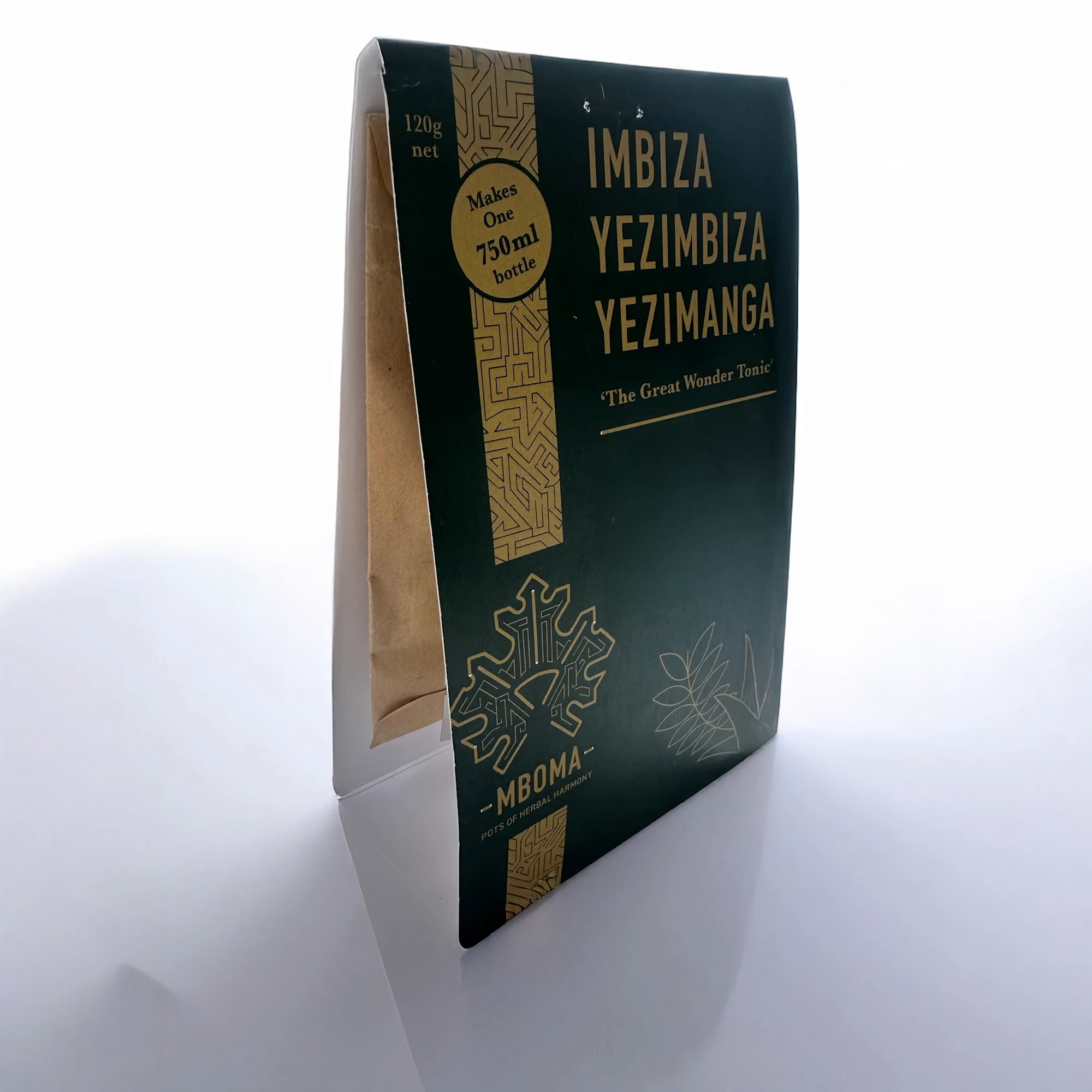
Imbiza, Yezimbiza, Yezimanga – Packaging
The brief was to design a cost effective package for production and shipping (the old product was in a 750ml large glass bottle), as well as stand out in a crowded market place of herbal supplements. My concept design was to a make at home package that consists of a liquid sachet and a paper envelope containing a herbal tea bag which is then wrapped in a single 3-fold sheet and eyelet punched to hold everything together.

The network for creativity
Join 1.25M professional creatives like you
Connect with clients, get discovered, and run your business 100% commission-free
Creatives on Contra have earned over $150M and we are just getting started











Related posts



Aryna, that golden symbol pops so nicely against the plum background ✨

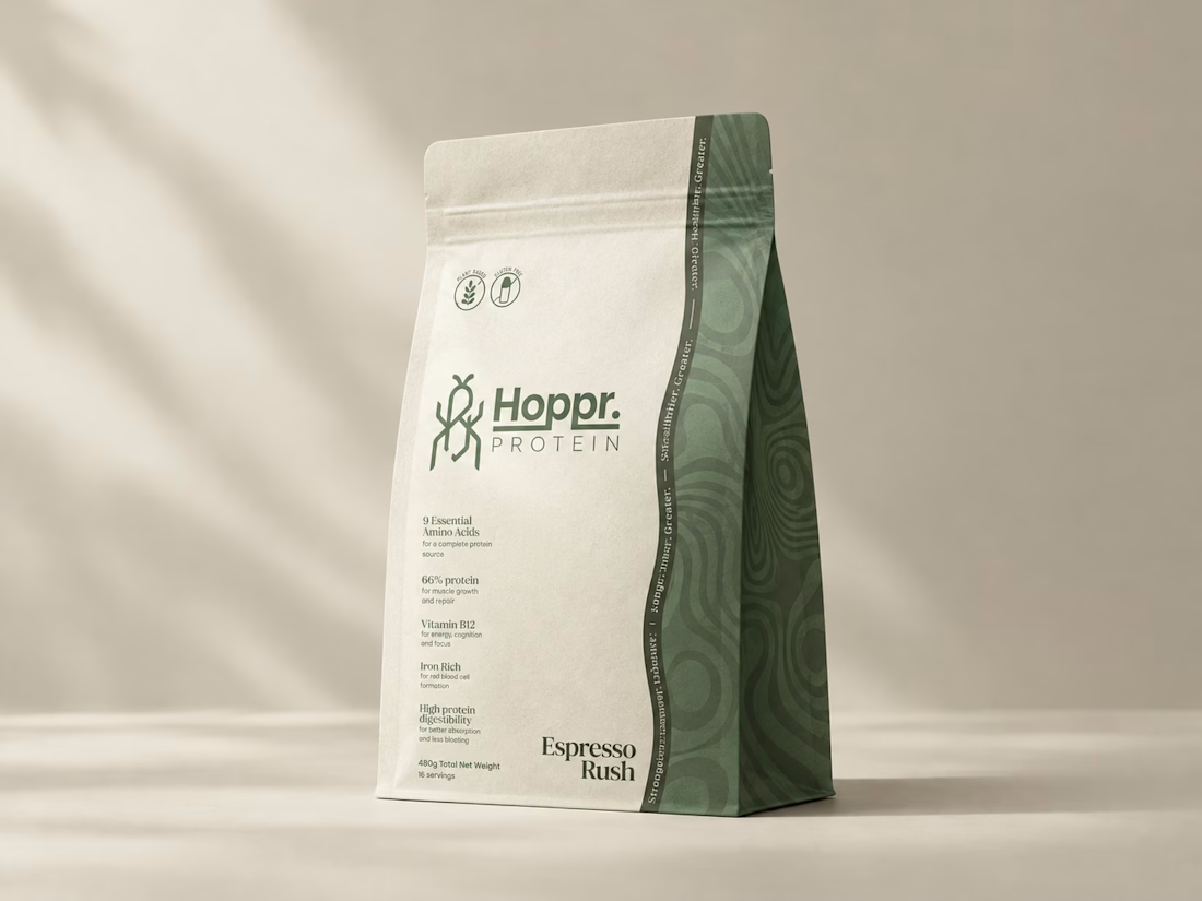
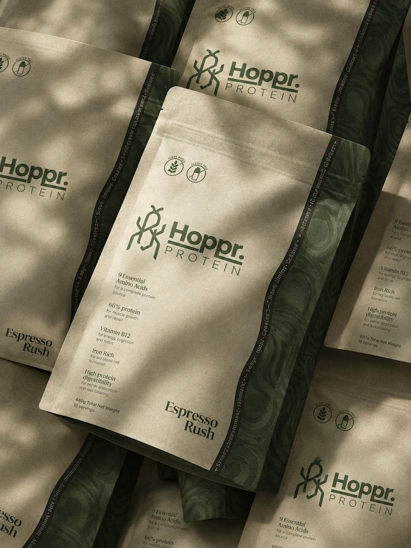
Not every client comes to me for a brand identity and not all my clients are skincare or cosmetic brands.
That was the case with Hoppr, a protein powder brand made from crickets. 🦗 YES, CRICKETS!
Sometimes the logo, colors, and visual system are already there and my job is to bring them to life on packaging and see how far I can push them.
I love projects like this because I get to play with typography, layout, and materials while working within an existing identity.
How much freedom do you think a designer should have when working with an established brand?


Great packaging work, nice job

The most serious brand I’ve ever worked on mails you a phone shaped like a shell.
Deadpan voice. Inflated letters. One strange object a month.
STILL LIFE SERVICE, case study out now.
Would you open the box?


I'd open the box for sure! Inflated letters with a deadpan voice is such a fun mix.