The network for creativity
Join 1.25M professional creatives like you
Connect with clients, get discovered, and run your business 100% commission-free
Creatives on Contra have earned over $150M and we are just getting started
Back to feedPost


"You have no entries."
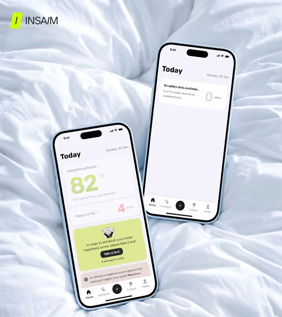
We saw this during our app audit across different niches, same dead end. The user opens the app for the first time, hasn't logged anything yet, and the screen tells them there's nothing there. No illustration, no glimpse of what this screen looks like when it's working, no trigger to add the first entry. Empty states are a design moment.
The user is deciding whether this product is worth the effort. So show them what they're working towards and the first log feels like a step. Show them nothing and it feels like work with no payoff.
You can't design around what the product needs from the user - design around what the user needs from the product at each moment.

The network for creativity
Join 1.25M professional creatives like you
Connect with clients, get discovered, and run your business 100% commission-free
Creatives on Contra have earned over $150M and we are just getting started











Related posts

sentences
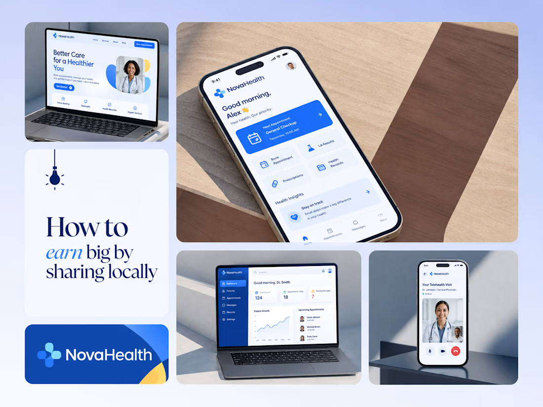
One brand, three screens: patient, doctor, and the video call between them.
NovaHealth is a healthcare brand and product system I designed from logo to apps. Healthcare software tends to feel either cold and clinical or too cluttered to open. I wanted something calm for a worried patient and quick for a doctor between appointments.
The logo breaks the classic medical cross into soft, rounded blocks in two blues, so it reads as “health” without feeling sterile.
The patient app opens with one thing: a solid blue card showing your next appointment. It’s the only fully saturated block on the screen, so nothing competes with it.
The doctor dashboard is built for a glance. Total patients, today’s appointments, and pending messages come first, in the same blue and rounded style as the patient app.
The telehealth screen has almost no UI. The doctor’s face fills the screen, with just three controls: mic, camera, and a red end-call button, the only red in the whole system.
One rule ties it together: blue means action, white space means calm, and yellow is a small spark of warmth.
Which screen should I break down next? 👇



Great medical brand design specially the phone app UI and top left laptop dashboard 🔥🔥🔥
great job Joshua ❤️🎉


Lovely cohesive work, Alex. The motion is spot on!

15 seconds of smooth UI, editorial layouts, and micro-interactions.
Kept the micro-interactions snappy, typography expressive, and transitions buttery smooth.
Rate this UI animation from 1 to 10 in the comments, or tell me what you’d improve! 😉


Solid 10/10 bro! 🔥 Micro-interactions are super snappy and transitions are buttery smooth indeed. Editorial layout game is strong. Keep it up!