The network for creativity
Join 1.25M professional creatives like you
Connect with clients, get discovered, and run your business 100% commission-free
Creatives on Contra have earned over $150M and we are just getting started
Back to feedPost

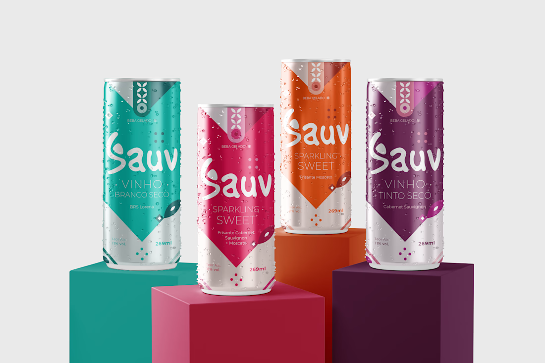
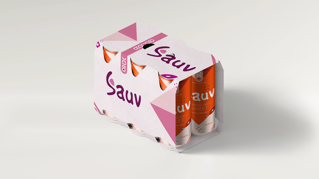
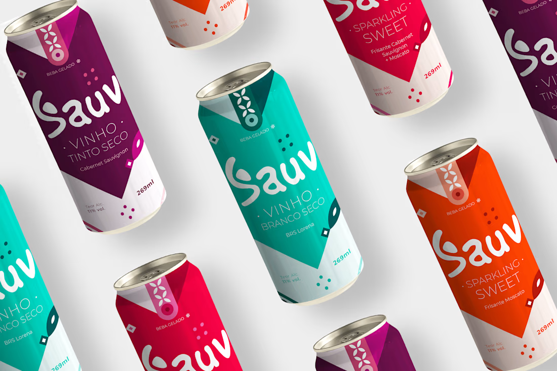
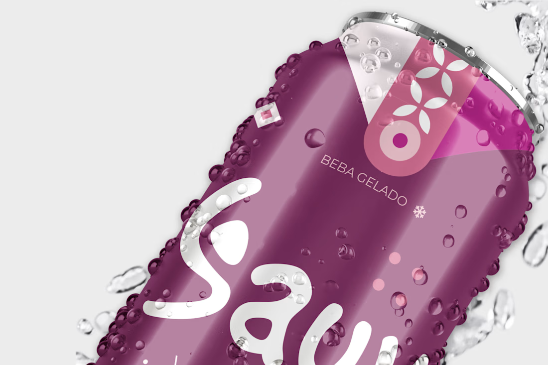
Young, modern and practical, are adjectives that very well describe the visual identity created for the NEW SAUV. With the use of vibrant and striking colors, which call to action, which make you want to dance, to jump, to want, to live EVERYTHING. EVERYTHING that NEW SAUV is and shows in its new packaging. The new visual identity brings joviality to the brand, making it modern and up-to-date, it is the brand that young people WANT to show, WANT to share in stories. When we talk about wine, we immediately think that it is a sophisticated drink, where we need to make correct pairings according to the grapes. But it doesn't necessarily have to be so refined and serious. Wine can be adaptable, appearing at different times and places. At the pool, at the club, at the bar, day or night, alone or with the crowd. You make your moment with Sauv. Sauv brings this contrast between the serious and the cool, and this was done in the visual identity of the brand, where we have the logo with an organic typography and with movement and the other (Montsserat), urban and with a slight touch inclined at the ends of the letters which makes it thinner. As well as the modern elements that make up the whole face of the brand, which give voice and feeling to it. Elements that have movement and impact on the look. Leaving the brand identity with a strong defined personality.
Check out the full project here: https://www.behance.net/gallery/161172297/Vinho-em-Lata-Sauv


The network for creativity
Join 1.25M professional creatives like you
Connect with clients, get discovered, and run your business 100% commission-free
Creatives on Contra have earned over $150M and we are just getting started

Challenges
View all


Related posts

Luxora - Eyemask Packaging Design

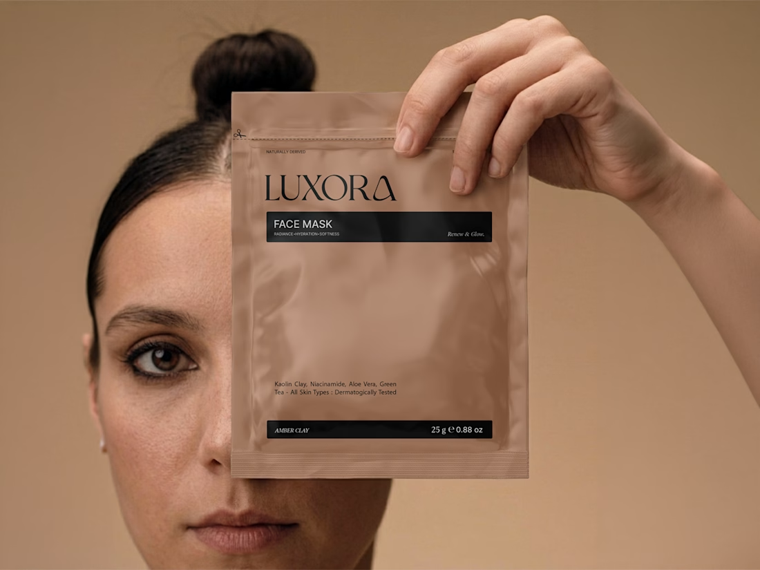
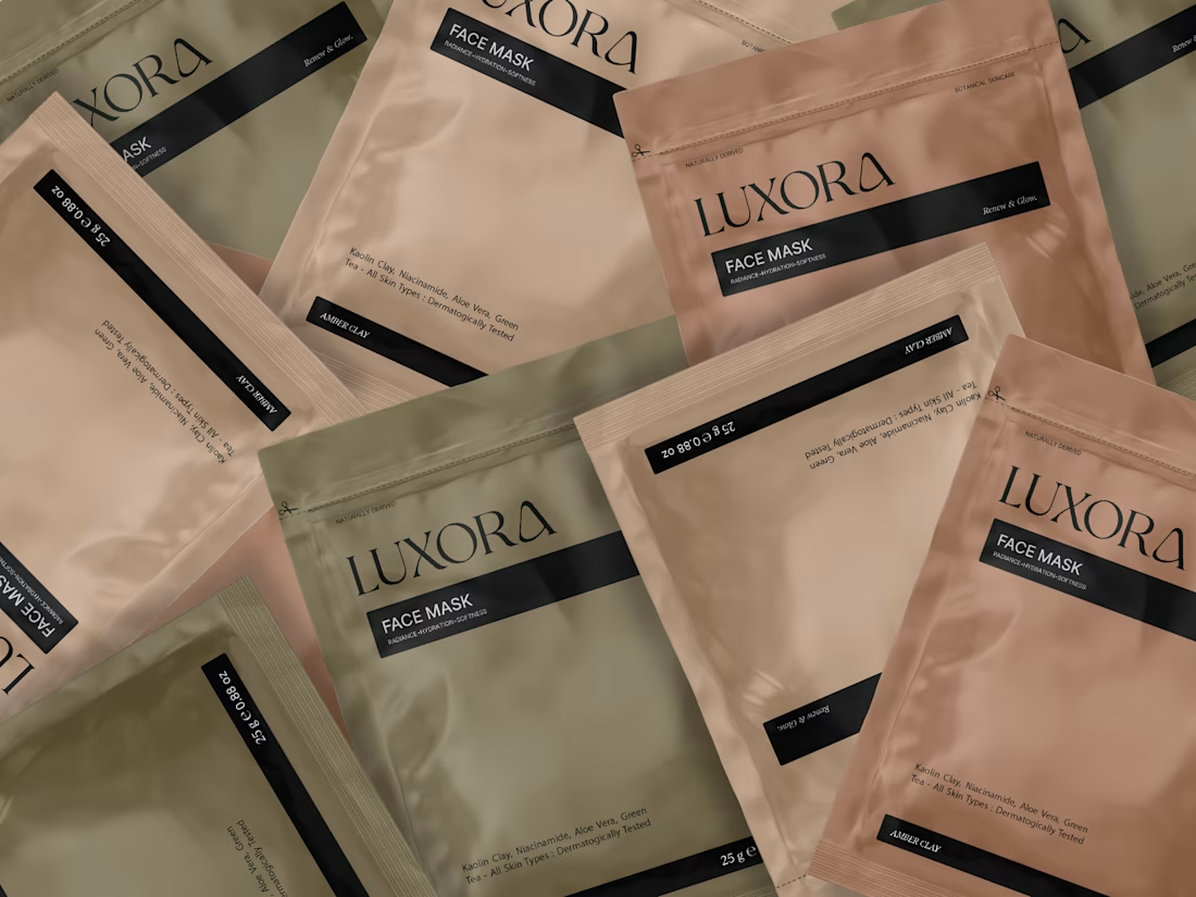
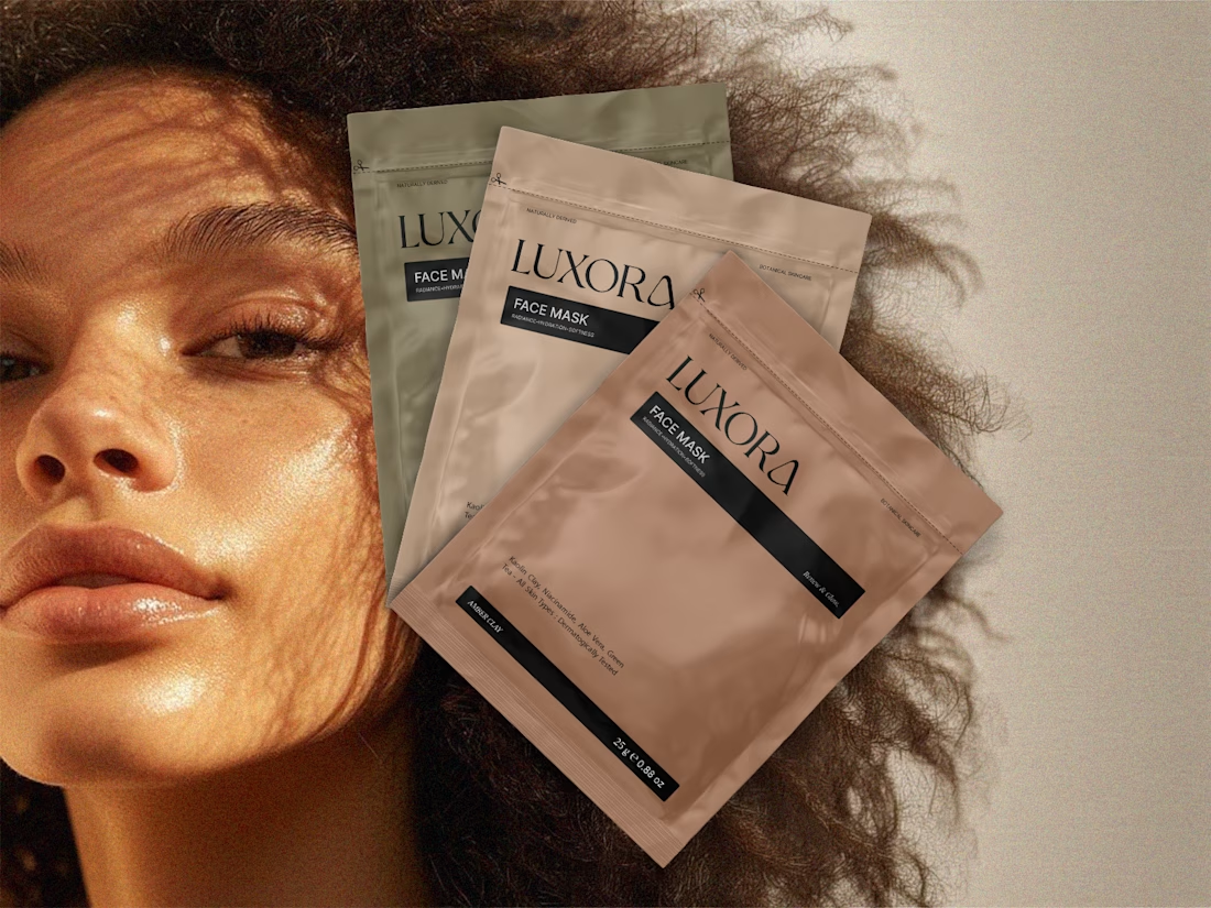

Beautiful!

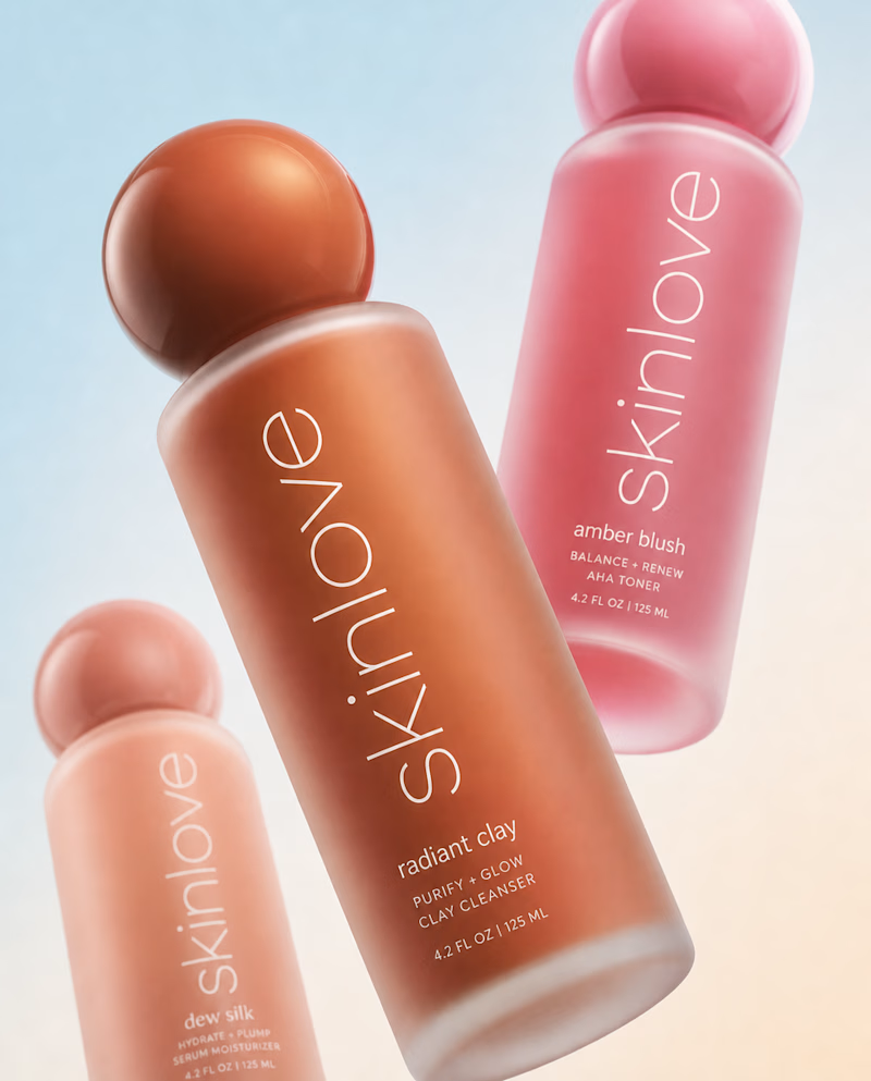
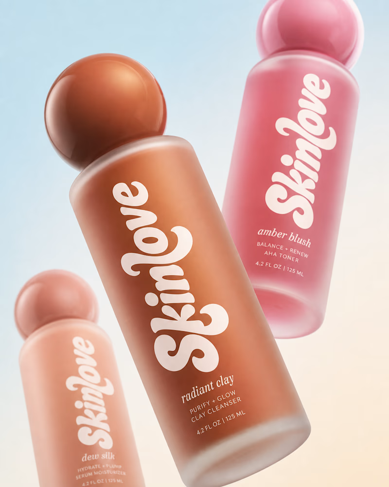
Bold, without a doubt. The “Safe” direction feels polished, but the “Bold” approach has more personality, stronger visual tension, and a much better chance of stopping the scroll. It feels more distinctive and memorable while still communicating the skincare message clearly.

Safe or bold, which one actually makes you stop scrolling? 🤔
Sans: the serif, tight tracking, one accent color playbook every skincare brand is running right now.
Bold: the same idea, redesigned with attitude. 💅
25 voted
32%
53 voted
68%
78 votes
Closed


BOLD is better

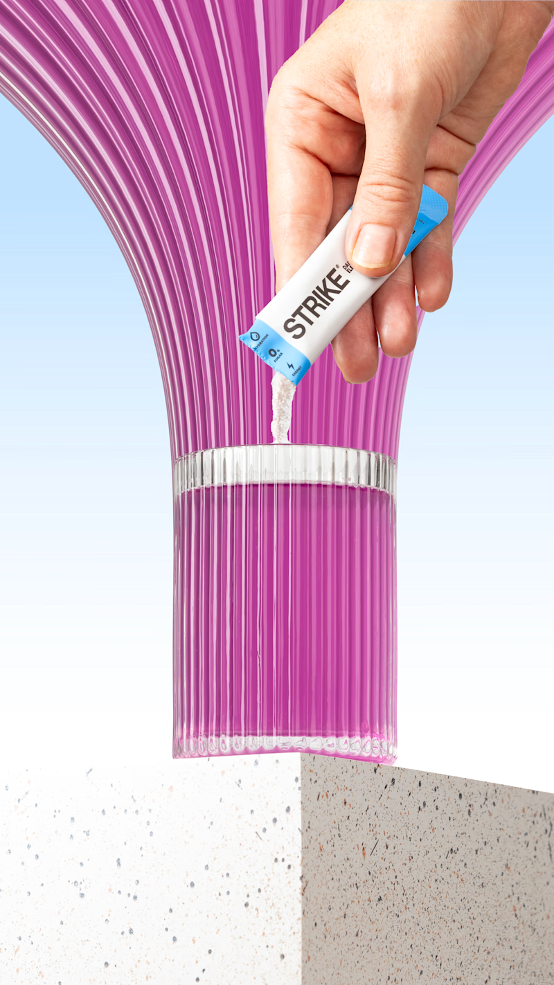
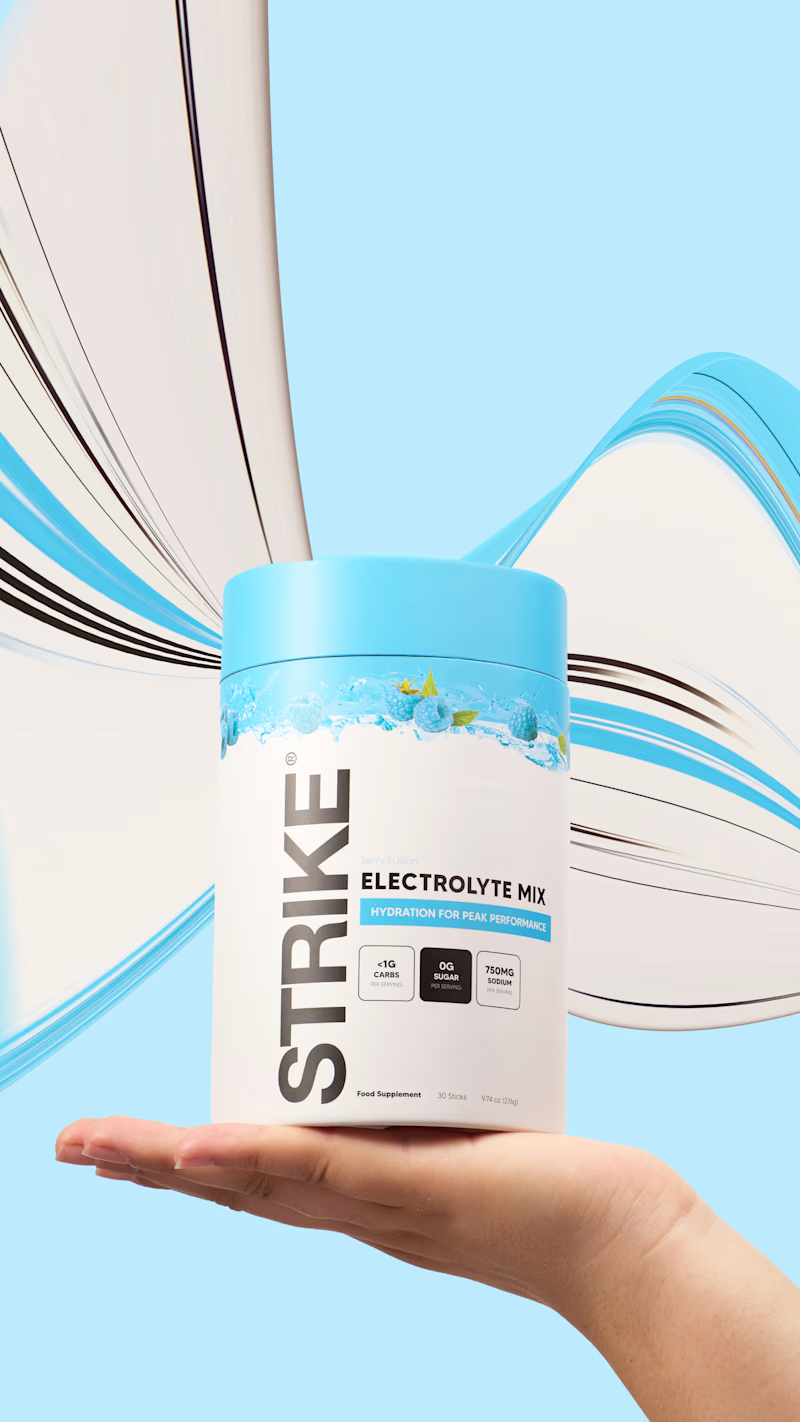
I tried the pixel-stretching trend on some packaging work recently, and I still can’t decide which version works better.
5 voted
29%
12 voted
71%
17 votes
Closed


the pink sachet looks so good. i pick sachet