The network for creativity
Join 1.25M professional creatives like you
Connect with clients, get discovered, and run your business 100% commission-free
Creatives on Contra have earned over $150M and we are just getting started
Back to feedPost
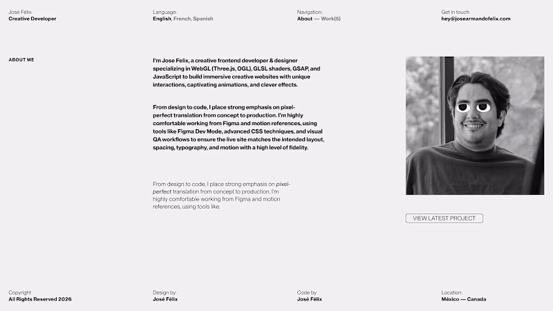
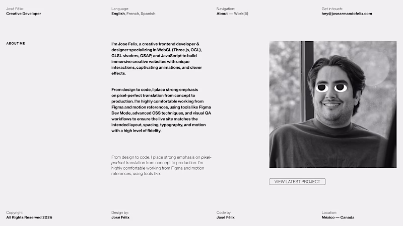
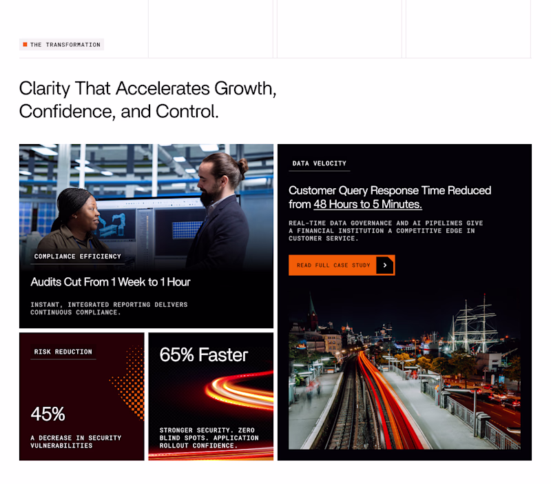
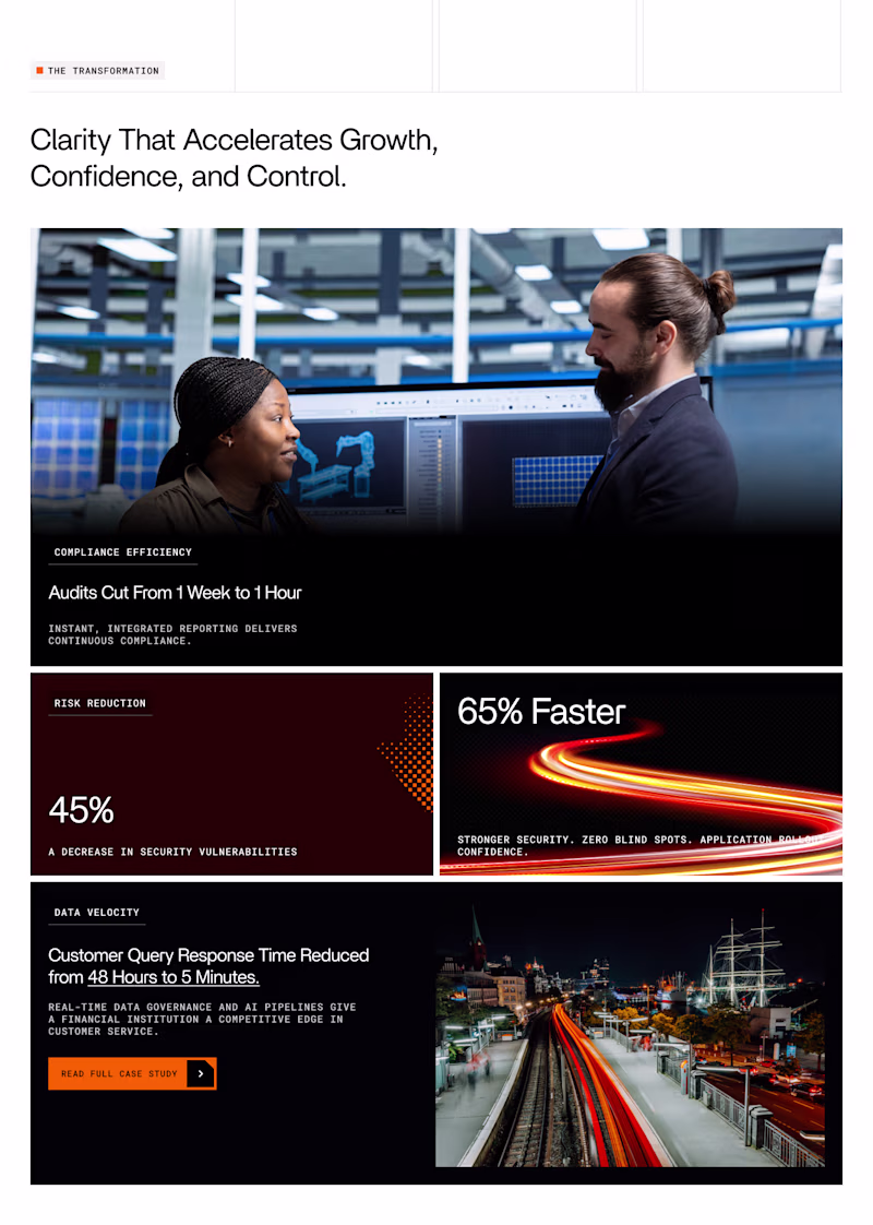
Taste Test
Hello there 👋 here I am again asking about your opinion! Which one do you like most? The difference is mostly layout.
Let me know your thoughts.
Thanks
4 voted
25%
12 voted
75%
16 votes
Closed
Both options offer an interesting reading experience and I like them. But, for me, option B wins. I eagerly await the final result. Good luck!
I voted B because personally I find a narrower text column easier to read and a bigger photo builds trust. The eyes are fun!
I’d go with B, the reading flow feels more natural
I am voting for Option B. The spacing feels a bit more balanced, and it highlights your 'Creative Developer' title and the immersive WebGL work more effectively. Both look very clean, though!
Option B feels more balanced. Nice work
The network for creativity
Join 1.25M professional creatives like you
Connect with clients, get discovered, and run your business 100% commission-free
Creatives on Contra have earned over $150M and we are just getting started
Related posts
Which layout would you prefer to use in a real application?
0 votes
Ends in 11h
Option one just flows better.
Design decision poll 👇
Which product detail page layout would you prefer?
Two different approaches.
Two different page layout.
Which one would you ship and why?
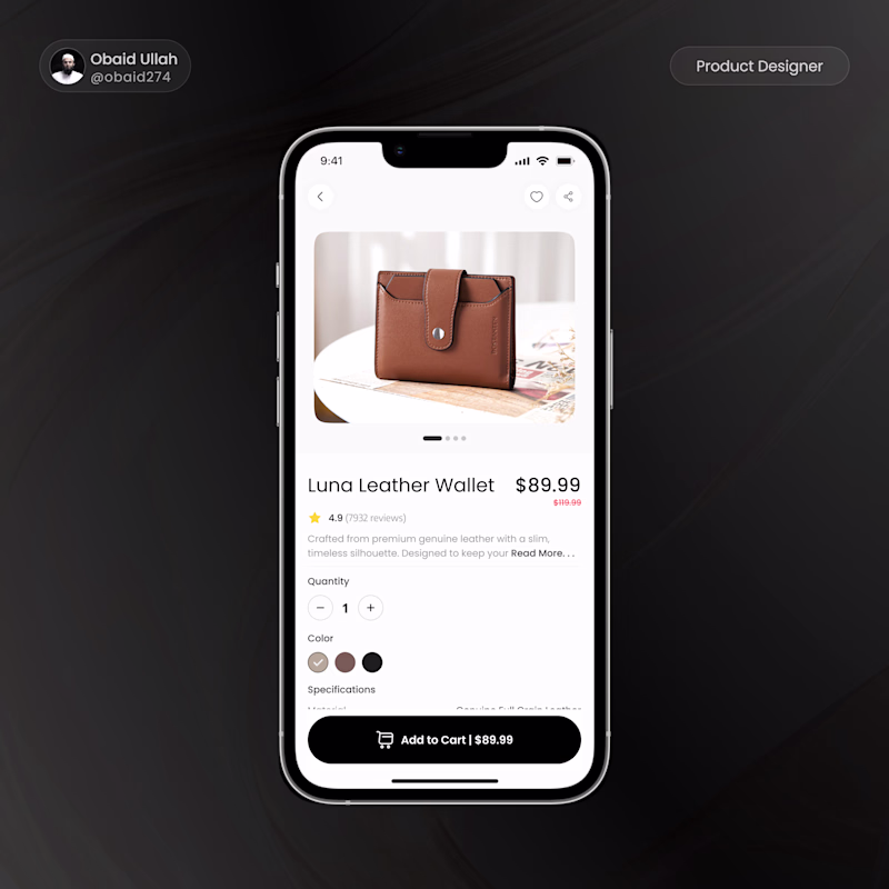
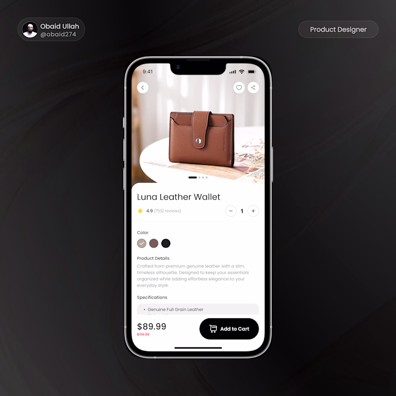
11 votes
Ends in 1h
Big CTA, makes for good user experience.
Trending
Claude
Claude has entered the design space. How are you using Claude Design?
Contra University
Learn from expert creatives how to earn more using next-gen AI tools.
creativeaiflow
Creative AI workflows are evolving. What tools do you use, and what are their strengths and weaknesses?
freelancerlife
Freelancer life is wins, pivots, and everything in between. What’s yours right now?