The network for creativity
Join 1.25M professional creatives like you
Connect with clients, get discovered, and run your business 100% commission-free
Creatives on Contra have earned over $150M and we are just getting started
Back to feedPost

Design with purpose.
Every brand starts with an idea.
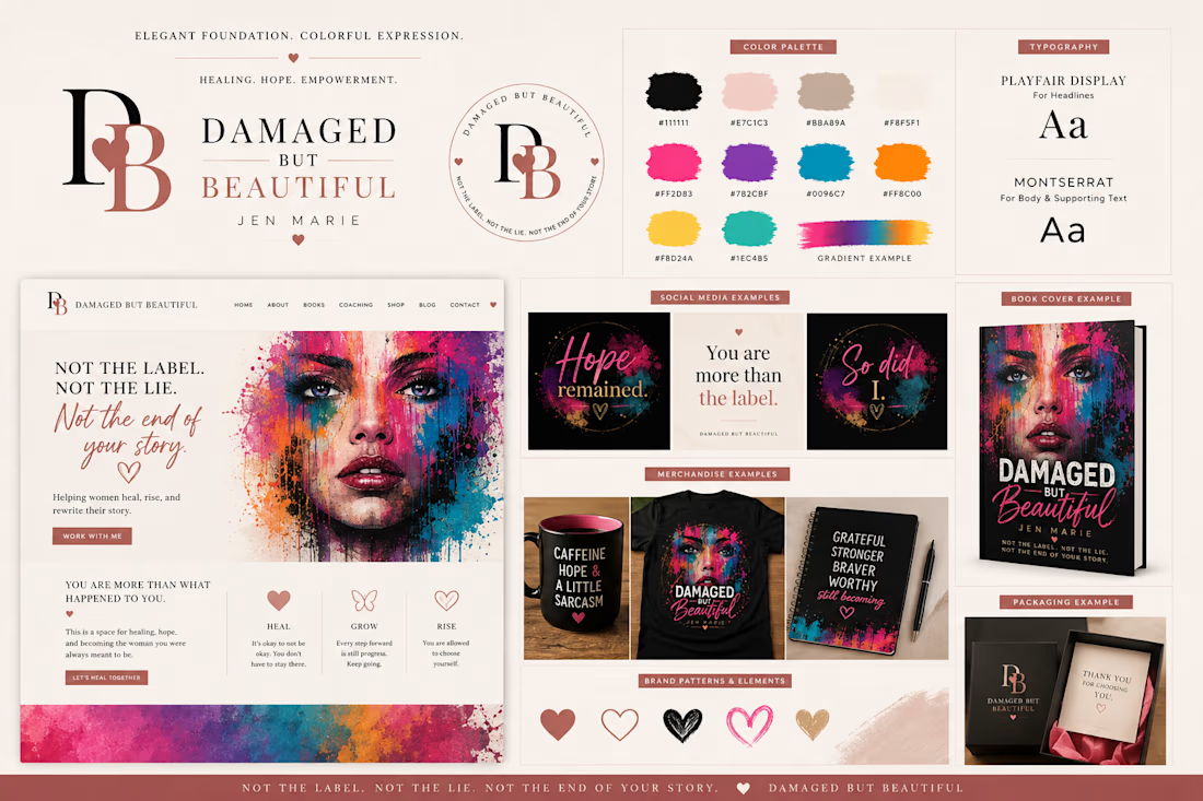
This is the visual identity I created for Damaged But Beautiful—a brand built around the belief that our experiences shape us, but they don't define our worth.
My goal was to create more than a logo. I wanted a complete identity that could grow across websites, books, social media, merchandise, and digital products while remaining consistent and meaningful.
This project includes:
✨ Brand identity
🎨 Color palette
🔤 Typography
📱 Social media concepts
📚 Book cover design
🛍️ Merchandise mockups
🌐 Website direction
📦 Packaging concepts
I'm excited to keep building my portfolio here on Contra and connect with other creatives along the way.
I'd love to know:
Which part of this branding board catches your eye first?



I like it! Beautiful combination with images. 👍
The network for creativity
Join 1.25M professional creatives like you
Connect with clients, get discovered, and run your business 100% commission-free
Creatives on Contra have earned over $150M and we are just getting started





Related posts




Which hero visual feels right for this brand?
While working on the homepage for Halfspace, a website design and SEO agency, I explored two different hero visuals for the same headline and layout. Same message, same structure, just a different visual metaphor and mood.
Option 1 - Rocket Launch. Bold, literal, and energetic, visually reinforcing the "launch your business" message with motion and fire.
Option 2 - Glass Cube. Abstract, sleek, and premium, giving a more refined, tech-forward feel without relying on a literal metaphor.
Would love your honest UX/UI take, which direction feels more impactful, memorable, and aligned with a web design/SEO brand, and why?
11 voted
41%
16 voted
59%
27 votes
Closed

Both design are great; it's hard to choose one

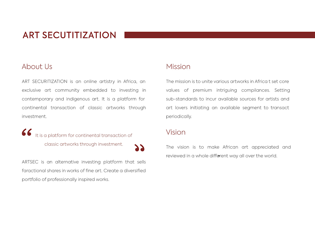
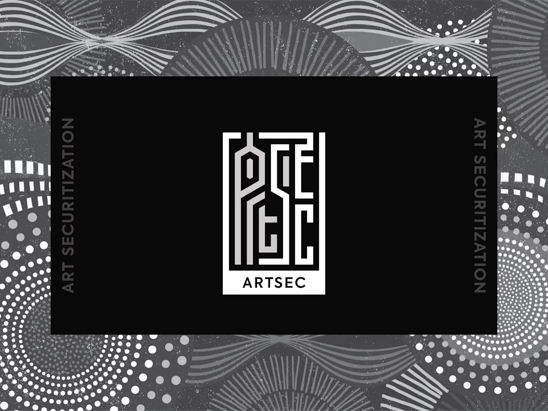
ARTSEC is an art investment platform focused on making African contemporary and indigenous art more accessible to collectors and investors.
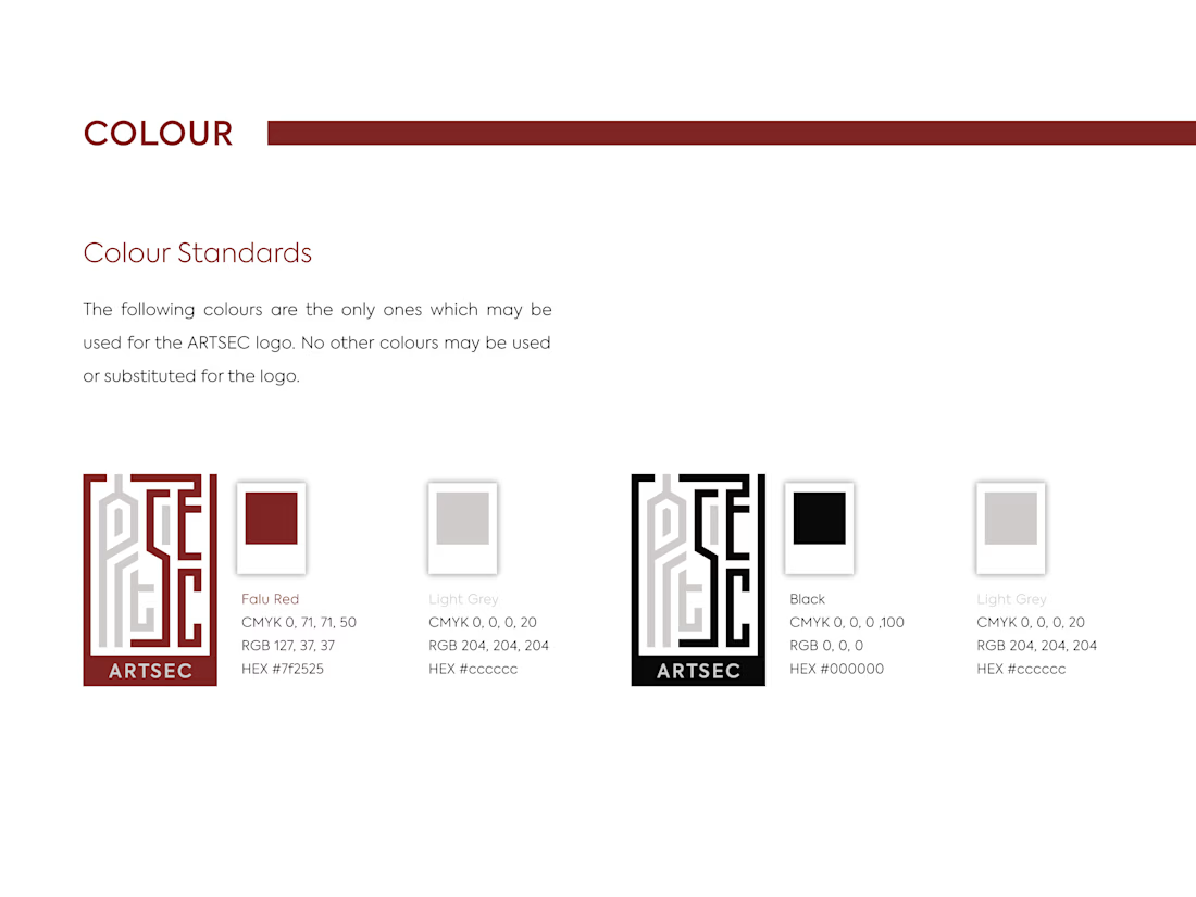
I developed a complete visual identity system for the brand, including the logo, colour palette, typography and usage guidelines.
The identity was designed to give ARTSEC a distinctive, consistent visual presence while reflecting its connection to African art and culture across print and digital applications.

Can't stop looking at this! 😍