The network for creativity
Join 1.25M professional creatives like you
Connect with clients, get discovered, and run your business 100% commission-free
Creatives on Contra have earned over $150M and we are just getting started
Back to feedPost

Telecom Customer Churn Analysis
Python • Pandas • Matplotlib • Jupyter Notebook
Overview
Cleaned and analyzed customer-level telecom data to identify patterns associated with customer churn across contracts, tenure, pricing, service adoption, and reported churn reasons.
What I Built
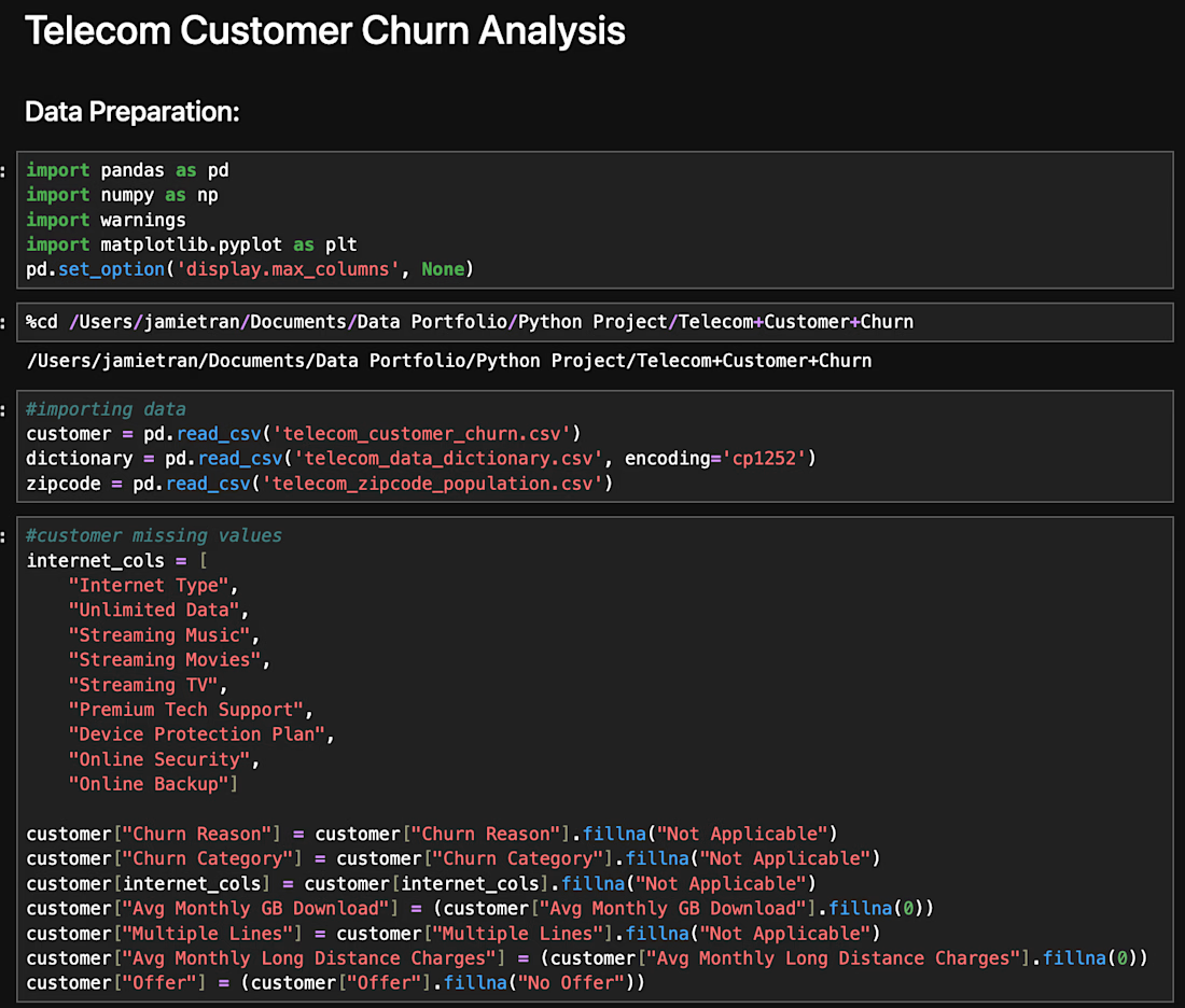
Using Python and Pandas, I investigated missing values and data quality issues, prepared the dataset for analysis, performed exploratory analysis, and created visualizations to communicate the most important patterns.
Rather than simply removing unusual or incomplete records, data-quality decisions were validated against related fields and documented to preserve the integrity of the analysis.
Key Findings
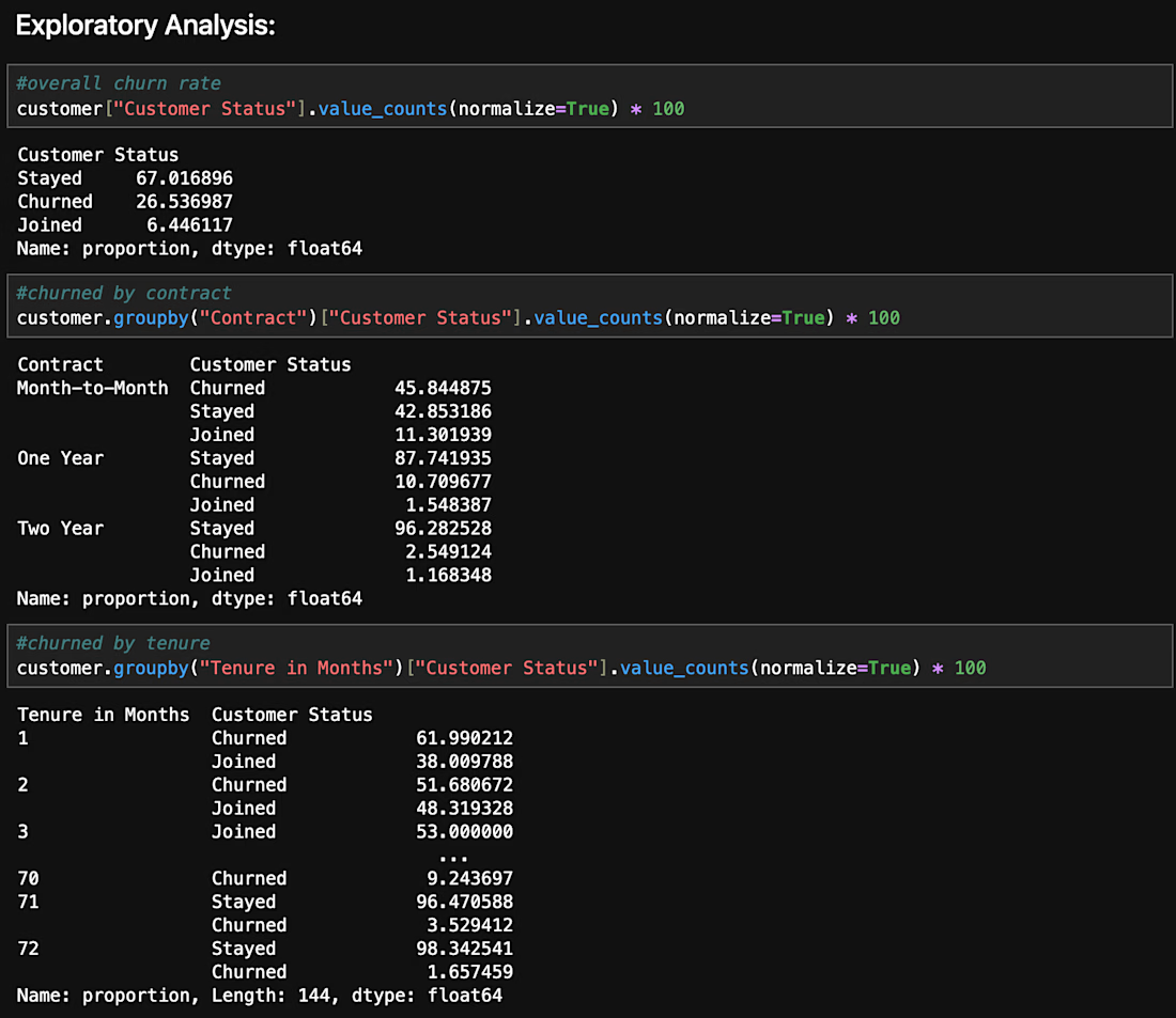
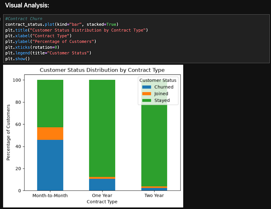
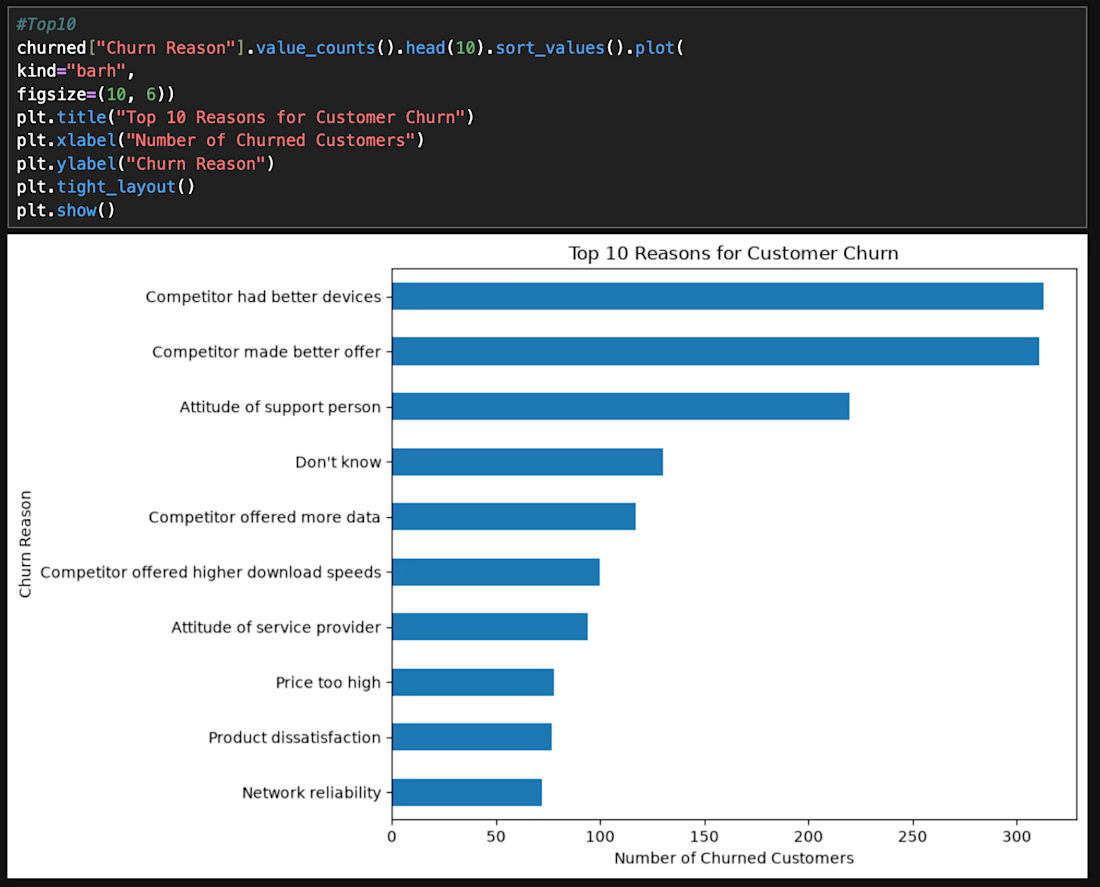
Overall churn was approximately 27% • Month-to-month customers had substantially higher churn than customers with longer contracts • Churned customers had higher average monthly charges • Internet customers without Online Security showed higher churn • Competitor-related factors represented a major group of reported churn reasons
Tools: Python • Pandas • Matplotlib • Jupyter Notebook
Want to see the analysis?
View the complete notebook and technical walkthrough on GitHub → https://github.com/jamietran8818/business-data-analytics-portfolio/blob/main/python-customer-churn-analysis/README.md


The network for creativity
Join 1.25M professional creatives like you
Connect with clients, get discovered, and run your business 100% commission-free
Creatives on Contra have earned over $150M and we are just getting started
Related posts

Road Safety Analysis | Python, SQL & Power BI
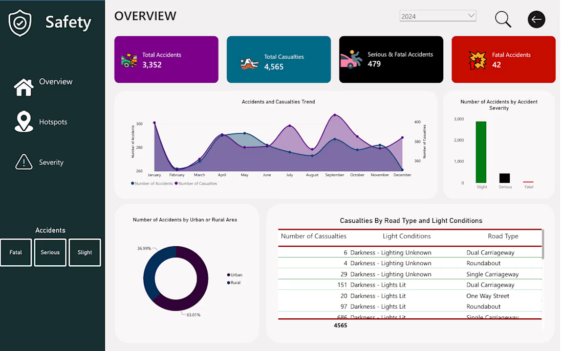
Developed an end-to-end road safety analytics project to help authorities understand accident patterns, identify high-risk areas, and make informed decisions about road safety interventions.
The project involved cleaning and preparing road accident data using Python and Pandas, followed by SQL-based exploratory analysis to investigate accident trends, casualty figures, severity distributions, and geographical patterns.
Using Power BI, I transformed the findings into an interactive dashboard featuring key performance indicators and visualisations that provide an overview of accident activity, highlight trends over time, and reveal differences in accident occurrence across districts and locations.
The analysis also explored accident severity in relation to road types, weather conditions, lighting, and road surface conditions.
Tools used: Python, Pandas, SQL, Power BI.
Project deliverable: An interactive Power BI dashboard supported by data cleaning, transformation, and SQL analysis.
The objective was to turn raw accident data into clear, meaningful insights that can support evidence-based road safety planning and resource prioritisation.



We designed and built a high-converting Framer landing page and Figma web dashboard for Streamline, turning unstructured B2B data and legal intake into an efficient, automated experience.
Check out the full case study on Contra and let's scale your SaaS platform: https://contra.com/p/WBeOsvBQ-streamline-legal-intelligence-platform-design?r=airzon_agency 🚀


Having him overlap the big Streamline wordmark is a nice touch.

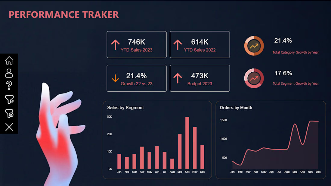
📊 Power BI Performance Tracker Dashboard
Turning raw data into meaningful insights!
I’m excited to share my latest Power BI Dashboard-Performance Tracker, designed to provide a clear and interactive view of business performance.
Key Features:
📈 YTD Sales Performance (2022 vs. 2023)
🎯 Budget vs. Actual Sales Analysis
📊 Sales Growth & Performance KPIs
🗂️ Sales Analysis by Segment
📅 Monthly Order Trends
📉 Category & Segment Growth Analysis
Tools Used: Microsoft Power BI | Data Visualization | Dashboard Design
My goal was to create a clean, modern, and visually engaging dashboard that makes complex business data easier to understand and supports better decision-making.
Always learning, building, and transforming data into insights!
#PowerBI #DataAnalytics #DataVisualization #BusinessIntelligence #DashboardDesign #MicrosoftPowerBI #DataAnalyst #Contra