The network for creativity
Join 1.25M professional creatives like you
Connect with clients, get discovered, and run your business 100% commission-free
Creatives on Contra have earned over $150M and we are just getting started
Back to feedPost

The Autorish logo transforms the letter “A” into a sleek geometric form inspired by the silhouette of a car. The result is a bold, minimal mark that connects the brand name with its automotive lifestyle at a glance.


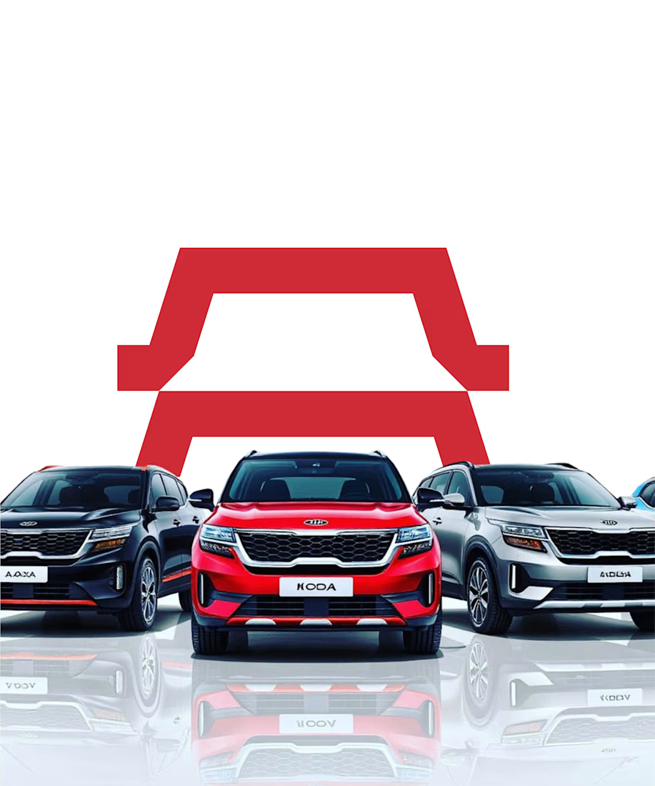
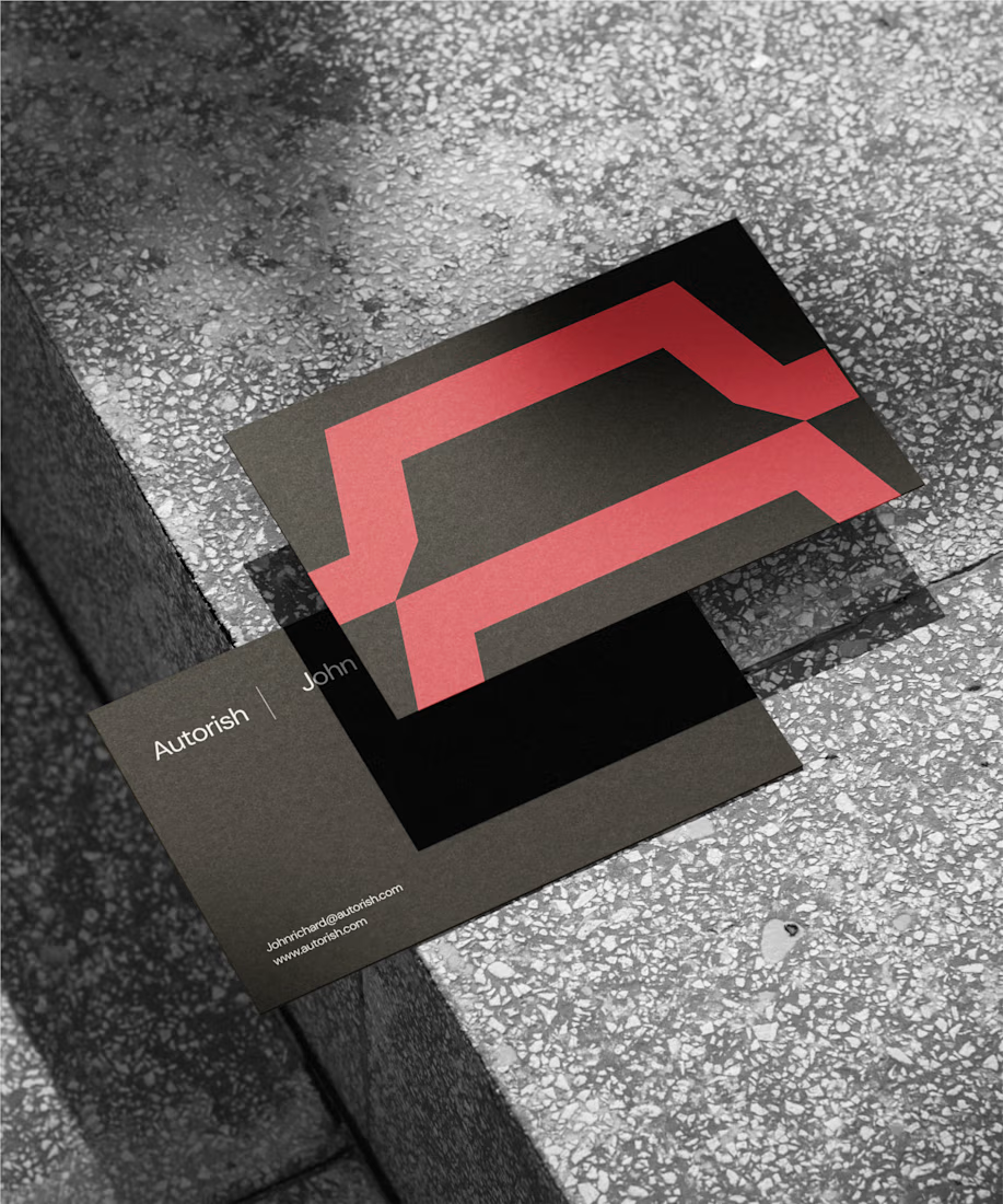
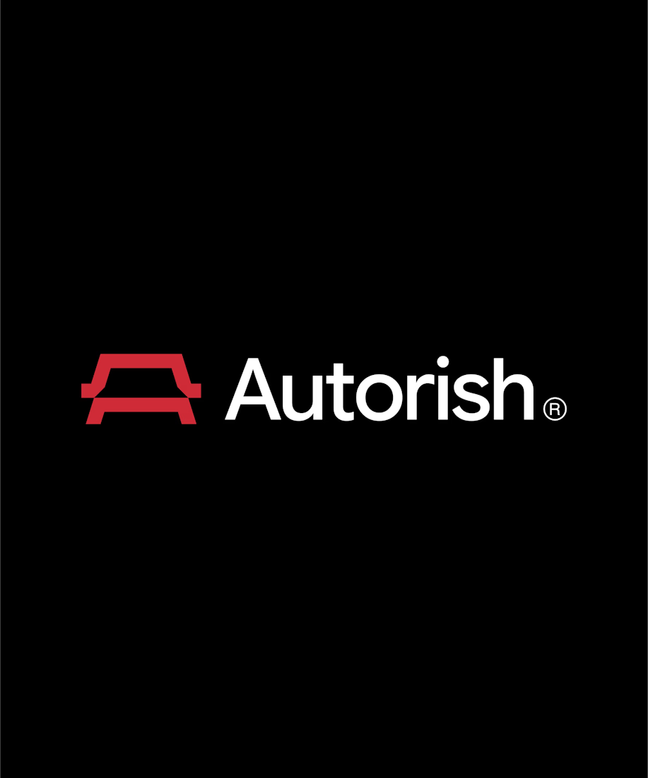
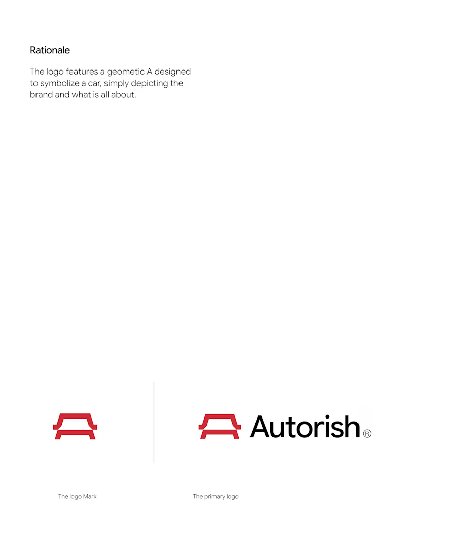

What I like is that the mark reads as a car roofline first and only becomes an A on the second look, which is the right order for an automotive brand - the letter is a bonus, not the point. Was the split between the two red weights (the thick roof vs the thinner base bar) a...
The network for creativity
Join 1.25M professional creatives like you
Connect with clients, get discovered, and run your business 100% commission-free
Creatives on Contra have earned over $150M and we are just getting started
Trending
retrofuturism
Share your favorite designs from the past exploring the distant future. Or your own take on the aesthetic 🚀
halftone
Dots. Texture. Grain. Let's see your designs using the halftone technique.

Midjourney
Creatives are showing off what they're making with Midjourney.
colorgrade
Video editors sound off: How do you enhance the mood of your video in color grading?





Related posts


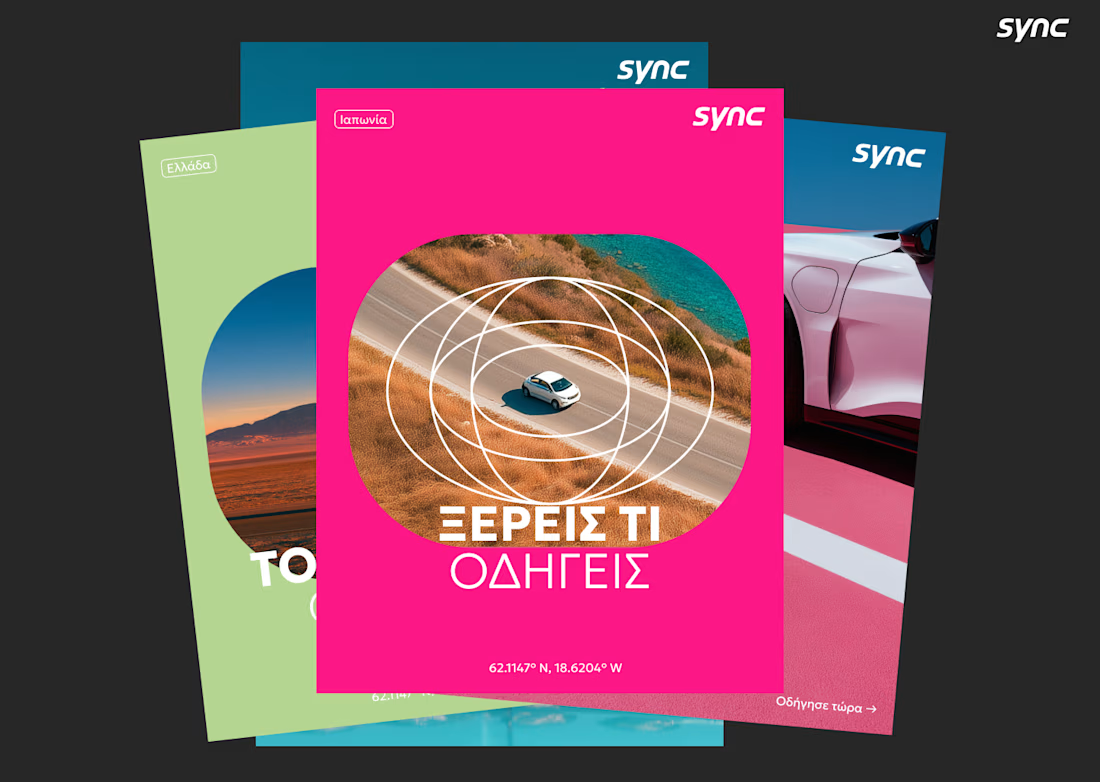
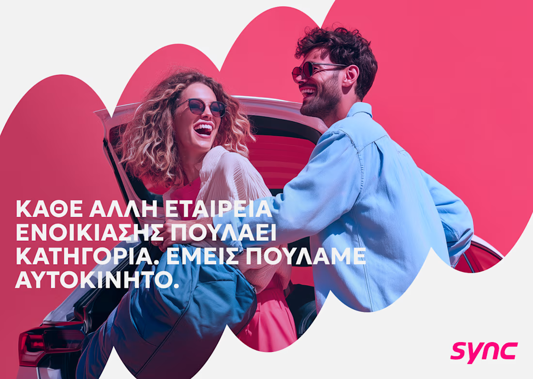
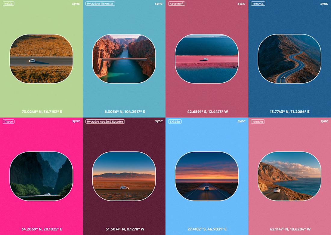
I don't speak any Greek, but I still made it work.
This is a part of the original exploration for an Athens based car rental company called Sync. The final identity looks a lot different and I cant wait to be able to share it as well.

Great Great work!!

Your brand is being judged before anyone reads a single word.
A strong visual identity creates recognition, builds credibility, and communicates value before you ever say a thing.
I don’t design logos just to make brands look good.
I build visual identities that position businesses, create distinction, and make brands impossible to confuse with everyone else.
A few identities I’ve worked on this year.
If you’re serious about building a brand that looks as valuable as the business behind it, let’s talk.
→ Available for select branding projects.


Good work!!


We’re excited to share a new brand identity we created for a perfume brand ✨
From the logo and bottle visuals to business cards, letterhead, perfume bags, and custom packaging - we crafted a cohesive identity designed to feel elegant, distinctive, and memorable.
Another project we’re proud to bring to life.

Super clean and subtle but still has a lot of personality!