The network for creativity
Join 1.25M professional creatives like you
Connect with clients, get discovered, and run your business 100% commission-free
Creatives on Contra have earned over $150M and we are just getting started
Back to feedPost
A potential customer shouldn't have to work too hard to understand what your brand stands for.
Your visual identity should communicate the right signals before anyone reads your About page or speaks to your sales team.
Think about it.
A premium skincare brand shouldn't look indistinguishable from a discount cosmetics store. A technology company shouldn't look outdated if it wants to be perceived as innovative. A financial institution shouldn't communicate uncertainty when its business depends on trust.
Every design decision contributes to perception.
Typography, colour, spacing, imagery, composition, and tone of voice all influence how people interpret a business.
My job as a brand designer is to make those signals intentional.
The goal isn't simply to make a brand look good. It's to make it look right for the market it wants to own.
#BrandPositioning #BrandIdentity #BrandDesign
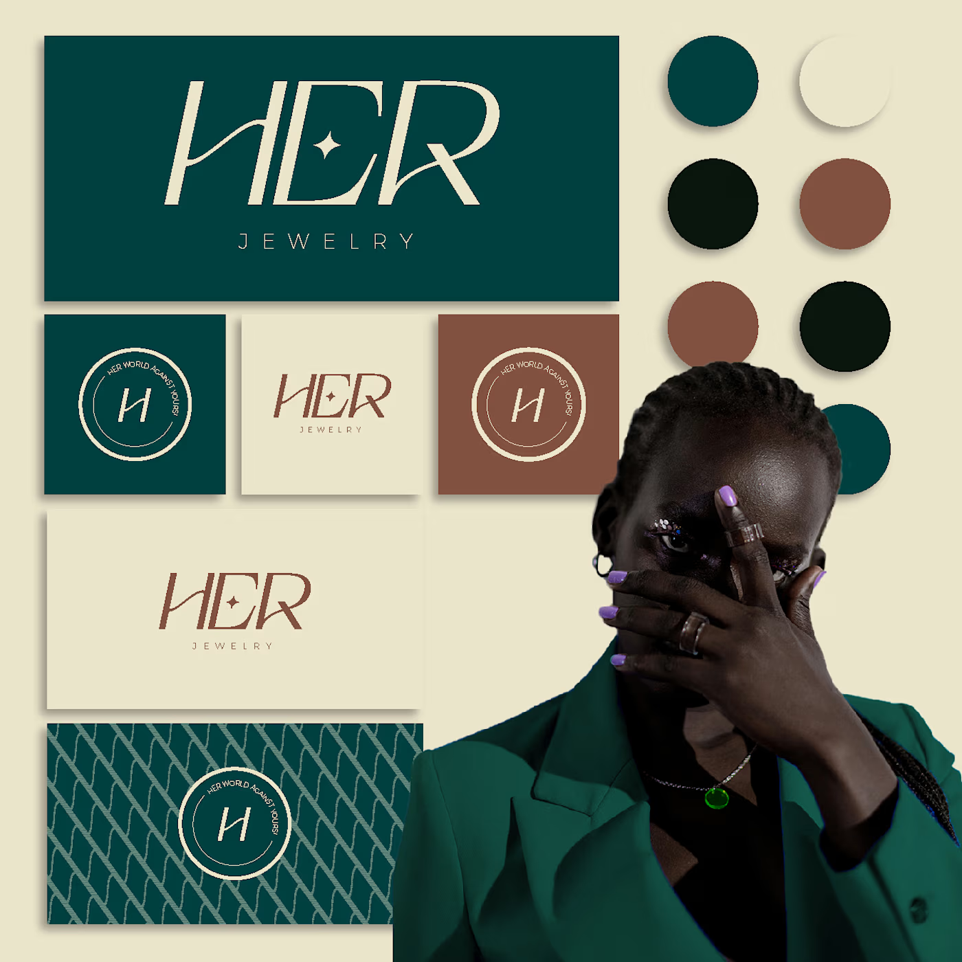
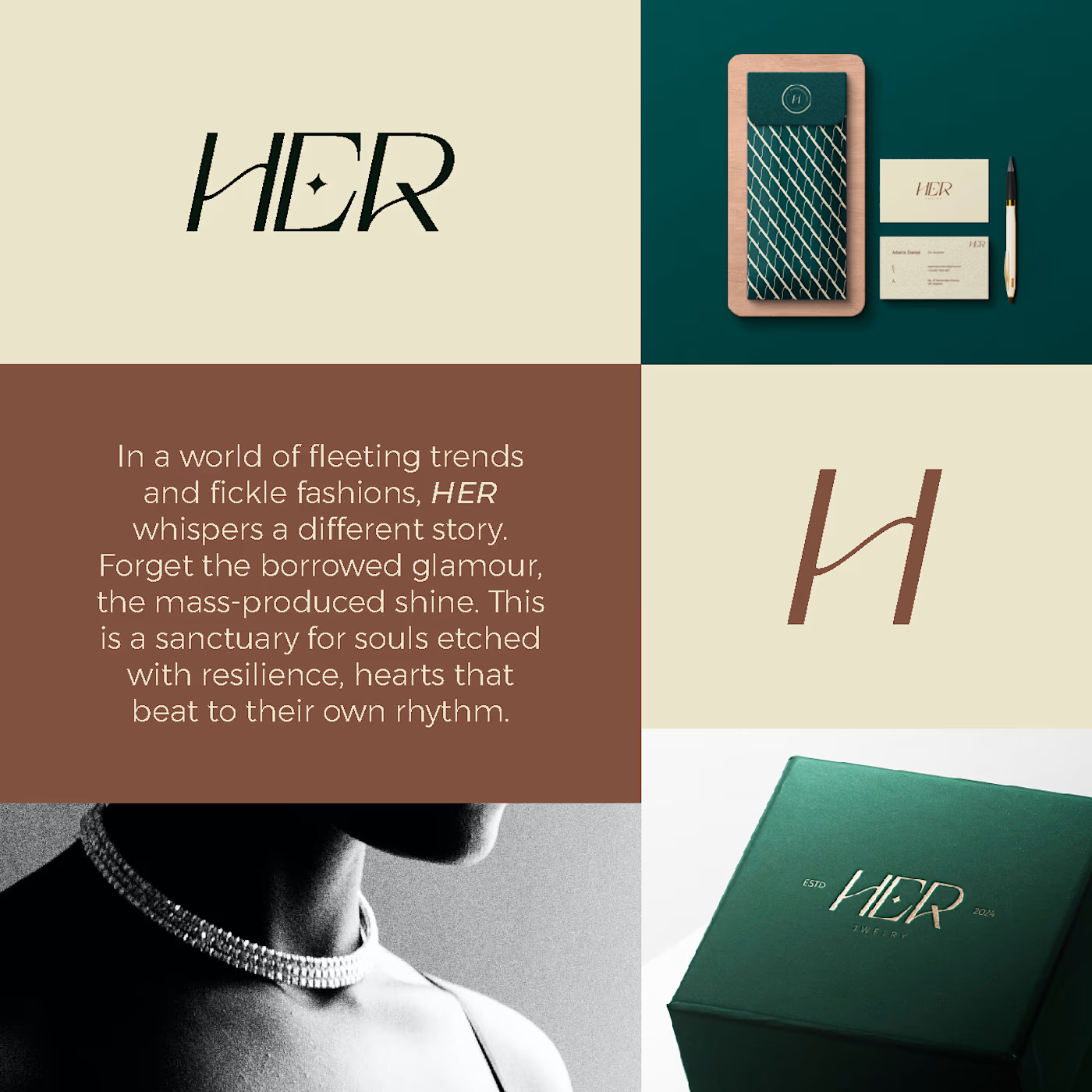
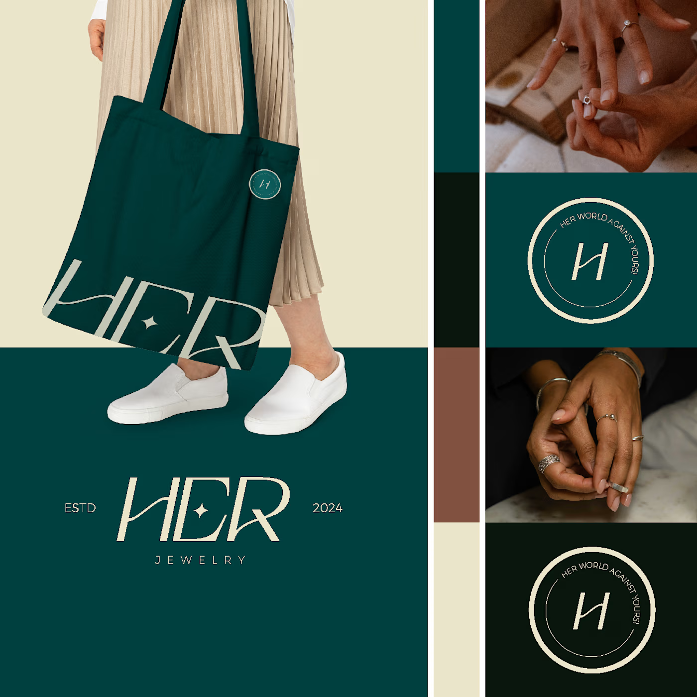
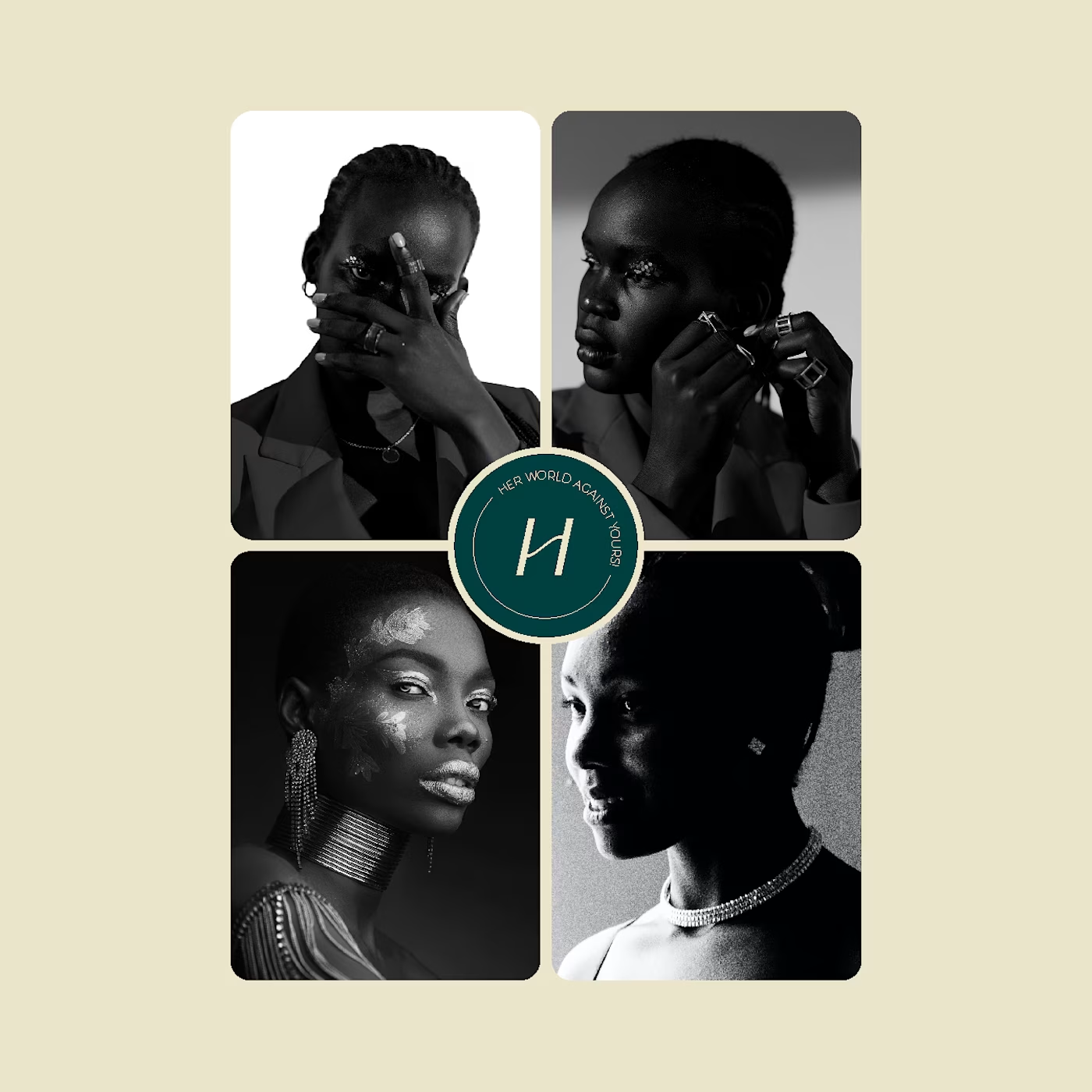


Thank you so much Anas. Can we be mutuals? I love your works too
You are welcome
The network for creativity
Join 1.25M professional creatives like you
Connect with clients, get discovered, and run your business 100% commission-free
Creatives on Contra have earned over $150M and we are just getting started







Related posts

How do you brand a business that doesn’t fit into one box?
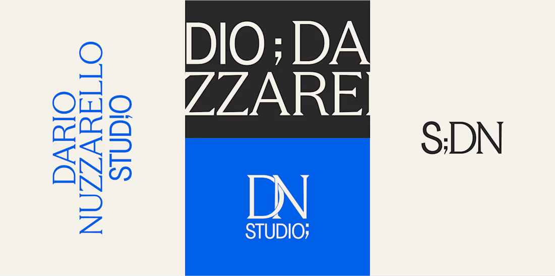
Dario Nuzzarello built a Studio that works across engineering, IT, strategy, and software. The challenge was creating a typographic identity that could bring all those disciplines together without limiting the brand to just one.
I wanted to avoid making it feel overly technical or cold. Since Dario’s work is highly custom and interdisciplinary, the identity needed to feel precise and structured while still being human and approachable.
Sometimes, the best solution is finding the right type, proportions, and details to make a name stand on its own.
What do you think about the final result?


A studio that spans engineering, IT, strategy and software is a naming and typography problem more than a logo problem, so leading with type was the right call. Precise but human is a hard line to walk. Did Dario push for a symbol at any point?

Recruitment is a people business. The brand should feel the same way.
Wayforce connects top talent with businesses and needed an identity that spoke to both sides at once. Sharp enough for the companies hiring. Human enough for the candidates being placed.
The mark does two things: reads as W, moves like a direction. Acid yellow that stands out in a category full of grey corporate sameness.
Not another recruitment agency. A force that knows where you’re headed.

This is wonderful man. love the branding

My Brand Alchemy – Visual Identity
How do you brand a branding agency without hiding behind someone else’s product?
The real question with My Brand Alchemy, a studio that helps entrepreneurs reimagine and transform their businesses, was this: Its identity had to stand on its own, not borrow from anyone else's.
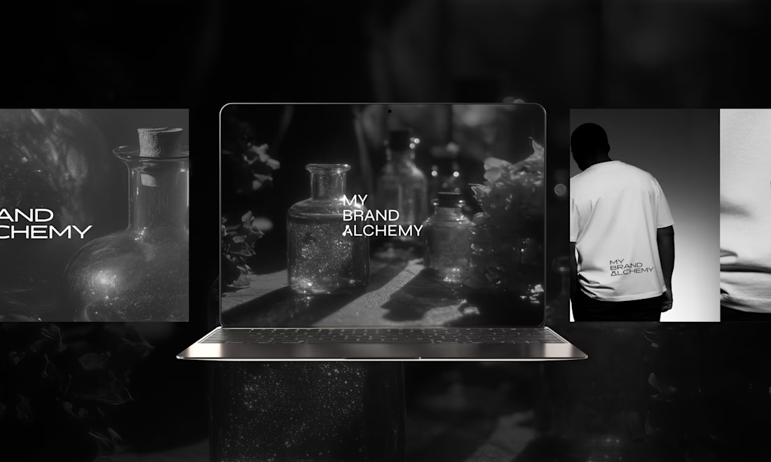
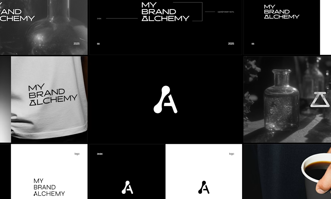
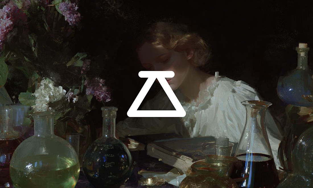
We built the system around one metaphor: the laboratory. Strategy as an experiment and clarity as the result of patient work.
→ A monochrome palette, stripped of anything decorative
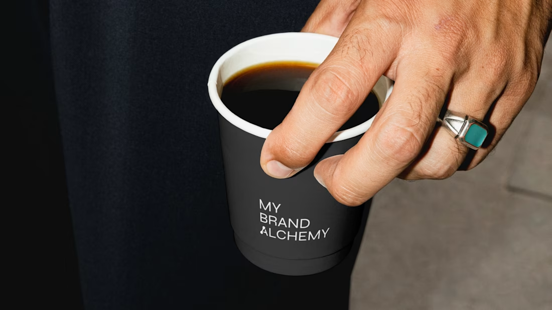
→ Precise, concept-driven typography with a custom symbol woven into the wordmark
→ Atmospheric glass photography against clean geometric forms
The whole system is meant to feel like a workshop, not a showroom. Transformation as something slow and carefully made, not performed.
Would you trust a branding studio more if its own brand looked like a lab, or like a gallery? 👇



The laboratory framing works because you're treating the studio's own identity as the experiment — the system has to earn its credibility by doing the reimagining it sells. The naming and taxonomy feel honest; if the system stretches into motion and sound, the same...