The network for creativity
Join 1.25M professional creatives like you
Connect with clients, get discovered, and run your business 100% commission-free
Creatives on Contra have earned over $150M and we are just getting started
Back to feedPost

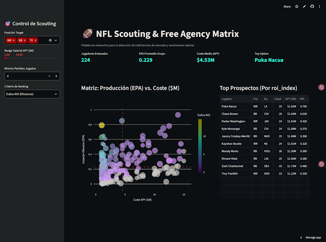
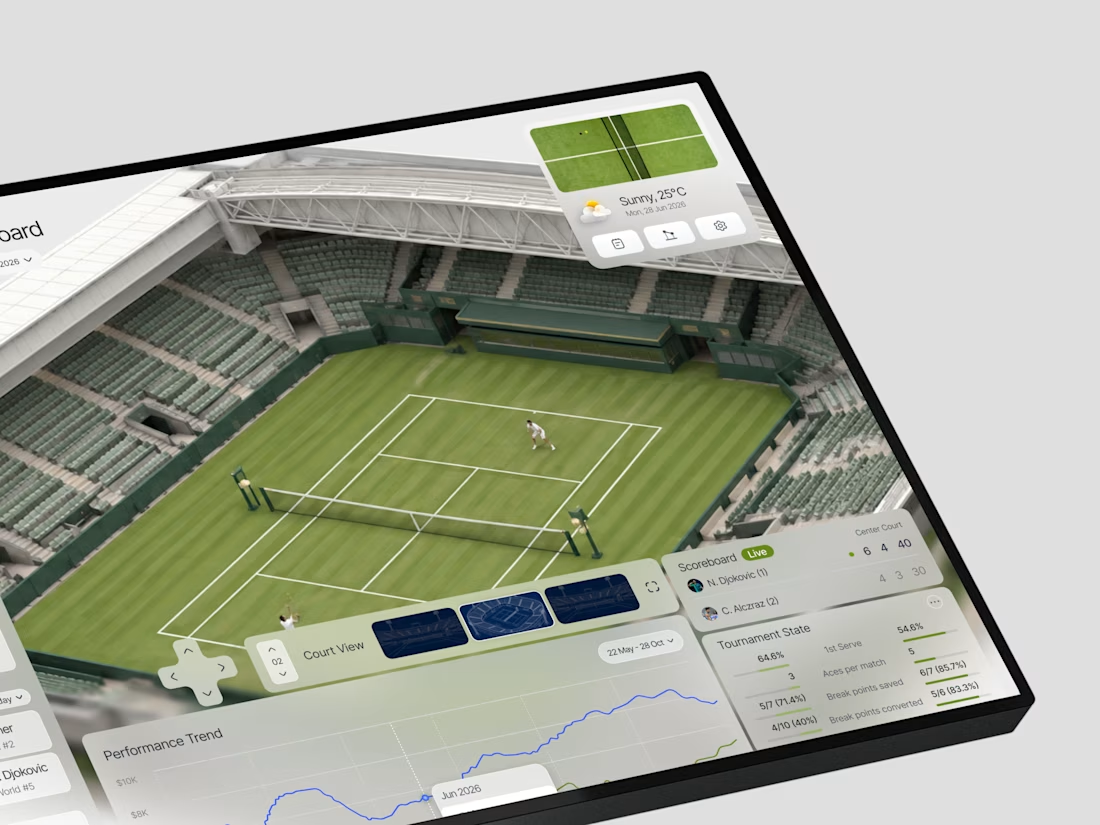
Interactive Business Intelligence Dashboard. Transforming complex datasets into real-time visual KPIs for strategic decision-making.


The network for creativity
Join 1.25M professional creatives like you
Connect with clients, get discovered, and run your business 100% commission-free
Creatives on Contra have earned over $150M and we are just getting started




Related posts

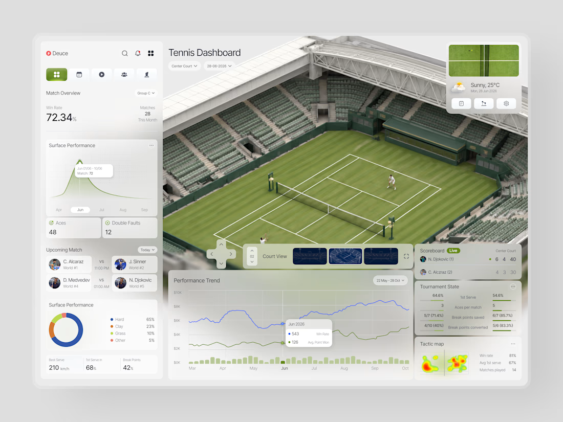
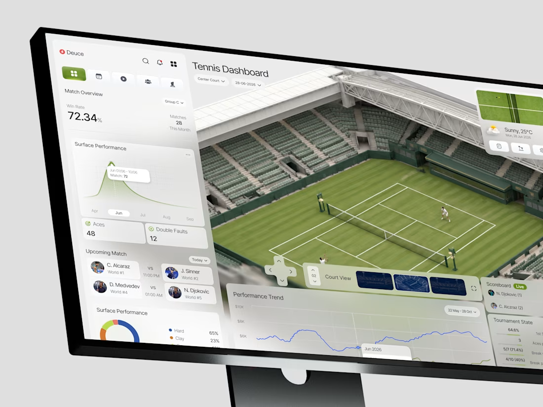
This is such a great example of turning complex data into a visual experience. 🎾🔥
Love how the court becomes part of the analytics instead of just sitting in the background. Really impressive work!

When does a sports dashboard need the court to be more than a background?
In this case, we were designing Deuce a tennis analytics platform that needed to make complex match data feel immediate and spatial, not just numerical.
The brief was clear: analysts and coaches don't just...

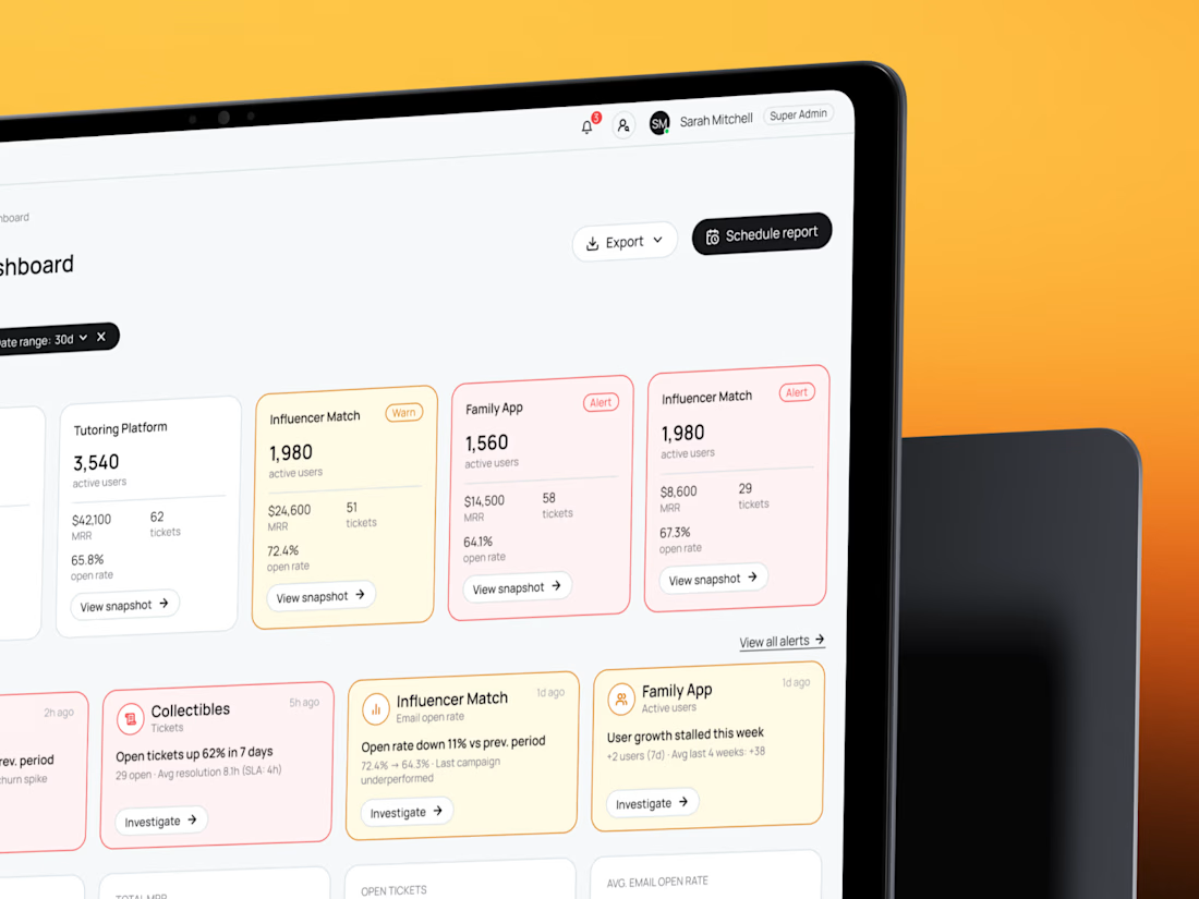
See how five products fit on one screen — B2B SaaS CRM dashboard and admin panel UX/UI🧡 Share your thoughts!

I bet it was a complicated task - to add 5 different products, but you did great!

GPU infrastructure gets expensive fast, especially when teams are running multiple models, clusters, and workloads at the same time.
Corebit explores a SaaS dashboard experience built to make GPU cost monitoring easier to understand and act on.
The dashboard surfaces compute spend, idle GPUs, workload utilization, potential savings, and optimization opportunities in one clear workspace, helping teams see where capacity is being wasted and what they can improve next.