The network for creativity
Join 1.25M professional creatives like you
Connect with clients, get discovered, and run your business 100% commission-free
Creatives on Contra have earned over $150M and we are just getting started
Back to feedPost

Thesis website with a blog about their research's



The network for creativity
Join 1.25M professional creatives like you
Connect with clients, get discovered, and run your business 100% commission-free
Creatives on Contra have earned over $150M and we are just getting started

Challenges
View all


Related posts

Making productivity a little more colorful. 💜
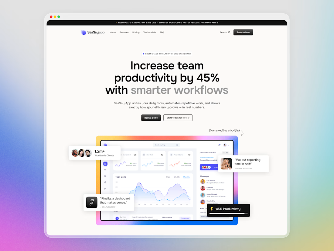
Hey Contra community! Today I want to share a closer look at SaaSsy App – a landing page concept for an all-in-one productivity platform.
The product has a lot going on, so the main challenge was presenting all those features without making the landing page feel overloaded. I kept the structure simple and used colorful gradients and bold typography to make the content easier to follow and a bit more memorable.


Creative work and UI Flow

Which AKARI Design Looks Better? 🍣
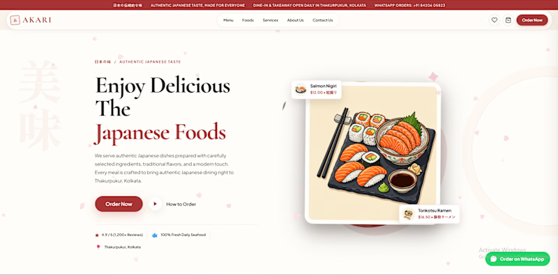
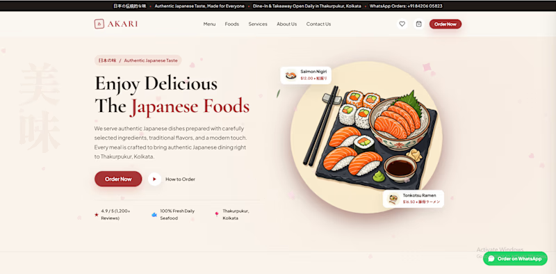
I’ve been working on AKARI (あかり) — a Japanese food restaurant website that I’m building both as a real-shop-ready concept and as a showcase of my web design & development work.
I’ve made two different versions of the design, and I want the Contra community to decide which direction looks better.
🅰️ Option A
Design 1 — More bold, structured and brand-focused.
🅱️ Option B
Design 2 — More minimal, clean and modern.
🅲️ Option C
Neither? 😅
Tell me what you would change, add, or completely redesign. I’m open to ideas!
👇 Vote A, B, or C in the comments.
Which one would you choose for a Japanese restaurant?
🍣 AKARI — あかり
Authentic Japanese Taste, Made for Everyone.
6 voted
46%
7 voted
54%
13 votes
Closed

I’d lean toward Design A—the bolder structure gives the restaurant a clearer point of view, while the centered dish still keeps the page inviting. The restrained palette and generous whitespace make the food do the talking.


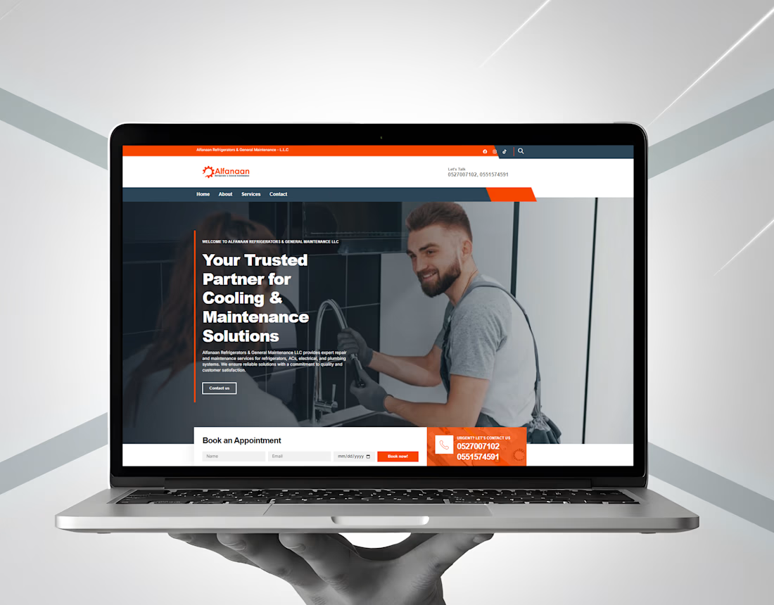
A modern website built to keep maintenance services simple, clear, and easy to access.
We designed and developed a professional website for Alfanaan Refrigerators & General Maintenance LLC, showcasing their AC, refrigerator, electrical, plumbing, and general maintenance services.
From a clean layout to clear service sections and strong CTAs, every element was designed to create a smooth user experience and help turn visitors into potential customers.
View the project: alfanaanrgm.com