The network for creativity
Join 1.25M professional creatives like you
Connect with clients, get discovered, and run your business 100% commission-free
Creatives on Contra have earned over $150M and we are just getting started
Back to feedPost

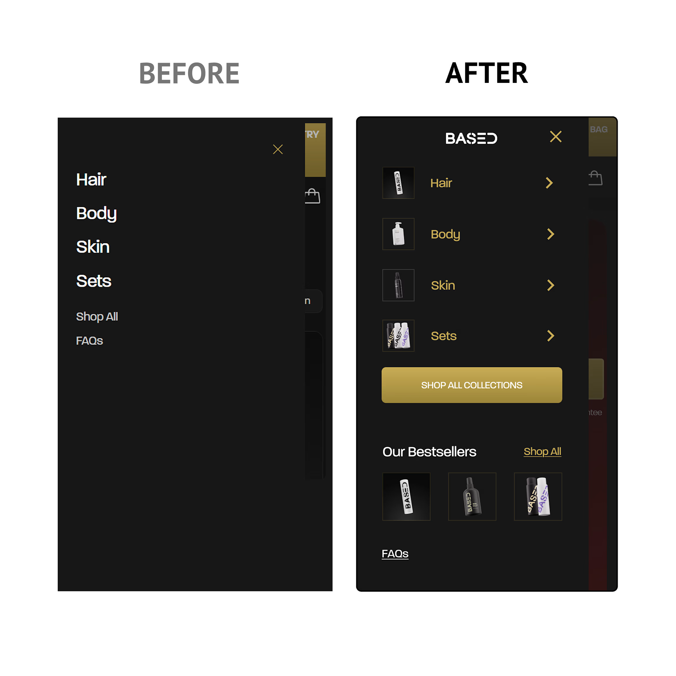
I recently redesigned @based mobile navigation to show how strategic designs can improve shopping experience and conversion rate.A few changes I explored:
Added a "Find My Routine" CTA to help first-time visitors discover the right products.
Surfaced Best Sellers to guide shoppers toward popular choices.
Added trust-building links to reduce purchase hesitation.
Introduced product thumbnails to improve scanability and navigation.
Small UX decisions like these can have a big impact on click-through rates, product discovery, and ultimately, conversions.
Sometimes the highest-impact design work isn't creating something new. It's removing friction from what already exists.
What would you have optimized differently?

The network for creativity
Join 1.25M professional creatives like you
Connect with clients, get discovered, and run your business 100% commission-free
Creatives on Contra have earned over $150M and we are just getting started







Related posts

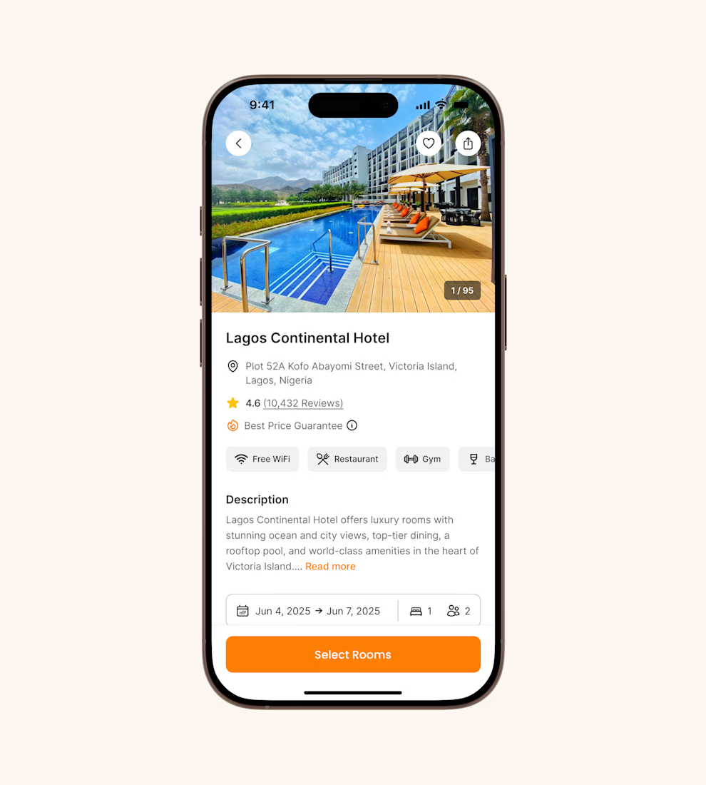
Hotel details screen for a booking app I’ve been designing.
Focused on clear information hierarchy, visual comfort, and helping users make quick booking decisions.
Excited to start sharing my work here 🚀

It's basic design but it's great❤️

Introducing Finora
A modern fintech app designed to make personal finance simpler, smarter, and easier to understand.
Built with a consistent Inter-based design system and a soft, modern visual language.
#UIUX #ProductDesign #Fintech #MobileApp #Figma


All experience in one app well designed.

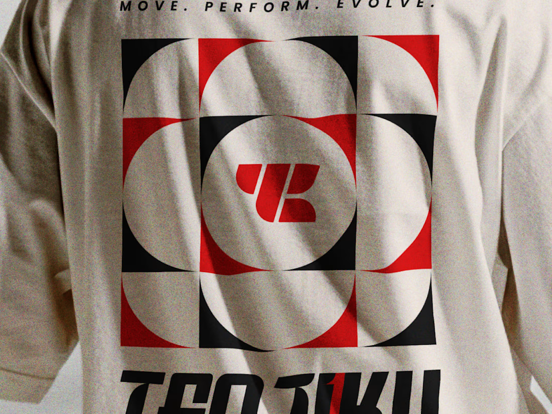
What type of combination is that?
Indian spirituality × Japanese minimalism × personality-driven clothing.
That’s Tenjiku.
But getting this combination right wasn’t as simple as putting three ideas together. We started with research digging into what Tenjiku means, where the name comes from, its cultural roots, and how those ideas could shape a visual identity without feeling forced or predictable.
From that research came the logo, typography, symbols, and the overall visual language.
Every element has a reason behind it.
The logo is only the final result. The interesting part is how we got there.
We’ve documented the whole thinking & design process on Behance.
Go check out the story behind Tenjiku


The research showing through the design is what makes this work. Love the Indian x Japanese balance - not easy to pull off but you nailed it.