The network for creativity
Join 1.25M professional creatives like you
Connect with clients, get discovered, and run your business 100% commission-free
Creatives on Contra have earned over $150M and we are just getting started
Back to feedPost

What type of combination is that?
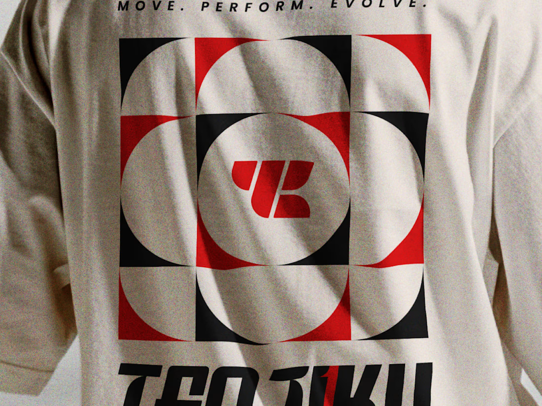
Indian spirituality × Japanese minimalism × personality-driven clothing.
That’s Tenjiku.
But getting this combination right wasn’t as simple as putting three ideas together. We started with research digging into what Tenjiku means, where the name comes from, its cultural roots, and how those ideas could shape a visual identity without feeling forced or predictable.
From that research came the logo, typography, symbols, and the overall visual language.
Every element has a reason behind it.
The logo is only the final result. The interesting part is how we got there.
We’ve documented the whole thinking & design process on Behance.
Go check out the story behind Tenjiku


That's really awesome design I like how it uniquely designed🎉🎉
Thank you for the kind words!
Pardon ❤️

The research showing through the design is what makes this work. Love the Indian x Japanese balance - not easy to pull off but you nailed it.
Really appreciate that you noticed the research and efforts we put into it.
Thanks! Cultural balance in branding is always tricky, you handled it with so much respect and craft. Keep it up!
Thank you so much.

The geometric block mark on the tee reads very Japanese in its restraint. Where did the Indian side come in most, the symbol construction or the typography?
The Indian influence comes primarily through the symbol construction. The mark is inspired by Lord Ganesha, interpreted through a minimal, geometric design approach.
For a better understanding of the concept and the design decisions behind it, I’d recommend going through the full...
Ganesha reduced to a geometric block explains why the tee feels restrained but still carries meaning. Did you try a more figurative version of the symbol before landing on this one?
We did explore more figurative versions as well, but they felt too regionally specific and risked compromising the brand’s international appeal. We wanted to strike a balance between honoring the Indian inspiration and maintaining a refined, contemporary identity that resonates with a global audience.

Starting from the name's cultural roots and letting the research drive the symbols is the right order — most brand work in this space leads with the mark and back-fits the meaning, so it's notable you went the other way. One risk when balancing Indian spirituality and Japanese...
Absolutely, that was one of the key considerations throughout the process. We wanted the Indian inspiration to be meaningful at its core, rather than just an ornamental element, while keeping the overall visual language minimal and globally relevant. The real challenge was...
The network for creativity
Join 1.25M professional creatives like you
Connect with clients, get discovered, and run your business 100% commission-free
Creatives on Contra have earned over $150M and we are just getting started



Challenges
View all


Related posts

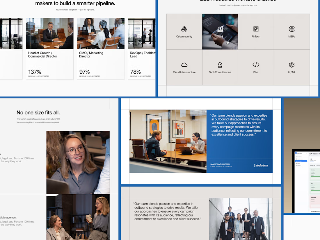
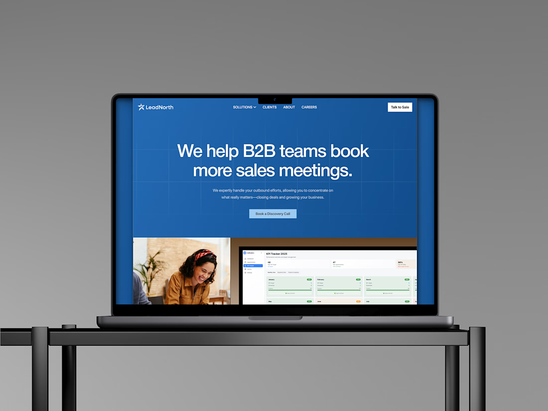

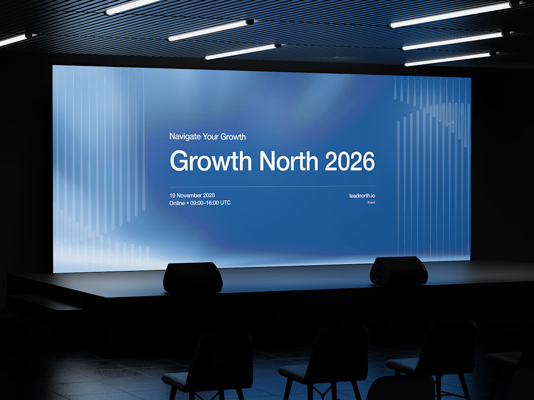


That saturated cobalt blue carries cleanly from the laptop hero onto the outdoor billboard and the Growth North 2026 stage screen.

Which brand style fits Yicora?
I'm crafting a brand book for an AI platform targeting for creators.
16 voted
53%
14 voted
47%
30 votes
Closed
A feels more professional great job 🎉🎉


Secnd is finally live.
After months of building, meet Secnd a two-person design studio shaping brands and designing digital experiences, founded by twins Carol and Cynthia Ugwu
We've spent our whole lives side by side, so starting Secnd together was always going to happen. Today it's official.
Take a look at what we've been working on, and if you've got a secnd, book an intro call.
http://secnd.studio

