The network for creativity
Join 1.25M professional creatives like you
Connect with clients, get discovered, and run your business 100% commission-free
Creatives on Contra have earned over $150M and we are just getting started
Back to feedPost


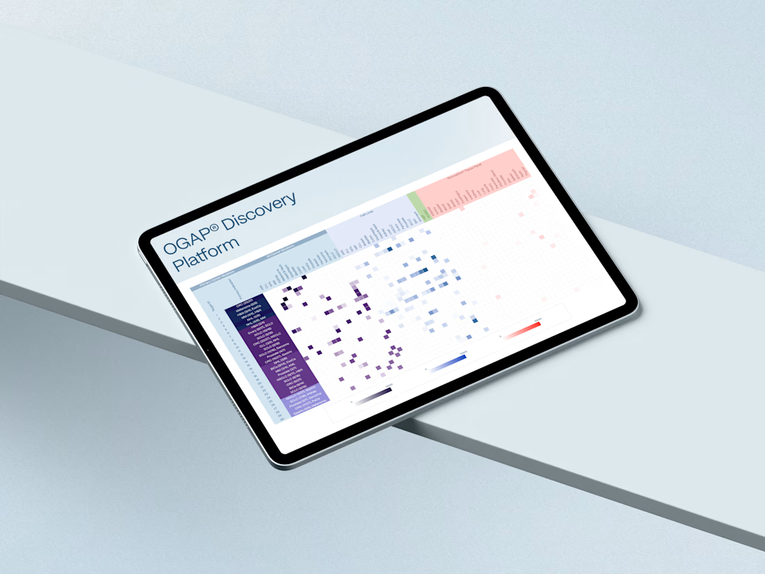
Oxford BioTherapeutics is a biotechnology company focused on developing next-generation oncology treatments through targeted therapies, including antibody-drug conjugates (ADCs), immuno-oncology, T-cell engagers (TCEs), and radiopharmaceuticals.
The goal was to create a restrained, professional digital experience built around stakeholder-focused content and visually clear scientific communication. The hero illustration depicts a T cell activating after detecting a tumor cell, reflecting the company’s work on redefining the cancer–immune synapse and exploring novel immune checkpoint mechanisms.


The network for creativity
Join 1.25M professional creatives like you
Connect with clients, get discovered, and run your business 100% commission-free
Creatives on Contra have earned over $150M and we are just getting started







Related posts

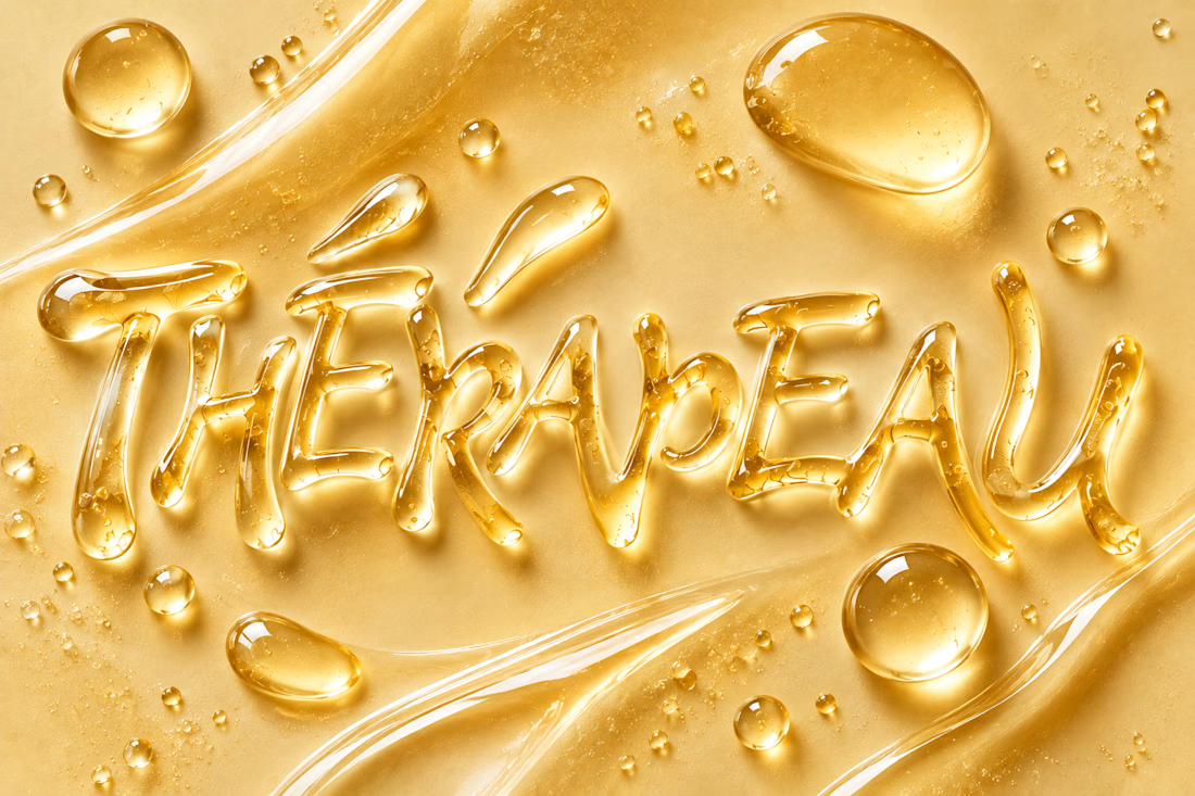
Exploring imagination through texture, typography and skincare. ✨
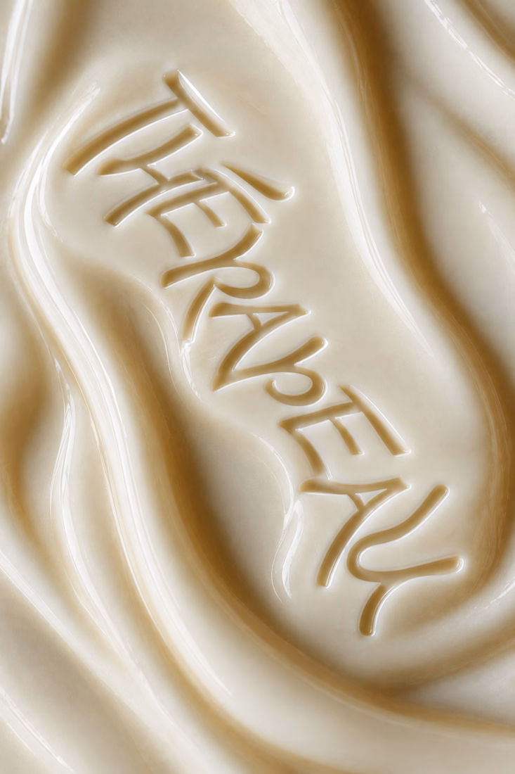
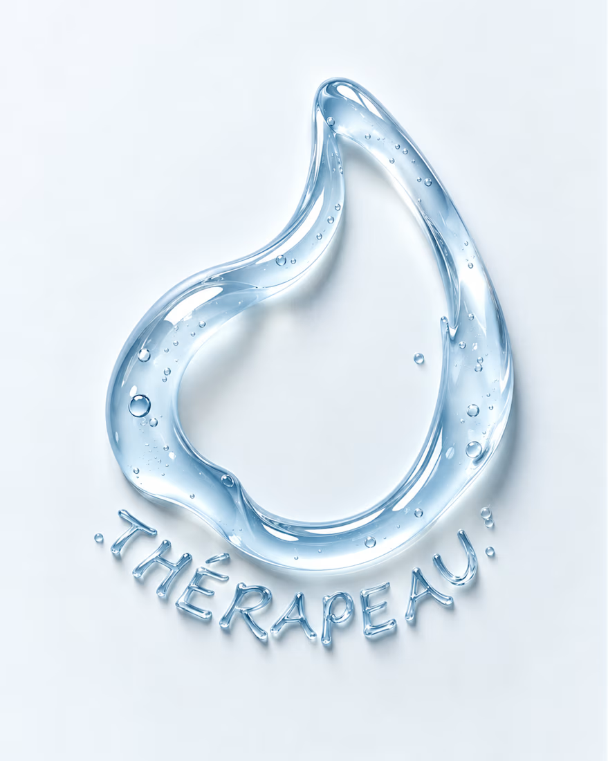
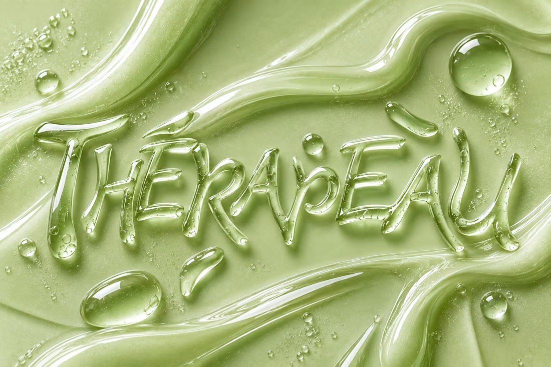
For THÉRAPEAU, I wanted to push the visual identity beyond packaging and explore how serum, gel and cream could become part of the brand language itself.
Using the core wordmark as a starting point, I experimented with different materials, colours and tactile expressions — turning skincare textures into typography and visual studies.
These explorations were created together with ChatGPT as part of the creative process, helping me test ideas quickly while keeping the final brand direction grounded in my own identity system and design decisions.
A small study in how texture can become communication. 💧
#ChatGPT #AIinDesign #Branding #VisualIdentity #SkincareBranding


Letting the wordmark turn into the material itself is a strong idea. Did you set a limit for how far a texture can distort the letters before it stops reading as THÉRAPEAU?

Night Quota – a Halloween game about my hometown
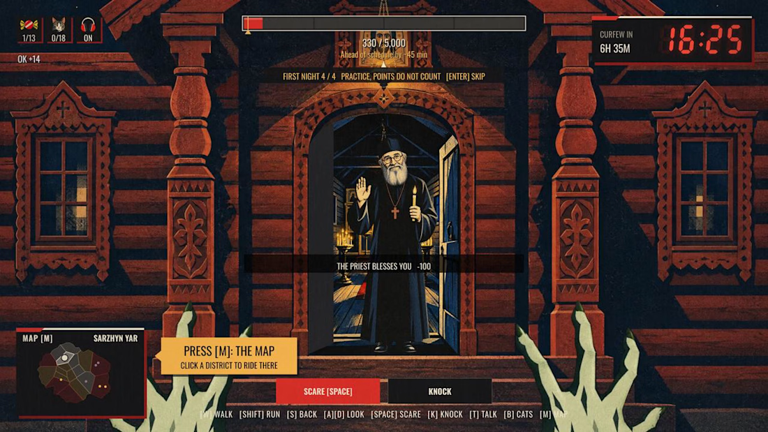
Monsters work one night a year. In Kharkiv, that night ends at 11 p.m. Not because of monsters. Because of the curfew.
Pick one of four monsters, walk the streets, scare people, knock on doors, and hit your quota before dawn. After eleven the streets empty and the job gets harder.
I’m from Kharkiv and I miss it, so I rebuilt it as a game. 18 districts, each started from my own photo of a real street and drawn as a constructivist poster, the style the city is known for. Every district has a local with a story about Kharkiv. The passers-by are people I love: my friends, my daughter as a little witch, and my cat Lisa, who hides in every district.
Features used: Rive CLI + GPU Canvas (both), Scripting, Data Binding, State Machines.
How it’s made
• Rive CLI + Claude Code: I’m a designer, not a game developer. I described the game, the agent wrote it, I watched the live preview and corrected it.
• RML for the scenes, Luau scripting for the logic: the night clock, the districts, the scares, the dialogues.
• GPU Canvas: one WGSL shader over the whole game. Curfew frame, searchlights, air-raid flash, a camera shutter for cat photos, the dawn report developing out of a halftone raster.
• Data Binding drives the HUD, State Machines run the buttons.
• Rive Editor to play it and check every screen.
• Higgsfield for character art, from my own references and photos.
Play it on desktop, with a keyboard and mouse.
Give it about 20 seconds to load, the whole city is in there.


The combination of clawed hands and the friendly priest is awesome! 😂🔥

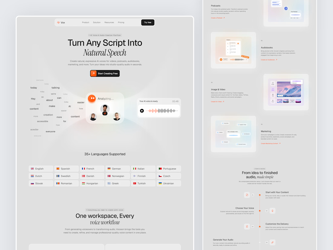
Designed a modern AI Voice SaaS Landing Page.
A soft light interface with gentle color glows, warm orange accents, and elegant italic serif headlines for a calm and creative first impression.
A floating word cloud turning into a voice wave, a language grid, use case cards for podcasts, audiobooks, video, and marketing, plus a simple step by step flow make AI voice creation feel easy to understand. Clean spacing and soft cards keep the whole page light and easy to explore.


Nice UI