The network for creativity
Join 1.25M professional creatives like you
Connect with clients, get discovered, and run your business 100% commission-free
Creatives on Contra have earned over $150M and we are just getting started
Back to feedPost

The network for creativity
Join 1.25M professional creatives like you
Connect with clients, get discovered, and run your business 100% commission-free
Creatives on Contra have earned over $150M and we are just getting started





Related posts

A recent SaaS website design project Done...


Excellent project, really nice

A modern pasta advertising poster designed with a warm, minimal color palette and bold typography. I combined a pasta dish photograph with oversized text, layered shapes, and promotional elements like 50% OFF and ORDER NOW to create an eye-catching food campaign.
I focused on typography, composition, contrast, and visual hierarchy while keeping the overall design clean and commercial.
Skills: Graphic Design · Food Advertising · Typography · Poster Design · Photo Composition · Promotional Design
#GraphicDesign #PastaDesign #FoodAdvertising #PosterDesign #Typography #FoodBranding #SocialMediaDesign #AdvertisingDesign #VisualDesign #CreativeDesign

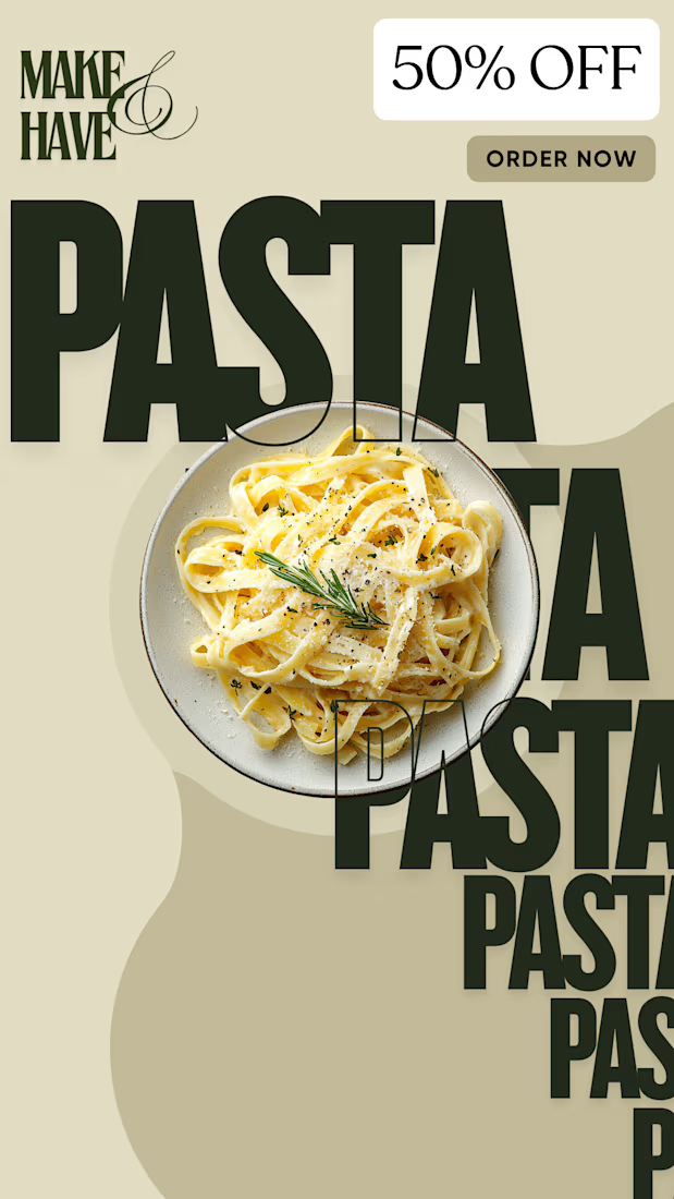

I noticed the oversized typography overlaying the pasta shot really pulls the visual hierarchy, letting the 50% OFF badge stand out without overwhelming the image

Congratulations!

When I moved from Upwork to Contra, I wasn’t sure whether I was making the right decision.
Now? I’m never going back.
Contra has given me more than a place to find work. It has connected me with clients who value my professional perspective, trust my expertise, and invest...

this is so great