The network for creativity
Join 1.25M professional creatives like you
Connect with clients, get discovered, and run your business 100% commission-free
Creatives on Contra have earned over $150M and we are just getting started
Back to feedPost
ARGEIA
A still-life campaign for ARGEA, an artisanal jewelry brand.
The visual direction explores the jewelry through sculptural compositions, materiality and light, creating a refined and contemporary visual language for the pieces.
The campaign focuses on the relationship between form, texture and craftsmanship, transforming the jewelry into the central element of each composition.
My role: Creative Direction, Art Direction & Visual Development.
Tools: AI image generation, Kling AI & CapCut.

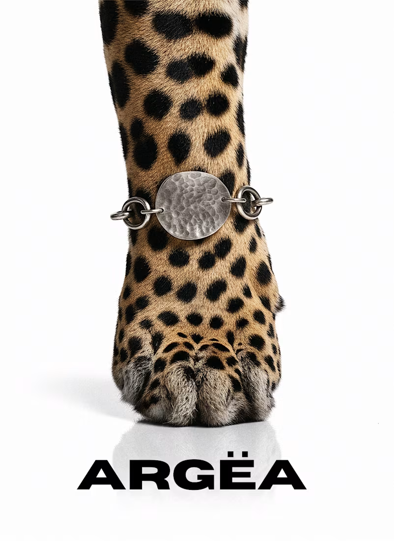
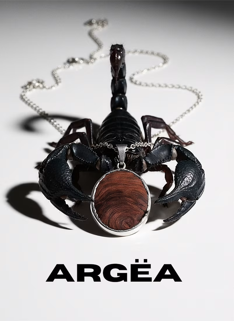
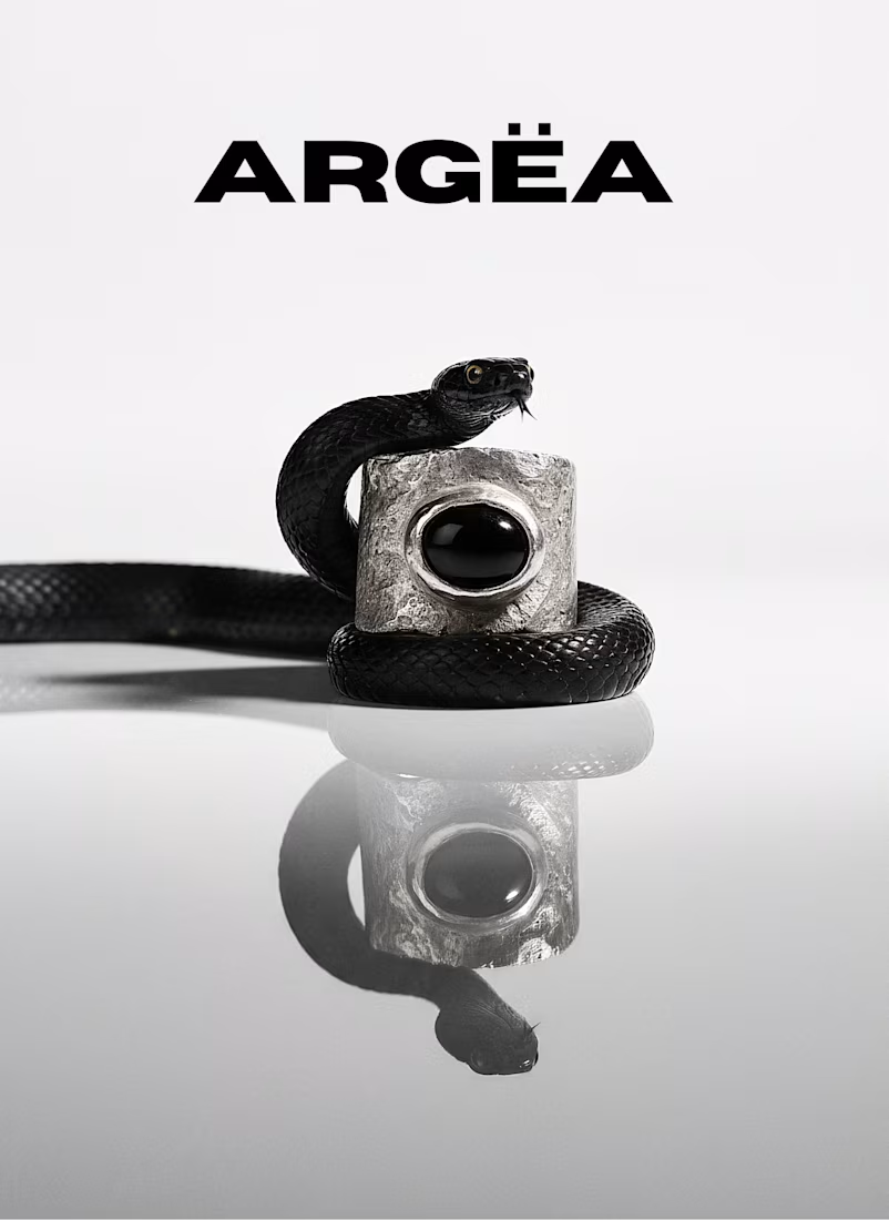
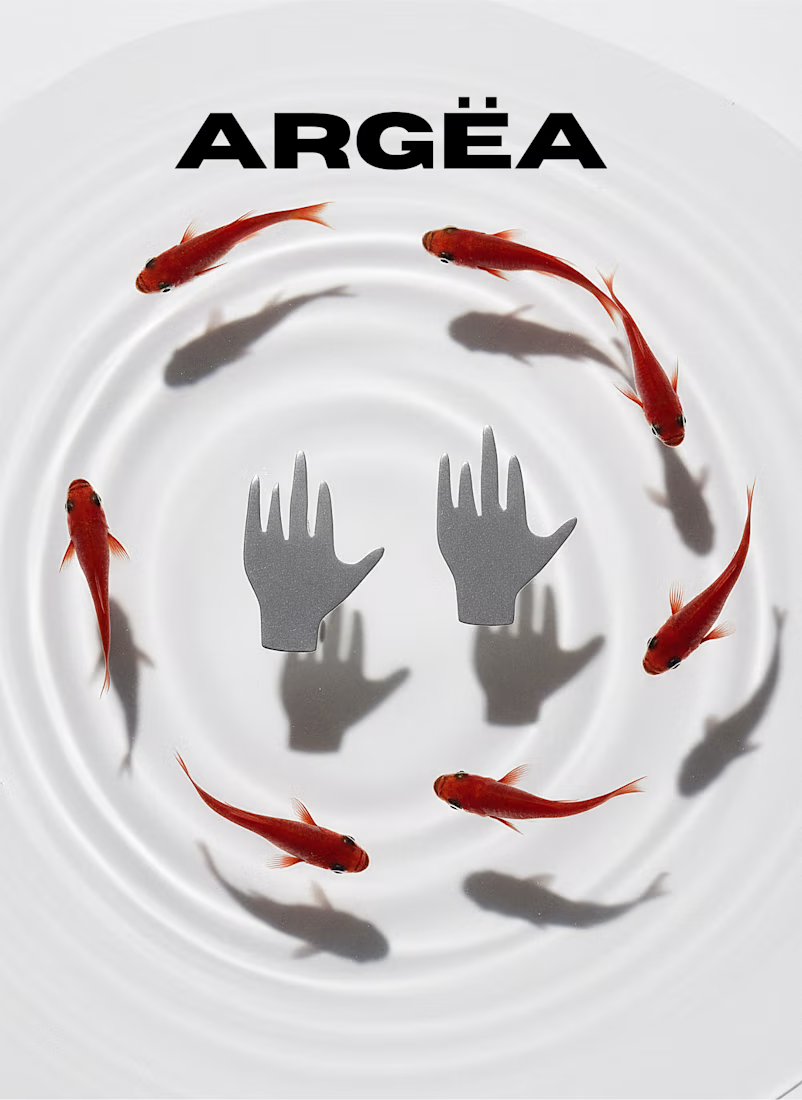

The way the light catches the chain in the second shot is stunning, it feels lit to sell the material rather than just show the piece off. Did you build that lighting inside Kling AI itself, or shoot real reference photos first and recreate the setup digitally?

I developed the lighting direction within the AI process, using visual references to guide the mood, material response and highlights. I wanted the light to feel intentional and almost sculptural, rather than simply functional.
The hands-with-goldfish shot is such an unexpected pairing for a jewelry campaign, in the best way. Was that surreal direction something ARGEIA asked for, or did you have to pitch them on going that abstract?
I actually wanted to push the project into a more surreal and unexpected direction. The idea was to move away from a traditional jewelry campaign and create something more abstract and visually intriguing. 😊

Suuuuuper cool visuals! 🙌
Thank you so much! Really appreciate it.

How Powerful and strong is this art ?
i'd wish to see one but aliens edition, but never mind
Thank you so much! Haha, now I’m curious about the alien edition 👽
The network for creativity
Join 1.25M professional creatives like you
Connect with clients, get discovered, and run your business 100% commission-free
Creatives on Contra have earned over $150M and we are just getting started
Related posts

Recent work for 39BC, a luxury bath and body care brand. An editorial, motion-led site built around slowness and ceremony. Ancient bathing, modern cleansing.
Full project:
contra.com/p/Y2A3rFYU-39-bc-luxury-bath-care-website


the slowness really comes through, looks great

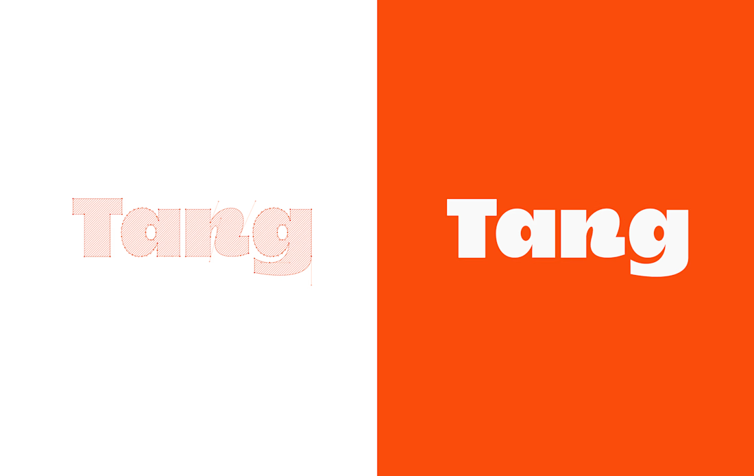
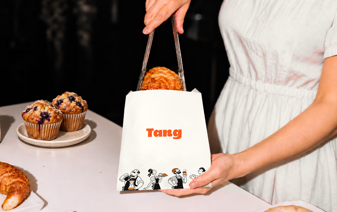
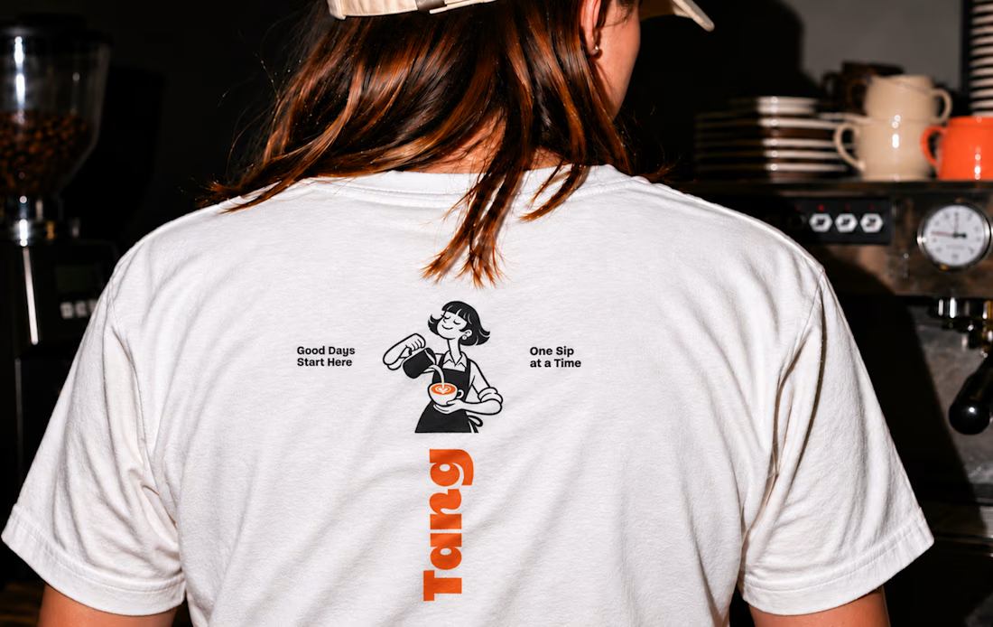
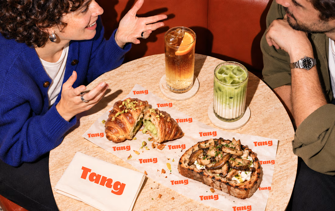
Tang - Café Brand Identity
A warm, playful café identity built around the idea “Good Days Start Here.”
Bold typography, illustrated café characters, and an orange-and-cream palette connect the brand across takeaway cups, packaging, menus, and apparel. The art direction captures the atmosphere of coffee shared over conversation.
Scope includes visual identity, packaging, menu design, apparel graphics, and art direction.


T O P!!

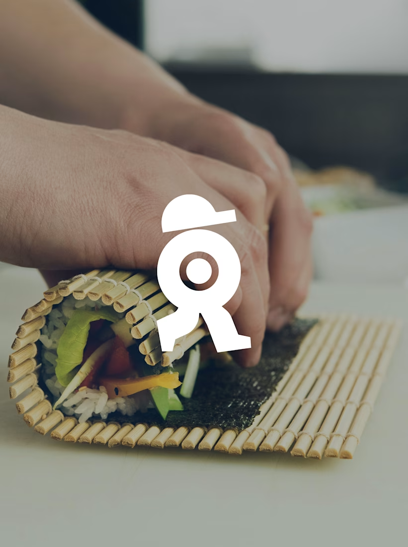
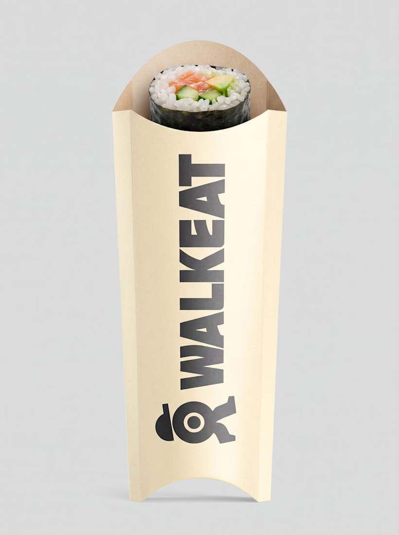
A sushi roll with a life of its own.
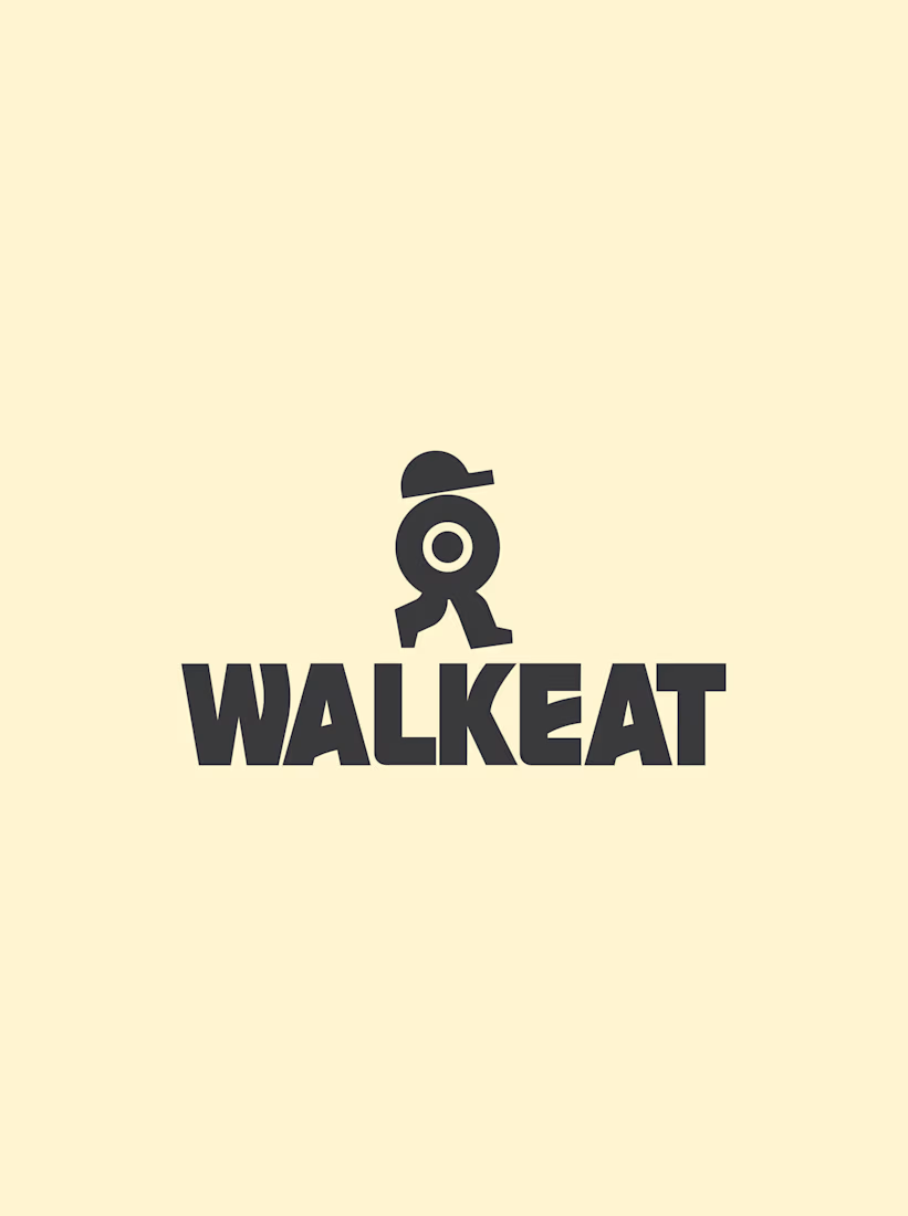
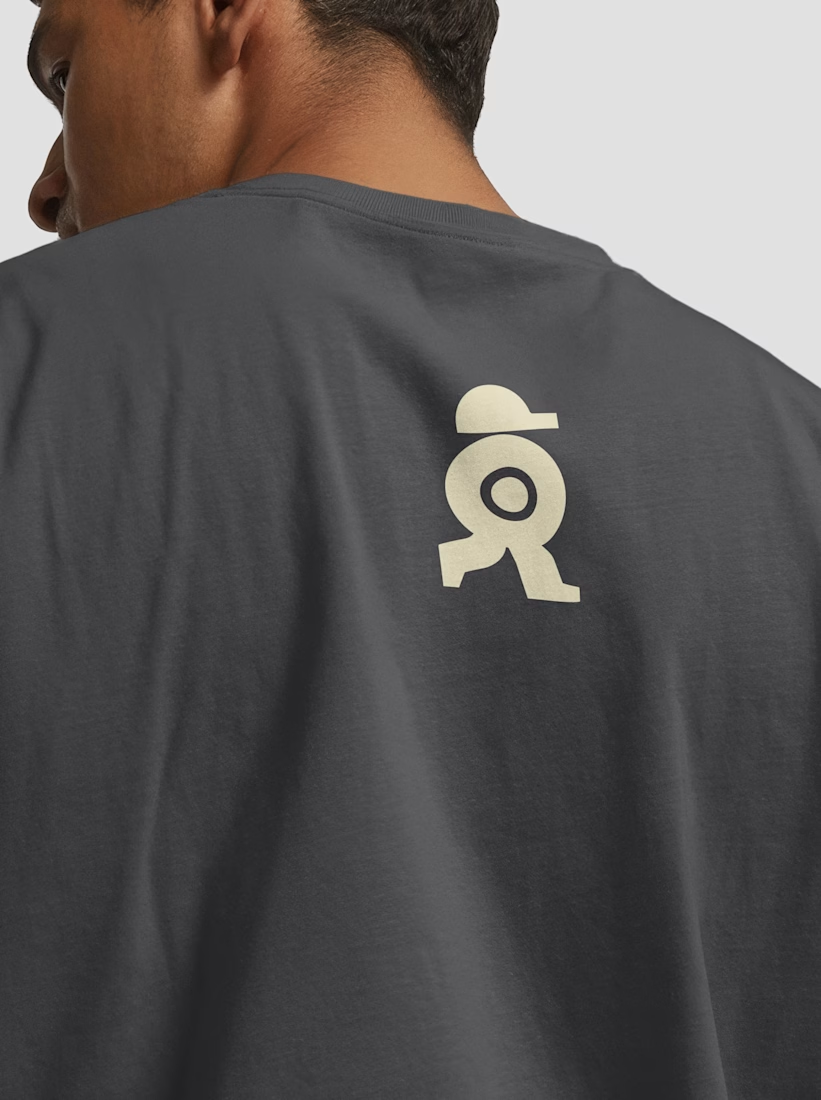
The WALKEAT identity transforms the shape of a sushi roll into a walking character. Its circular center references the cross-section of the roll, while the cap and legs bring movement and personality to the figure.
The custom-designed wordmark reinforces this concept through subtle modifications to the W, A, and E, creating a visual connection between typography and symbol.
A simple, playful and contemporary identity that communicates the product without relying on literal Japanese imagery or an overly cartoonish character.


Great work!!






