The network for creativity
Join 1.25M professional creatives like you
Connect with clients, get discovered, and run your business 100% commission-free
Creatives on Contra have earned over $150M and we are just getting started
Back to feedPost

🌿 My recent newsletter project for Aspire Admin Services in Australia is now live.
I supported the design, content creation and scheduling for the newly launched newsletter, helping shape its brand voice and visual direction from the start.
This project felt especially aligned. Paula has been an incredible client to work with, and her clean, thoughtful aesthetic closely reflects my own creative instincts.
A lovely reminder that good communication is not just about sending updates. It is about creating something people recognise, trust and want to open. 🪷



The network for creativity
Join 1.25M professional creatives like you
Connect with clients, get discovered, and run your business 100% commission-free
Creatives on Contra have earned over $150M and we are just getting started

Challenges
View all


Related posts

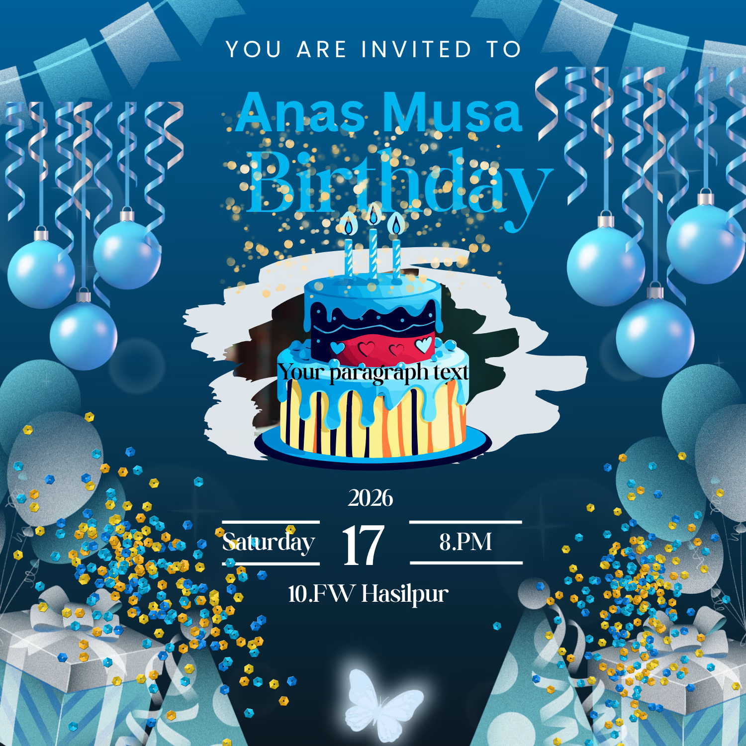

Nice effort 👏 but there are lots of elements on the design, makes it look crowded

I designed a practice flyer for a farm market. I feel the wordings of the first and second circle are a bit off but I'm still working on my skills. What do you think?
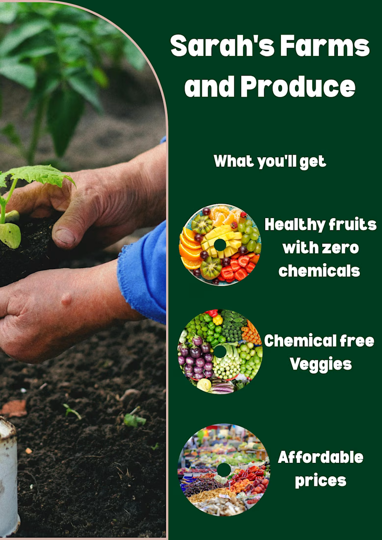

Since you asked: the three labels break into different line counts and sit at slightly different distances from their circles, which is probably the off feeling. Setting one line width and the same gap to every circle should tighten it up.

Designed this skincare and beauty thumbnail in Canva 💄✨
What do you think?
DM for Thumbnail Design".
Visit my profile for more
designs. "
Follow my page for daily
thumbnail designs.
Available for YouTube Thumbnail Design
#YouTubeThumbnail #GraphicDesigner
#ThumbnailDesign #CanvaDesigner #YouTubeCreator #Freelancer #GraphicDesign
#ContentCreator #SocialMediaDesign
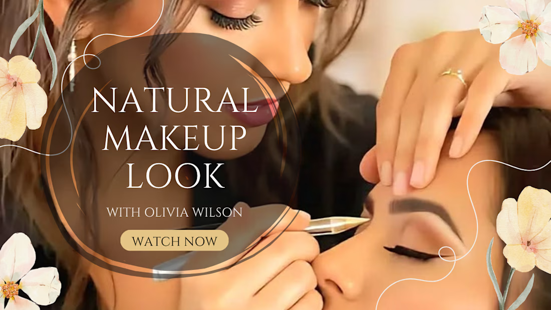

Relying on Canva for beauty thumbnails can be a double edged sword. The templates are fast, but they often lead to a generic look that struggles to stand out in a crowded feed.