The network for creativity
Join 1.25M professional creatives like you
Connect with clients, get discovered, and run your business 100% commission-free
Creatives on Contra have earned over $150M and we are just getting started
Back to feedPost
Throwback: OFF GRID. A premium retreat with no phones, no signal, no noise. Just concrete, silence, and 12 hours of nothing.
Brand identity, campaign, objects, environments.
OG ⤙ 01

Designing for absence is a tricky brief, and the empty corridors and big quiet frames make the identity feel like the place itself rather than a logo on top of it. Did you keep colour out of the system entirely, or is there one accent held in reserve?

Great work!


great, love this style!
The network for creativity
Join 1.25M professional creatives like you
Connect with clients, get discovered, and run your business 100% commission-free
Creatives on Contra have earned over $150M and we are just getting started






Related posts

two brands, one tiny taste test.
would you rather look through an Oriel or answer a Calling?
winner gets the full brand. reply with your pick.
35 voted
85%
6 voted
15%
41 votes
Closed

The biggest misconception about branding is thinking it's just a logo. What actually saves founders time and money later is a compact system a focused 2–3 color palette and clear sub-brand rules so every new deck, social post, or product launch looks cohesive without starting from scratch.
How long can you sit on a brand before it starts to look different to you?
Sisyphus: identity, landing page and campaign for a workflow engine I made up.
Took a break, came back, cut half of it. The boulder is still the logo.
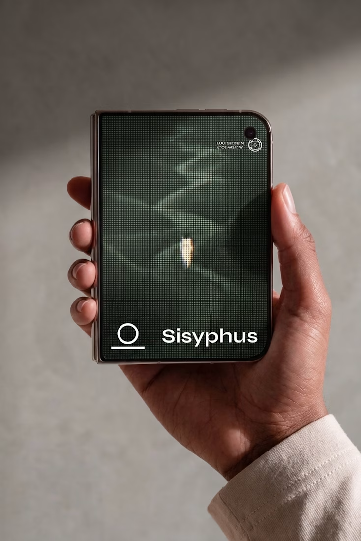
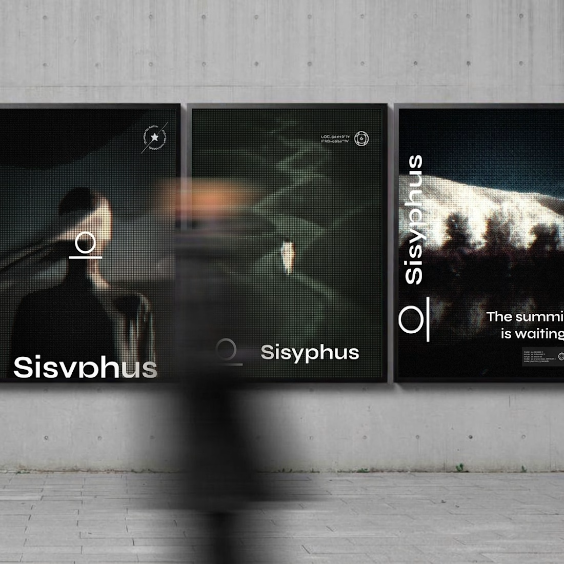
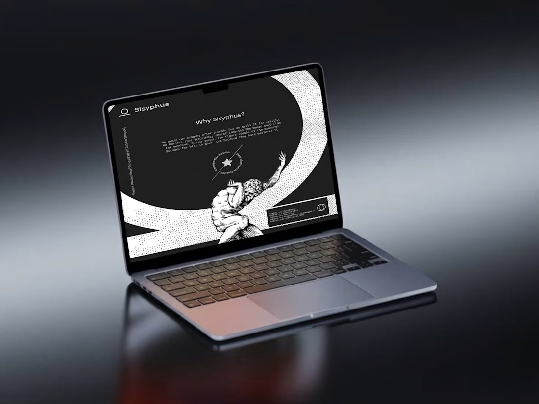

Cutting half after a break is underrated. Was the boulder always the mark or did it show up in the cuts?


Some of my recent works. As you can see I have pretty wide range of styles and topics 😅


the range is real