The network for creativity
Join 1.25M professional creatives like you
Connect with clients, get discovered, and run your business 100% commission-free
Creatives on Contra have earned over $150M and we are just getting started


The network for creativity
Join 1.25M professional creatives like you
Connect with clients, get discovered, and run your business 100% commission-free
Creatives on Contra have earned over $150M and we are just getting started





Related posts

Can AI create a professional-looking logo?
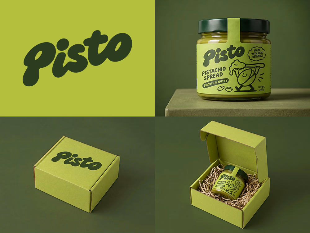
I tried to create a logo concept for a pistachio spread brand using Recraft Logo Maker.
After answering a few questions about the brand and going through several variations, I finally landed on a logo that felt right and captured the fun, fresh personality I had in mind.
But I didn't want to stop at just the logo.
I took it a step further by exploring how the identity could come to life through product packaging and a branded mailer box.
A quick process video is included in the comments.
What do you think?



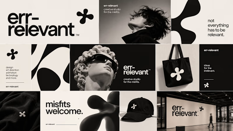
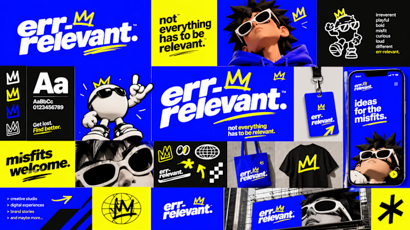
Before we begin working on any branding project, we use Curative Intelligence to explore ideas, challenge conventional thinking, and establish the creative direction.
Err-relevant is something particularly fun that we're developing at The RLVNT Studios.
Now, I'd love your inputs. Which visual direction do you think we should take forward into the main production stage?
8 voted
67%
4 voted
33%
12 votes
Closed