The network for creativity
Join 1.25M professional creatives like you
Connect with clients, get discovered, and run your business 100% commission-free
Creatives on Contra have earned over $150M and we are just getting started
Back to feedPost

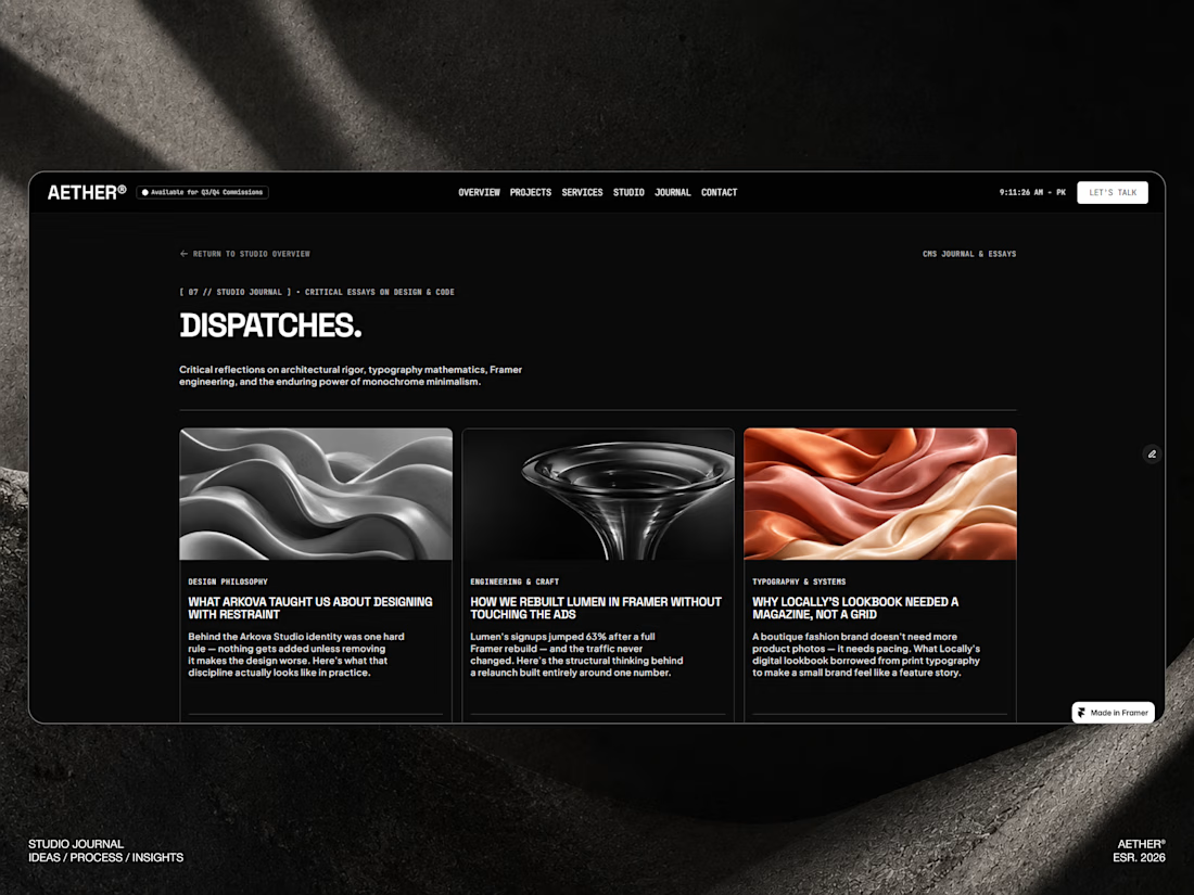
A question I kept asking myself while building AETHER: what actually makes a template feel "premium" vs. just dark and minimal?
Landed on three things:
→ Typography doing the heavy lifting (not decoration hierarchy)
→ Every component reusable and token-based, not one-off styling
→ Restraint no section exists just to fill space
The hardest part was making it flexible enough to rebrand fast without losing that "monolithic" feel that makes it distinct.
Curious how other creators here think about that balance reusability vs. distinct visual identity. Where do you draw the line?
The network for creativity
Join 1.25M professional creatives like you
Connect with clients, get discovered, and run your business 100% commission-free
Creatives on Contra have earned over $150M and we are just getting started

Challenges
View all


Related posts


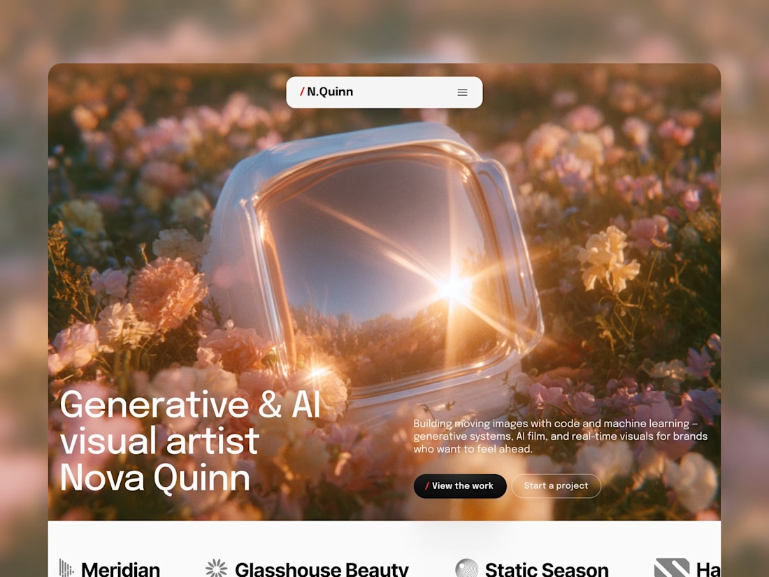
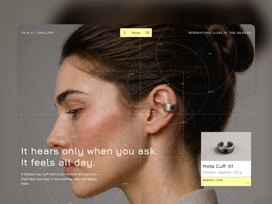
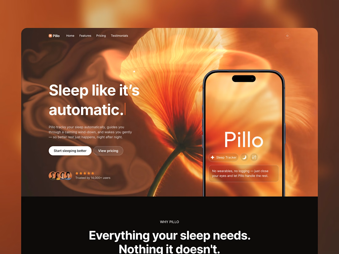
All 9 Startfrom Framer templates are now on Contra.
Buy them right here, no extra checkout. Each one comes two ways:
→ Framer template: remix link the moment you pay
→ Figma + Framer bundle: the Figma file copied straight to your Drafts, plus unlimited websites
Parley, Marby and Elias Vent are free. The rest start at $79.
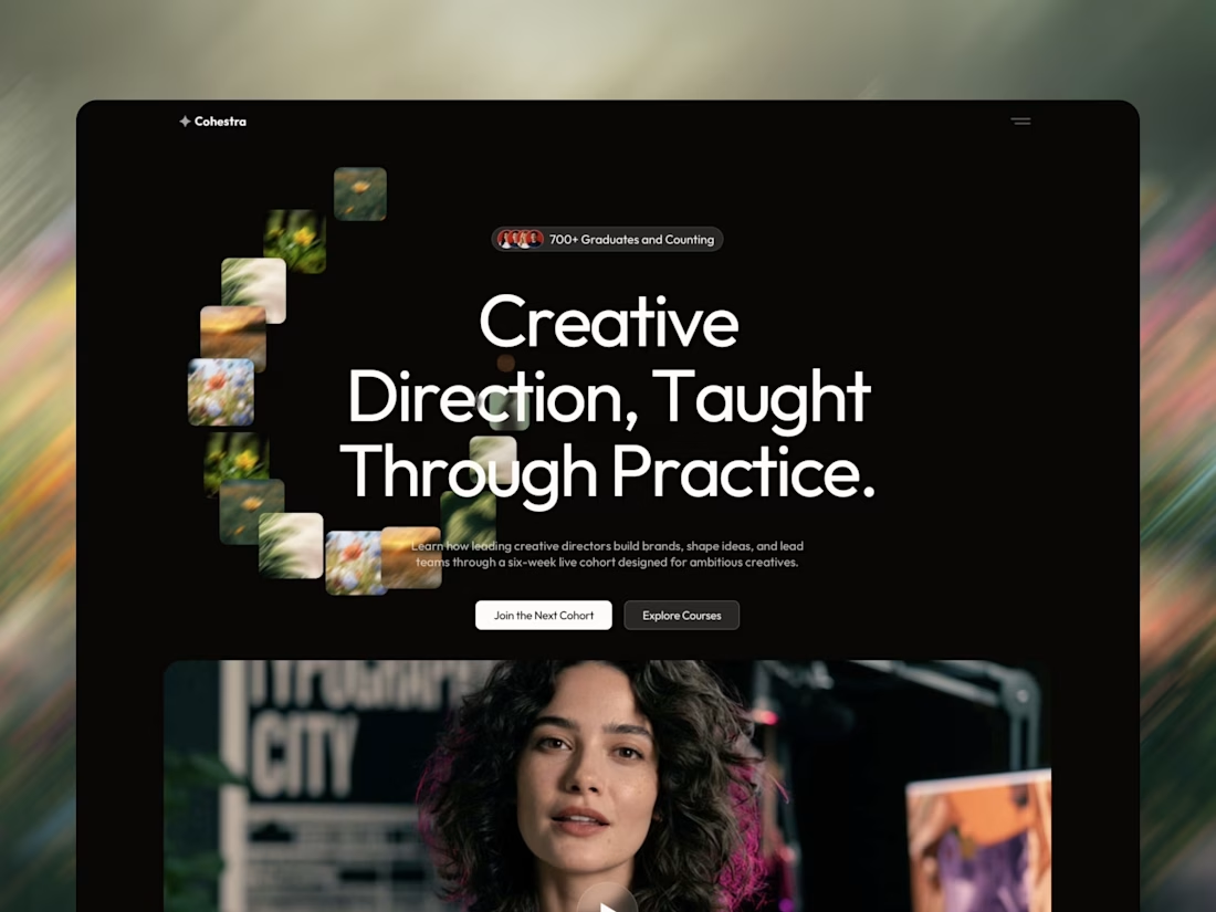
Sunbeam, Auria, Parley, Marby, Cohestra, Pillo, Elias Vent, Mote, Nova Quinn.


🔥

Olma Hotel client Project Website preview
Instead of simply making a hotel website look beautiful, I focused on creating a design that helps visitors quickly understand:
Where they are staying → What they get → Why they should trust the hotel → How they can book.
I designed this hotel Website for Olma Hotel with one goal in mind: make the brand feel premium while making the booking journey simple and clear.
The design combines large architectural imagery, strong typography, spacious layouts, and carefully placed CTAs to create a visual experience that communicates comfort, trust, and luxury.
What I focused on:
— Premium first impression
— Clear hotel positioning
— Strong visual storytelling
— Easy-to-understand room & amenity sections
— Strategic booking CTAs
— Responsive-friendly layout structure
— Consistent luxury-focused visual language
A luxury hotel website should sell the experience before the guest even books.


This looks very attractive, but I feel like it will get more better if the blank spaces are not there, there are too many blanks spaces

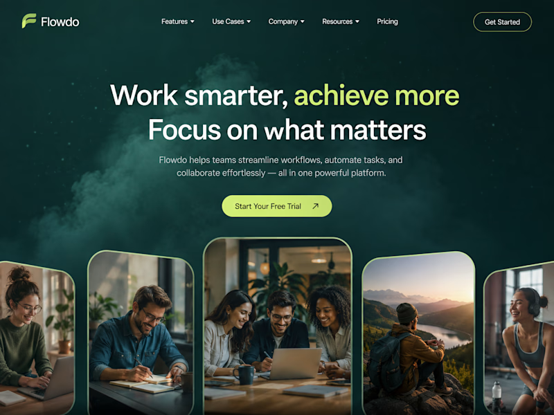
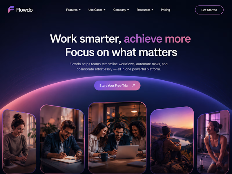
One header, two color stories.
Green: cool tones, feels productive and safe
Purple: gradient glow, feels modern and premium
Same words. Different first impression.
Which one would make you click "Get Started"?

26 voted
59%
18 voted
41%
44 votes
Closed

Went with calm and focused. The copy is literally asking people to focus on what matters, so a header that competes for attention with a glow works against its own message.