The network for creativity
Join 1.25M professional creatives like you
Connect with clients, get discovered, and run your business 100% commission-free
Creatives on Contra have earned over $150M and we are just getting started
Back to feedPost
A good product identity isn't built by picking pretty colours. It's built on clear design decisions.
Last week, I introduced Lego Flow, the project I'm currently working on.
Today, I'm sharing a little more of the process: the style guide.
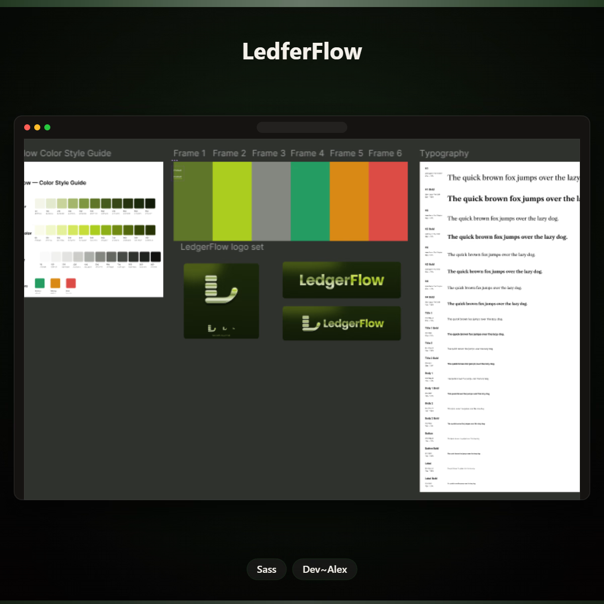
Here's a look at the visual foundation I'm putting together:
Logo: Giving the project a recognisable identity.
Colour palette: Establishing its visual direction.
Typography: Creating consistency and making the content easier to read.
But why start with a style guide?
Because as a product grows, its design shouldn't become a collection of random decisions.
A clear style guide helps keep the experience consistent, makes future design decisions easier, and gives developers and anyone working on the product a shared visual reference.
Good design isn't just making one screen look good. It's building a system that makes the whole product feel connected.
That's the thinking behind Lego Flow.
I'm curious: When you start a new product, what do you establish first, the brand identity, design system, or user experience?
Founders and designers, I'd love to hear your thoughts.



Founders, designers, and developers, what's currently on your workbench?
A new product, a client project, a side project, or something you've been meaning to build?
Share it below. Let's see what everyone's working on!
The network for creativity
Join 1.25M professional creatives like you
Connect with clients, get discovered, and run your business 100% commission-free
Creatives on Contra have earned over $150M and we are just getting started



Related posts


We designed the visual identity for an early-stage studio that helps AI companies adapt one product story for different audiences and channels.
Its positioning was already defined. Our job was to make it visible.
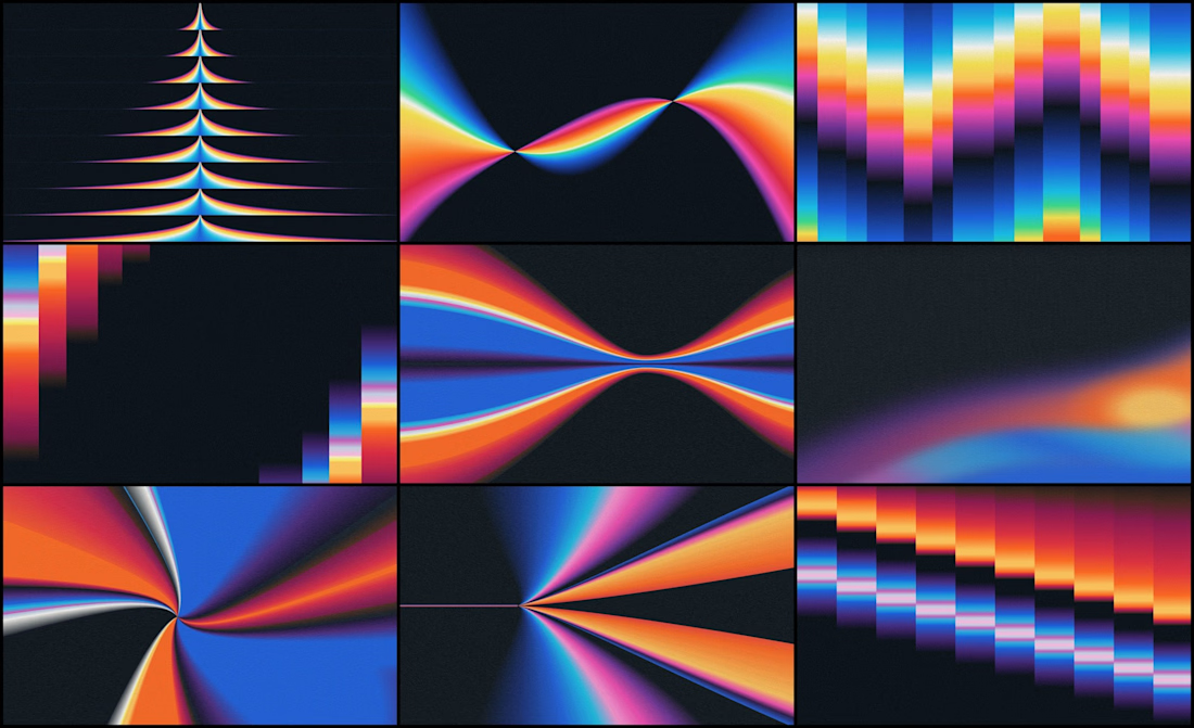
The organizing idea was refraction: one source opening into multiple expressions.
Rays expand from a shared point. Color fields stretch, compress and change direction, which gives a still image a sense of movement.
If your brand needs a lot of variety, decide first what every variation stays connected to.

Happy to share a little piece of what I've been working on lately: Nexus.
Nexus is a concept for a network that moves money and data as fast as the internet moves information. Payments, tokenized assets, AI agents that pay for things on their own, apps that need privacy by default.
The full website is coming soon.



Big idea and it looks great. Excited to see where you take Nexus next.

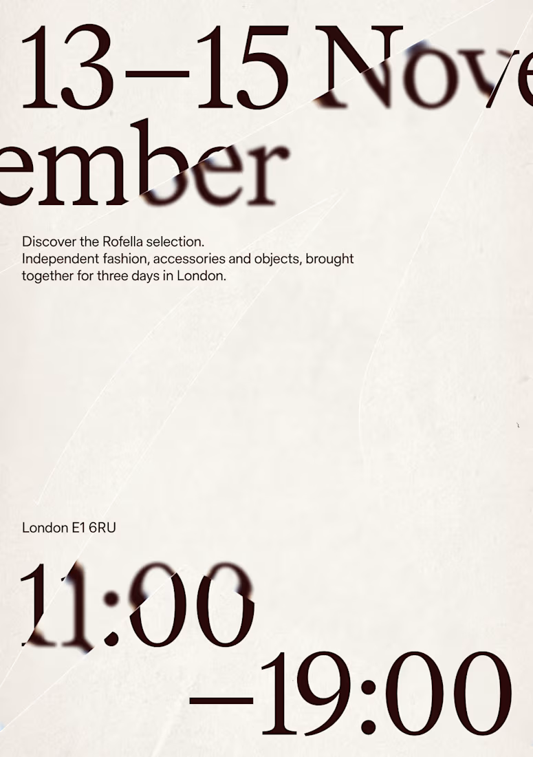
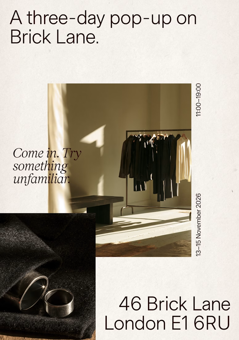
Recent poster designs.



Great work