The network for creativity
Join 1.25M professional creatives like you
Connect with clients, get discovered, and run your business 100% commission-free
Creatives on Contra have earned over $150M and we are just getting started
Back to feedPost

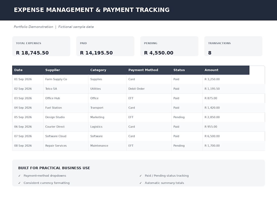
This is an independent portfolio project demonstrating expense management and payment tracking. Practical, easy to use and very functional improving overall usability. Sample data used for demonstration purposes.


The network for creativity
Join 1.25M professional creatives like you
Connect with clients, get discovered, and run your business 100% commission-free
Creatives on Contra have earned over $150M and we are just getting started

Challenges
View all


Related posts

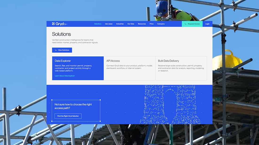
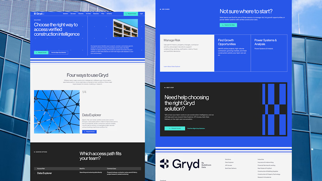
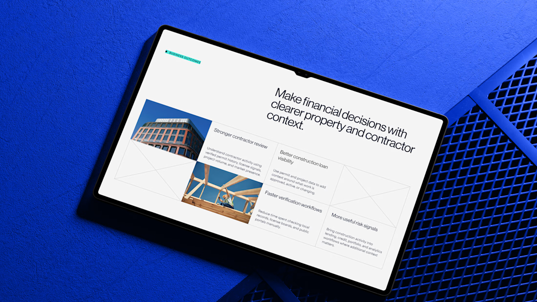
30+ pages, 3 weeks, and honestly one of my favorite projects in a while.
I'd been wanting to design something more tech-driven for a long time, and Gryd, a platform turning construction permit data into intelligence for insurers, lenders, and real estate teams, was exactly that.
Wireframes first, then UI across every page, fully responsive, with animation on the key screens, all built inside the brand the client had already set.
Case study's on my profile.

Clean design 😍


Finally updating our portfolio and adding one of my favourite projects 🤭
Remento is a memory preservation app, think recorded family stories, turned into a keepsake book. They came to us in late 2023 with a Christmas campaign and a three-week window to find, contact and hire creators before the holidays.
We crushed it and what started as a one-time sprint turned into 16 months, 8 campaigns and 871 creators vetted.
That's the thing about trial runs, you never know what they're the beginning of.


the memory book idea is so sweet. how long did the campaign take?

Food delivery platforms have a lot happening behind the customer-facing experience.
Orders are coming in, deliveries are moving, restaurants are performing, customers are interacting with the platform and revenue is changing throughout the day.
This Food Delivery Dashboard SaaS concept was designed to give operators a clearer view of all of it.
The dashboard brings key business metrics, order activity, delivery information and performance data into a structured workspace.
Rather than filling the screen with every possible metric, the design prioritizes information based on how an operator would actually use it.
The result is a SaaS interface that feels analytical without becoming difficult to navigate.
Services: SaaS Product Design · Dashboard Design · UI/UX Design · Data Visualization · Web App Design · Restaurant Tech
The goal was straightforward: turn a large amount of operational data into a workspace people can actually work from.
Designed by WaxyWeb.


great one