The network for creativity
Join 1.25M professional creatives like you
Connect with clients, get discovered, and run your business 100% commission-free
Creatives on Contra have earned over $150M and we are just getting started
Back to feedPost

I noticed that deMILKo, a fantastic local coffee spot here in Potchefstroom, was completely missing from the digital landscape. They had no website, no online menu, and no way for customers to engage with them outside of walking through their doors. For the #GiveItAGlow challenge, I decided to change that and give them the digital presence they deserve! ☕️✨
The Transformation:
Real-World Utility: I built a fully responsive, modern web platform from scratch. This project solves a significant operational problem by giving a local business an authentic digital identity for the first time.
Design Quality: I designed a premium, mobile-responsive UI that reflects the personality and high quality of the café. The goal was to ensure the digital experience feels just as inviting as the physical shop.
Automation & Operations: I implemented a seamless ordering flow that allows customers to browse the menu and schedule pickups digitally. To back this up, I built a custom dashboard for the owner to track incoming orders in real-time, meaningfully saving the business owner time by reducing manual phone intake and administrative overhead.
AI Integration: To further enhance customer experience and support, I integrated an AI chatbot directly onto the site. Now, customers can get instant answers to their questions, check information, or receive support without the owner needing to be involved in every interaction.
This project wasn’t just about building a site; it was about creating real value, generating new leads, and helping a local Potchefstroom business thrive in a digital-first world.
Check out the full transformation in the video below! 🚀
The network for creativity
Join 1.25M professional creatives like you
Connect with clients, get discovered, and run your business 100% commission-free
Creatives on Contra have earned over $150M and we are just getting started
Related posts

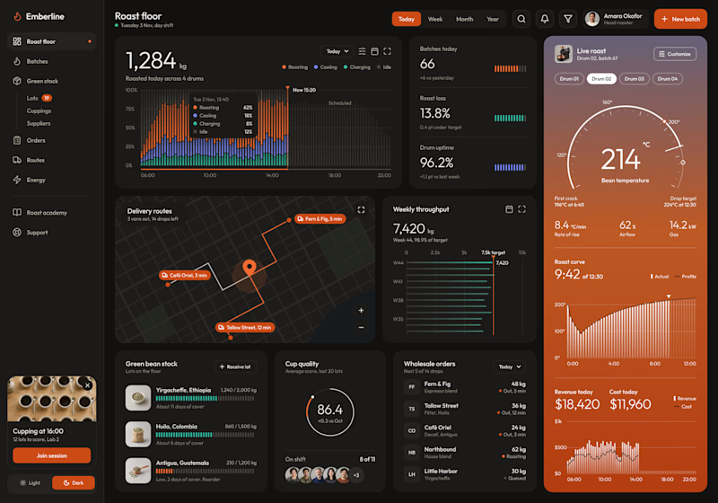
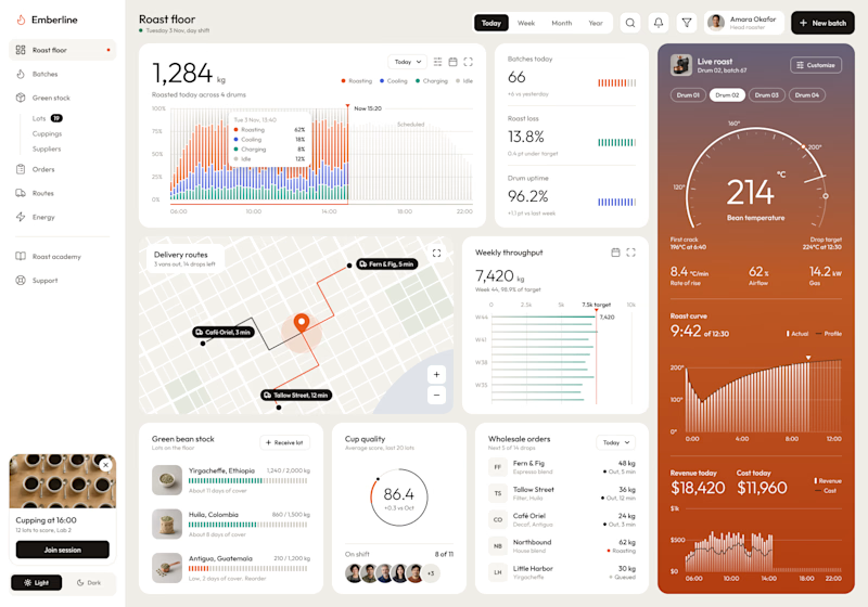
Dark or Light? Which dashboard design do you prefer?
I designed a production dashboard for a coffee roasting business in two themes, and I'd love your opinion! 🖤🤍
It brings everything into one view: live roast tracking, batch stats, delivery routes, weekly throughput, green bean stock, cup quality scores, wholesale orders, and daily revenue.
Both versions share the same layout and warm orange accents, but each creates a very different feel:
Option 1: Dark mode – Bold, focused, and easy on the eyes during long shifts.
Option 2: Light mode – Clean, bright, and airy with a modern minimal look.
Which one would you choose for your daily workflow? Vote and share why in the comments!

6 votes
Ends in 17h

VENDE FÁCIL — Everything in your town, in one cart.
I built Vende Fácil — appvendefacil.com — a free, hyperlocal marketplace for small towns in Santa Fe, Argentina.
The problem is simple: big platforms take the money out of town. Your local greengrocer, the bazaar, the artisan — they don't have an easy way to sell online. And neighbors end up buying from 5 different places.
The idea: you only buy and sell inside your own community. If you're in Las Parejas, you only see Las Parejas. If you're in Armstrong, only Armstrong. Money stays where it's made.
What makes it different:
• One cart, many stores: veggies from the greengrocer + something from the bazaar + something else from another shop — it all arrives together, in one delivery. • Built to create work: anyone can sign up to deliver in their own city. • Free forever for artisans: makers get a free storefront 365 days a year. Zero commission. • Services with no commission: electricians, hairdressers, cleaners, teachers — they can list what they do for free.
The character: I created a friendly little yellow chick as the mascot. I wanted tech to feel like a neighbor, not a corporation.
Live now in: Las Parejas, Armstrong, Las Rosas, Montes de Oca, Cañada de Gómez, Funes, Rosario.
It was built for one reason: to grow local sales so the big platforms don't take the town's money.
My role: Founder, Product Direction, UX/UI, Brand Character, Community Building.

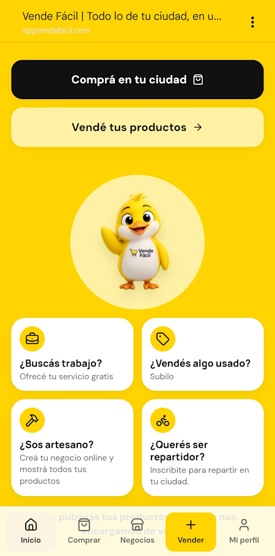

"Money stays where it's made" is such a strong pitch for a small town. One cart from several local shops in a single delivery is the part big platforms can't copy. How are you getting the first shops on board?

Brewleaf Coffee Co. — Logo & Brand Identity Design
A thoughtfully crafted coffee brand identity combining botanical inspiration, expressive typography, and a warm, sophisticated café experience.
Brewleaf Coffee Co. is a self-initiated branding concept exploring how a distinctive visual identity can communicate craftsmanship, comfort, and the everyday ritual of enjoying exceptional coffee.
The project brings together logo development, packaging design, typography, color direction, and realistic brand applications to establish a cohesive visual world for a contemporary specialty coffee brand.
The Creative Concept
The creative direction centers on the relationship between coffee and its natural origins.
Rather than treating coffee branding as a purely commercial exercise, the identity celebrates the organic character of the product and the atmosphere surrounding it.
The name Brewleaf provided the foundation for a visual language combining botanical forms with recognizable coffee imagery.
The resulting identity is intended to feel welcoming yet refined, balancing traditional café character with contemporary design sensibilities.
Logo Design & Symbolism
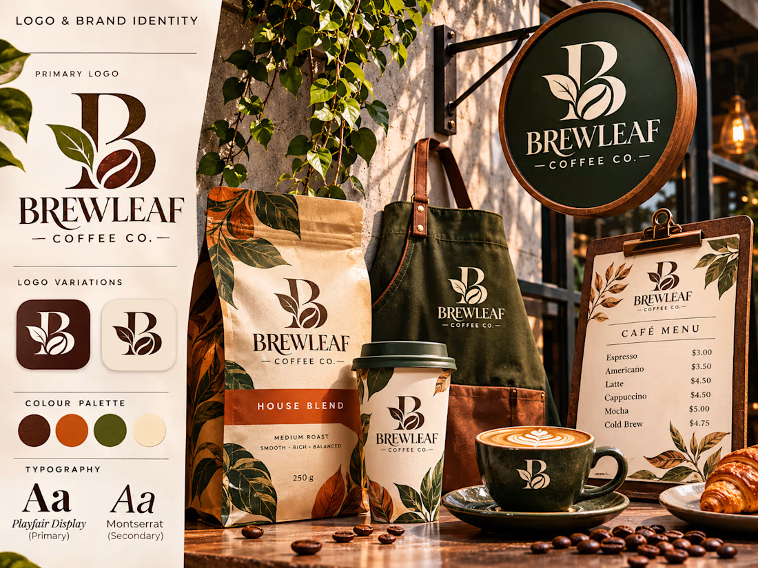
At the center of the identity is a custom monogram built around the letter B.
The letterform incorporates two recognizable elements:
A botanical leaf, referencing the natural origins of coffee and the brand's organic inspiration.
A coffee bean, directly connecting the symbol to the product and industry.
These elements are integrated into the monogram to create a recognizable brand mark that can function independently or alongside the full wordmark.
The primary logo pairs the symbol with an elegant typographic treatment of BREWLEAF, supported by the descriptor COFFEE CO.
Secondary logo variations allow the identity to adapt to smaller applications, packaging, merchandise, and digital environments.
Typography & Color Direction
The typography combines editorial sophistication with practical readability.
A high-contrast display serif gives the brand an established, premium personality, while a clean sans-serif supports everyday communication and informational content.
The palette draws inspiration from coffee culture and natural materials.
Deep espresso brown communicates richness and warmth, forest olive introduces an organic character, burnt orange adds energy, and soft cream provides balance.
Together, these colors establish a cohesive visual identity that feels grounded, recognizable, and adaptable.
Brand Applications & Packaging
The identity was explored through a coordinated collection of physical brand applications.
Coffee Packaging
A branded house-blend coffee bag demonstrates how the monogram, typography, botanical illustration, and color palette translate into retail packaging.
Café Signage
A circular exterior sign presents the primary logo at a larger scale, reinforcing recognition and establishing a distinctive storefront presence.
Takeaway Cups & Drinkware
Branded takeaway cups and ceramic drinkware demonstrate how the identity can extend into everyday customer touchpoints.
Staff Apparel
An embroidered-style apron application showcases how the logo translates into a professional hospitality environment.
Menu Design
A coordinated café menu brings together the brand's typography, decorative details, and color system in a functional printed format.
Art Direction & Presentation
The final presentation was developed as a premium editorial brand showcase rather than a collection of disconnected mockups.
Warm natural lighting, tactile materials, botanical details, and carefully arranged café objects create a consistent atmosphere across the visual composition.
The logo remains central while the surrounding applications demonstrate the identity's versatility.
The combination of realistic product imagery and structured brand guidelines allows viewers to understand both the creative concept and its practical applications.
Project Outcome
Brewleaf Coffee Co. demonstrates how a simple brand idea can develop into a cohesive visual identity with recognizable symbolism and consistent applications.
The project showcases an approach to branding that connects logo design, typography, packaging, and art direction into one unified creative system.
The result is a warm, premium coffee identity designed to feel memorable across every customer interaction — from the first glimpse of the café sign to the coffee cup in someone's hand.
Self-initiated portfolio concept created to demonstrate logo design, brand identity development, and packaging presentation.



Nice this