The network for creativity
Join 1.25M professional creatives like you
Connect with clients, get discovered, and run your business 100% commission-free
Creatives on Contra have earned over $150M and we are just getting started
Back to feedPost
Taste Test
Dark or Light? Which dashboard design do you prefer?
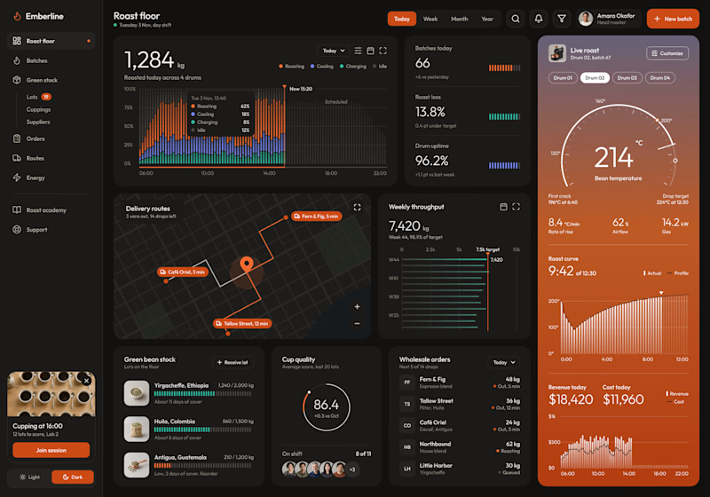
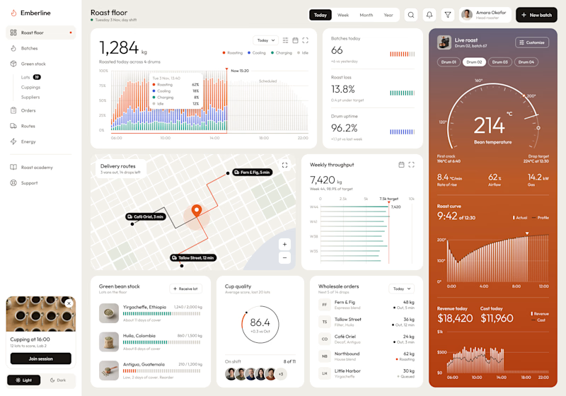
I designed a production dashboard for a coffee roasting business in two themes, and I'd love your opinion! 🖤🤍
It brings everything into one view: live roast tracking, batch stats, delivery routes, weekly throughput, green bean stock, cup quality scores, wholesale orders, and daily revenue.
Both versions share the same layout and warm orange accents, but each creates a very different feel:
Option 1: Dark mode – Bold, focused, and easy on the eyes during long shifts.
Option 2: Light mode – Clean, bright, and airy with a modern minimal look.
Which one would you choose for your daily workflow? Vote and share why in the comments!

6 votes
Ends in 16h

@Umar Tanveer
Thank you very much for the vote.
@Tushar Vaghasiya
Thank you very much for your vote

The light mode was stunning 😍
The network for creativity
Join 1.25M professional creatives like you
Connect with clients, get discovered, and run your business 100% commission-free
Creatives on Contra have earned over $150M and we are just getting started
Related posts

Two warm ups today, both might become full case studies:
Parlata: an audio-postcard service that records and archives local dialects. Every recording becomes a small printed card with a QR link.
MODULO: an Industrial IoT brand. Olive, navy, one wobbly blob.
One is warm and human. One is technical and playful. Which would you want to see go all the way?
31 voted
63%
18 voted
37%
49 votes
Closed

Love it

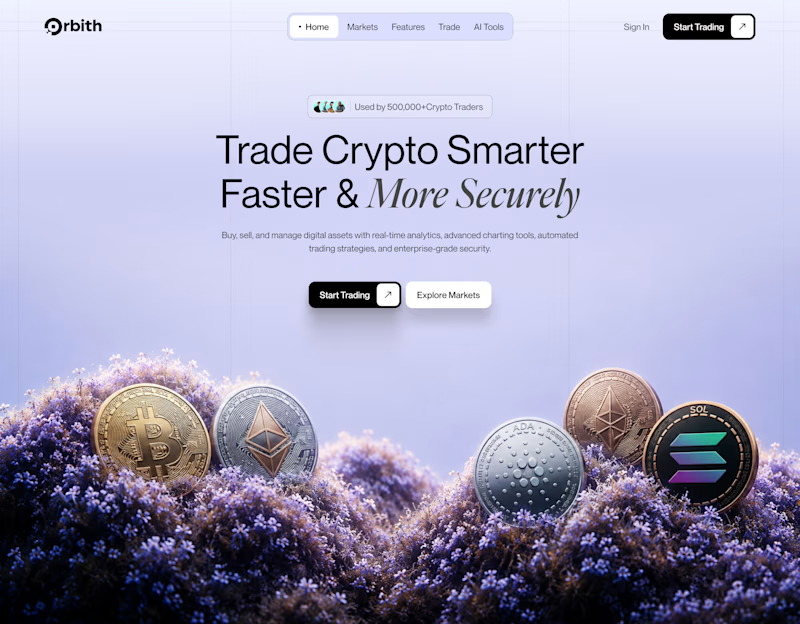
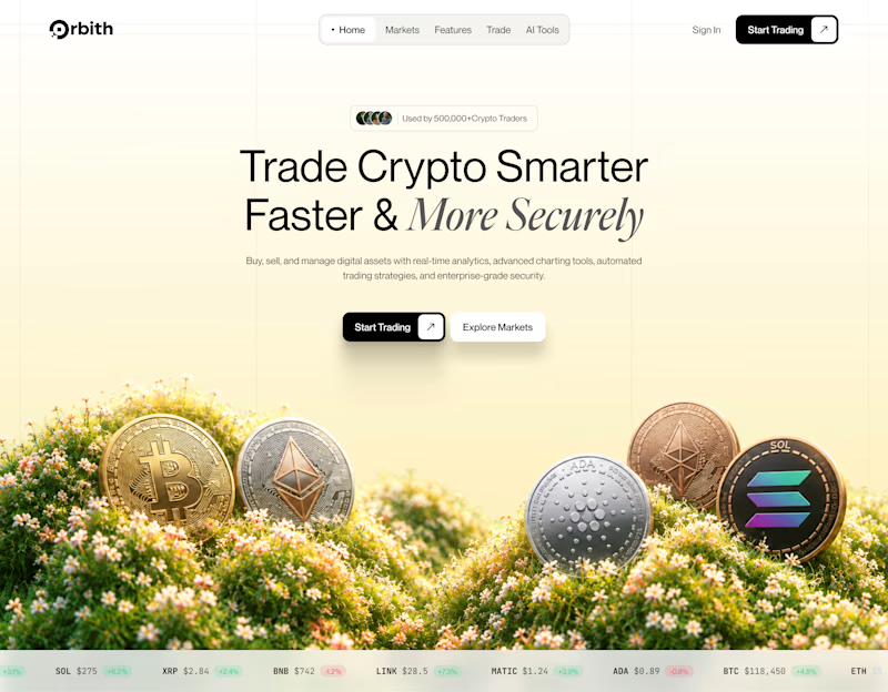
Your crypto landing page has 3 seconds to earn trust. Which direction gets it right?
One crypto homepage feels built for serious traders. The other makes crypto feel effortless.
Which one would make you click “Start Trading” without hesitation: #1 or #2?


10 voted
37%
17 voted
63%
27 votes
Closed


A new day, a new design to share! 📸
This time it is a photography challenge app that brings creativity and competition together through contests, voting, and gamification. What do you think of this one? ✨