The network for creativity
Join 1.25M professional creatives like you
Connect with clients, get discovered, and run your business 100% commission-free
Creatives on Contra have earned over $150M and we are just getting started
Back to feedPost
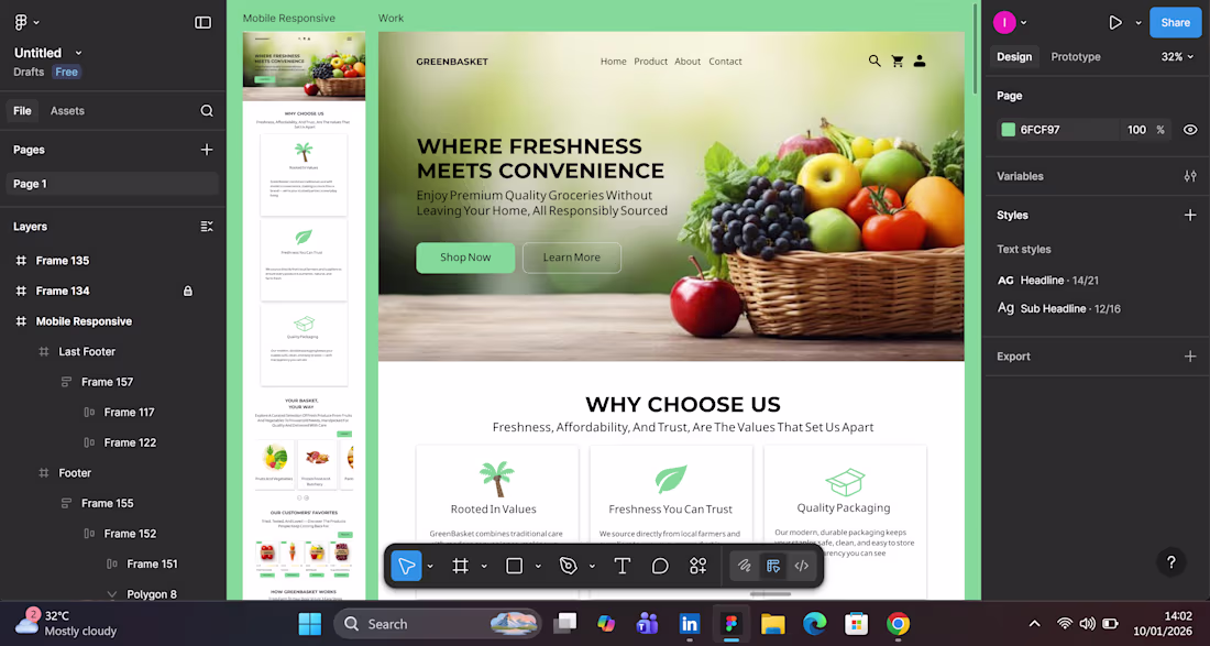
Ever spent 20 minutes designing a button, only to realize it’s not the button that’s broken, it’s the flow?
This week, I was deep in a redesign for a grocery delivery site (yes, the kind that promises “freshness at your doorstep”). I kept tweaking the CTA button: color, size, copy. Nothing felt right.
Then it hit me. The issue wasn’t the button. It was the user journey. The page didn’t build enough trust before asking for action. Once I restructured the flow to highlight sourcing, packaging, and values before the CTA, everything clicked.
Sometimes the smallest UI hiccup is a symptom of a deeper UX misalignment.
Curious to hear how others spot when a visual tweak is masking a structural flaw.
Open to remote opportunities and always happy to connect with fellow designers, developers, and product professionals.
The network for creativity
Join 1.25M professional creatives like you
Connect with clients, get discovered, and run your business 100% commission-free
Creatives on Contra have earned over $150M and we are just getting started
Related posts
WE INTERVIEW AND INTRODUCE OUR PRODUCT TO REAL LOCAL BARBERSHOP BUSINESS.
Yes! you read it right. We are confident with the product and show it to public.
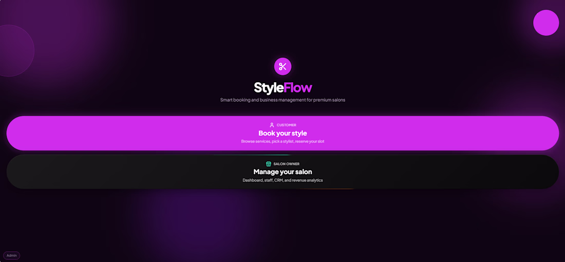
Introducing - "StyleFlow" powered with Ai and built in @Base44
I made an website where it will help the Hair salon/Barbershop for fast bookings or Drop in with also help of Ai.
🚀 PROBLEM:
The problem i see there are no Rewards for loyal customers, Ai integration and in Drop-In customer have no idea how many are in queue.
🧠 IDEA:
Keep the app simple and focused on what matters: Smooth for booking, Drop-ins, and showcasing the barbershop's services.
When i go to barbershop i usually google what hairstyle i want so now in Styleflow you can do it before and the staffs will see details about the bookings/Drop-in (Upload images about the haircut)
For DROP-IN customers, StyleFlow displays the current queue and provides real-time updates, so they know how many people are ahead of them and when it's their turn. Customer can do book DROP IN even they are at home/anywhere.
━━━━━━━━━━━━━━━━━━━━
😊 Automation:
Reservations/Booking
Email notifications
Customer and owner support
Daily report
Find hairstyles
Check bookings
Ai business insights
Customers receive email confirmations and appointment reminders. Drop-in customers are also notified when their turn is approaching.
━━━━━━━━━━━━━━━━━━━━
🎉 STYFLOW FEATURES:
Email reminder
Fast booking
Drop in & Booking
Loyalty program with rewards
Image input
Ai booking
Ai hairstyle helper
Ai support
Ai owner support
Announcement
Tip/Bonus points
Revenue tracker
Staff settings
Salon owner settings
Waitlist
Google map
Dark and light mode
Customer history
Owner/staff Dashboard & settings
━━━━━━━━━━━━━━━━━━━━
🙌 BEFORE:
it was just a simple app/website where customer would Book Appointments, simple Ui design, show the Salon services and a bit help with Ai.
💯 AFTER:
Improve the Ui & UX design
Faster booking.
Add DROP IN feature.
More Automations and Ai.
Announcement banner.
Loyalty program.
Google map
Adjusted staff services
Settings
Improve the buttons
Add a bit color in background
VERSION:
Mobile and Desktop.
Live :https://styleflow-hub.base44.app/
Video below: Walkthrough, Before & after, Interview
For years, my father's hardware shop ran on trust, memory, and a handwritten khata book. Every credit sale — name, amount, date — tracked by hand, in Kannada, across two worn notebooks. No reminders. No records if a page tore or a book went missing. Just paper, and hope nothing got lost.
I decided to give it a glow-up.
Meet Abhi Shop, now live online — a full digital storefront for our hardware, cement, plumbing, and electrical business, built on Base44.
✅ A clean, mobile-friendly catalog across all four categories, with real pricing and stock levels
✅ A ₹/$ toggle for customers browsing from anywhere
✅ An AI assistant that answers stock, price, and hours questions instantly — day or night
✅ And behind the scenes: our Udarbook, fully digitized. Every customer's credit balance, tracked automatically, with automatic reminders when payments are due — no more lost pages, no more relying on memory.
The response has been the best part. Regular customers messaged the moment they saw it. And my father — who's run this shop for years — was genuinely surprised by what it's become.
What used to take a notebook and a bit of luck now takes one glance at a screen.
Built for the #GiveItAGlow Challenge by @Base44 — proof that even the smallest local businesses deserve a real digital upgrade.
🔗 Live App [Abhi Shop]
🎥Social Media X {link with video}
#GiveItAGlow #Base44 #SmallBusiness #AI
Impressive!
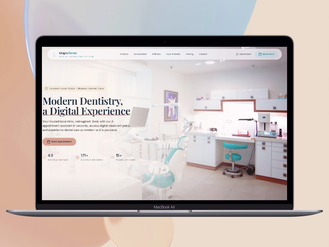
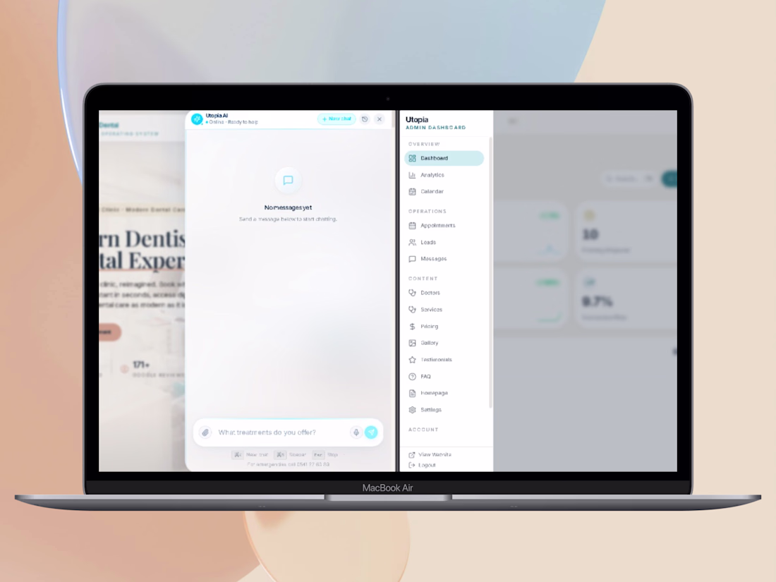
🚀 The Final Reveal — Utopia Dental is LIVE! ✨
After days of building, refining, and polishing, my final submission for the Give It a Glow Challenge is complete.
I set out to turn a traditional local dental clinic into a premium, AI-powered digital experience. The result? A complete "Dental Operating System" that feels effortless.
Here is what I built:
✅ Premium Aesthetic: Clean, minimalist UI with a calming Apple-like vibe.
✅ AI Superagent: 24/7 intelligent triage and automated instant booking.
✅ Zero Friction: A seamless Patient Portal connected directly to a custom Admin CRM.
✅ Built entirely and seamlessly on Base44.
I’ve also included a two-part video series in my submission:
🎬 Part 1: The Vision (Cinematic Showcase)
🎬 Part 2: The Process (Behind the scenes of building with Base44)
🔗 Experience the Live Demo here:
https://dashing-smile-care-flow.base44.app/
Thank you to everyone who supported, voted, and followed the journey since Day 1! 🙏 Let's go!
#base44giveitaglowchallenge #Base44 #Contra #ProductDesign #UXDesign #BuildInPublic
Trending
Claude
Claude has entered the design space. How are you using Claude Design?
Contra University
Learn from expert creatives how to earn more using next-gen AI tools.
fifaworldcup2026
The World Cup is here and the whole world's watching. How are you designing for the world stage?
creativeaiflow
Creative AI workflows are evolving. What tools do you use, and what are their strengths and weaknesses?
freelancerlife
Freelancer life is wins, pivots, and everything in between. What’s yours right now?