The network for creativity
Join 1.25M professional creatives like you
Connect with clients, get discovered, and run your business 100% commission-free
Creatives on Contra have earned over $150M and we are just getting started
Back to feedPost

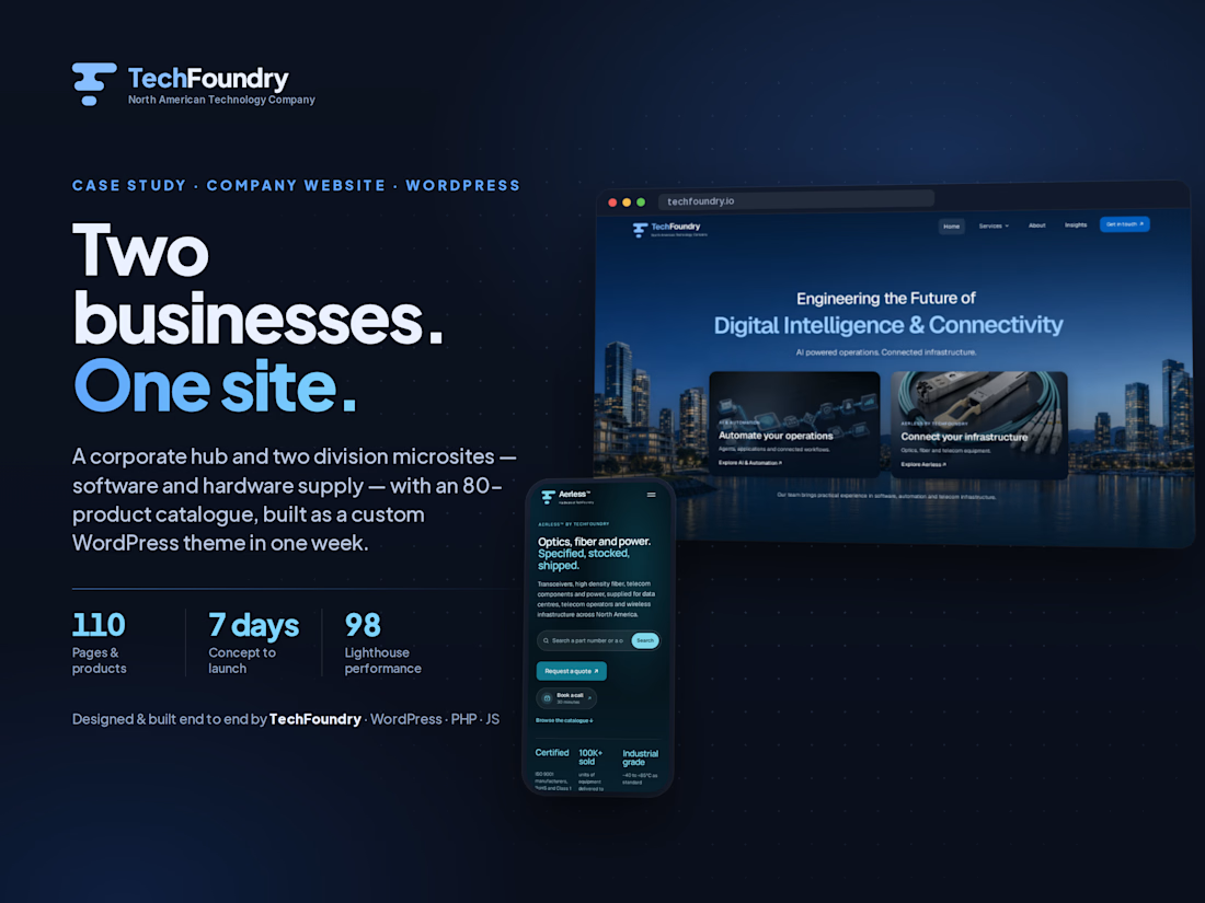
We rebuilt TechFoundry's website in a week. The brief that mattered most wasn't "make it look good". It was "make ChatGPT and Gemini able to find us".
Buyers ask an AI before they search now. So all 110 pages (26 pages, 80 Aerless™ hardware parts, 4 articles) are server-rendered with real content and structured data a model can cite: Product schema with SKU and MPN on every part, BlogPosting on articles, CreativeWork on case studies, and a robots.txt that lets AI crawlers in.
Three other decisions I'd make again.
1) One hand-coded WordPress theme, three "surfaces": corporate hub, /ai, /aerless. Each gets its own nav, palette and CTAs; the same codebase decides which company you're looking at. No page builder, no front-end framework. Homepage Lighthouse: 98 / 100 / 100 / 100.
2) Leads go where the team already is. Every form posts straight into a Microsoft Teams channel and creates a record in a lightweight CRM I built inside WordPress. Nothing lives only in an inbox.
3) Claude Code and ChatGPT alongside hand-written PHP and JS. That's how one person ships 110 pages in seven days.
What I'd fix on day one next time: reserve space for the animated heroes so mobile doesn't shift layout, and ship an llms.txt next to the sitemap.
If you're rebuilding a site this year: are you designing for AI search yet, or still just Google?


Thank you, Ayesha, and thank you for the design eye. Most of those changes were the right call, and the site is better for them. Credit where it's due.

Appreciate the honesty on the mobile layout shift. Are you fixing it with explicit CSS aspect ratios to push that mobile score back above 90?
Partly, yes. The shift on the homepage isn't actually the animation, it's the two division cards in the hero mounting after first paint, so the grid jumps from zero height to full. The fix is reserving the box: aspect-ratio on each card's scene container, and explicit...
The network for creativity
Join 1.25M professional creatives like you
Connect with clients, get discovered, and run your business 100% commission-free
Creatives on Contra have earned over $150M and we are just getting started









Related posts


So proud to finally share this one 🎨
Drawing America was one of our biggest Kajabi projects – a 4+ month rebuild and migration of an entire art education platform from WordPress to Kajabi.
We started with the sitemap and platform structure, created a visual guide, designed the experience in Figma, and then moved into custom Kajabi development.
One of the most interesting challenges was building a custom filtering system for 50+ courses across recorded, live online, and in-person formats. On top of the website, we also worked on course migration, Kajabi offers, events, community, automations, and migrating 9,000+ student contacts.
Definitely one of those projects where Kajabi became much more than a course platform 🙌


Very impressive. I’d love to help out if you need help with AI automation or an extra dev support in the future


Great visual hierarchy.


It's been 3 years since I started UI Flip and its website was the first one I built in Framer.
It was far from great and an overhaul was way overdue.
I started a new version from scratch earlier this year and it has been on-hold for months, as I wanted to polish it just a little bit more, but this morning I said "f*ck it, just ship it" and hit that "publish" button 🚀