The network for creativity
Join 1.25M professional creatives like you
Connect with clients, get discovered, and run your business 100% commission-free
Creatives on Contra have earned over $150M and we are just getting started
Back to feedPost

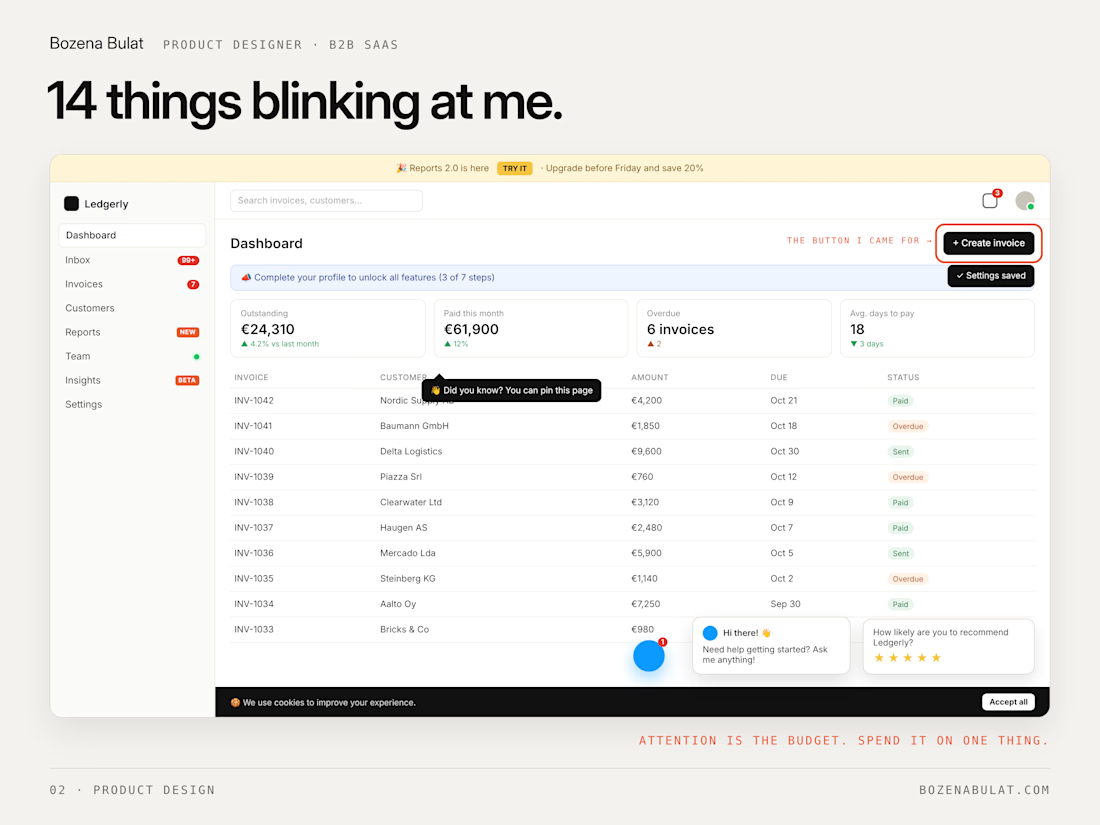
Your product has 14 things blinking at me.
A red badge. A green dot. A “New!” tag. A tooltip. A banner. A survey. A chatbot waving. And somewhere under all that, the button I came for.
Every notification was a good idea on its own. Together they’re a casino.
The quiet products win because:
→ One thing asks for attention at a time → “New” stops being new after a week → The main action is the loudest thing on the screen → Everything else waits its turn
Attention is the budget. Spend it on one thing.
This is most of what I do for B2B SaaS teams: find the one thing on each screen, and get everything else out of its way.
How many things are blinking in your product right now?

The network for creativity
Join 1.25M professional creatives like you
Connect with clients, get discovered, and run your business 100% commission-free
Creatives on Contra have earned over $150M and we are just getting started






Related posts

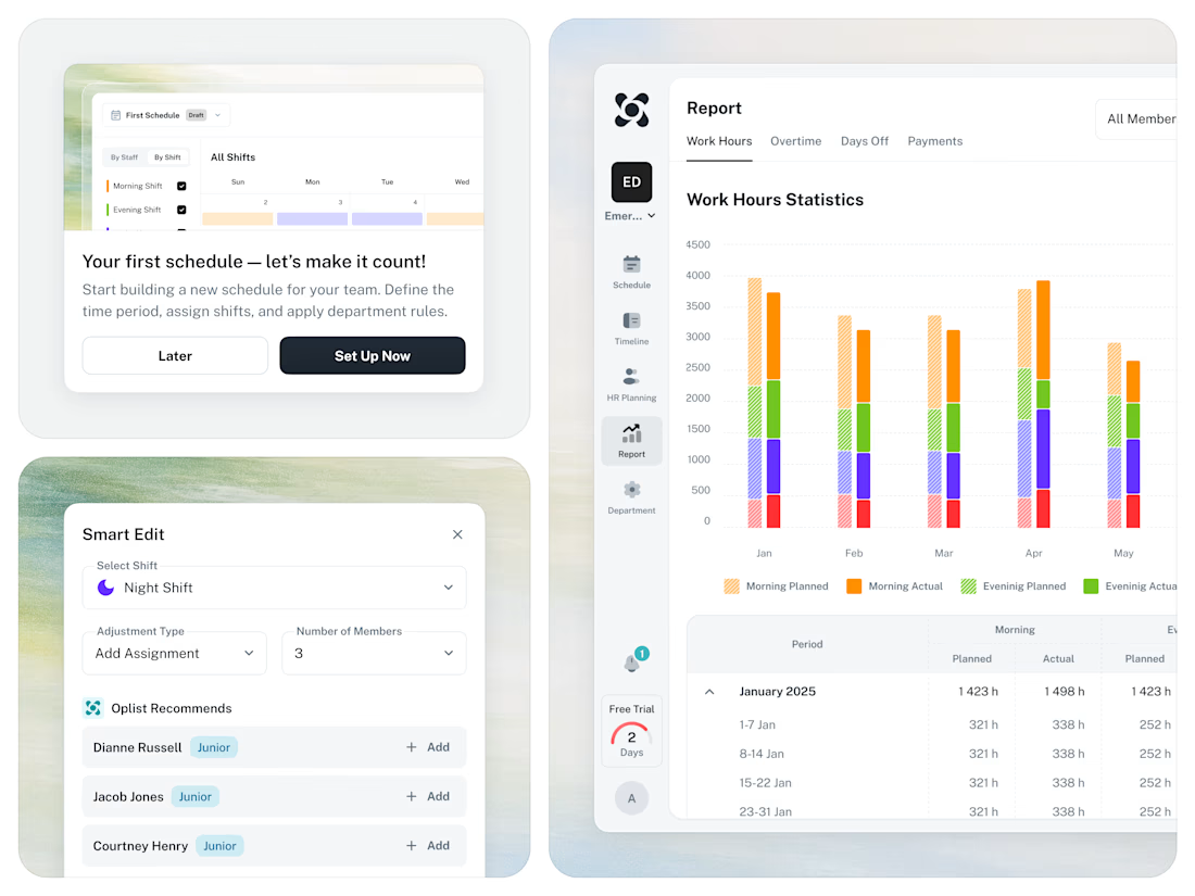
🚀 From Excel chaos to a clear SaaS workflow for staff scheduling.




Hear the sound 🎧
An experimental exploration of bringing AI conversations to life through motion. ✨
Tool stack: Figma × Claude × After Effects


Really impressive

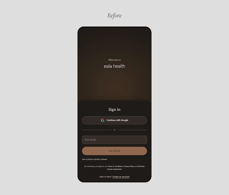
A founder ask me for a feedback on there product, so i started reviewing the healthcare app, and something felt off.
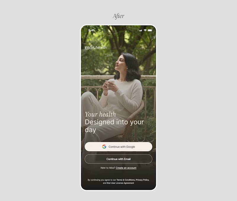
The website felt warm and welcoming. You could tell there were real people behind the brand.
But once you opened the app to sign up, that feeling was gone.
And honestly, for something as personal as healthcare, that matters. People need to feel comfortable before they trust you with their health.
So I worked on the onboarding screen to bring that feeling back.
Nothing complicated. I added a human touch through imagery and kept the screen simple, while making the app feel more connected to the website.
Sometimes, it's not about adding more to a screen. It's about making what's already there feel right.
Which would make you more comfortable signing up:
Before or After?
4 voted
14%
25 voted
86%
29 votes
Closed

Good catch on the disconnect between the website and signup flow. Carrying that human warmth into onboarding feels especially relevant for healthcare. Have you had a chance to test the redesign with new users?