The network for creativity
Join 1.25M professional creatives like you
Connect with clients, get discovered, and run your business 100% commission-free
Creatives on Contra have earned over $150M and we are just getting started
Back to feedPost

Title: Brand Messaging & Voice Development for a Specialty Coffee Subscription Brand
Fictional Client : Ember & Oak — an online specialty coffee subscription brand.
Brand Messaging & Voice Development
Ember & Oak — Specialty Coffee Subscription Brand
Project overview
Ember & Oak is a fictional specialty coffee subscription brand created for this portfolio project. The goal was to develop clear, consistent messaging that communicates the brand’s value and makes its subscription offer appealing to coffee lovers.
1. Brand positioning
For coffee lovers who want better coffee without the hassle of searching for it, Ember & Oak delivers carefully selected specialty coffee directly to their door.
2. Brand tagline
Better coffee. Delivered with intention.
3. Core value proposition
Discover quality coffee, enjoy convenient monthly deliveries, and make every morning worth looking forward to.
4. Brand voice
Warm: Make customers feel welcome.
Knowledgeable: Communicate coffee quality confidently without sounding complicated.
Approachable: Keep the language natural and easy to understand.
Thoughtful: Highlight the experience behind every delivery.
5. Key brand message
Good coffee should fit naturally into your everyday routine. Ember & Oak makes discovering and enjoying quality coffee easier, one delivery at a time.
6. Sample promotional copy
Headline: Make Your Mornings Something to Look Forward To.
Body: Tired of settling for the same coffee every morning? Discover carefully selected specialty coffee delivered straight to your door. With Ember & Oak, your next favourite cup could be just one subscription away.
CTA: Explore Your Coffee Subscription.
Project outcome
This messaging framework gives the fictional brand a consistent foundation for communicating across its website, promotional campaigns, product pages, and social media.
This is a self initiated speculative portfolio project, not commissioned client work.
The network for creativity
Join 1.25M professional creatives like you
Connect with clients, get discovered, and run your business 100% commission-free
Creatives on Contra have earned over $150M and we are just getting started


Related posts

Out of Order® — Brand Identity & Label Design
Out of Order is a fictional streetwear brand created for the @designerbriefs weekly challenge (Brief 185): clothing for people inspired by the fear of being average.
What do you think about the aesthetic?
Full case study on my web: notvidrio.com
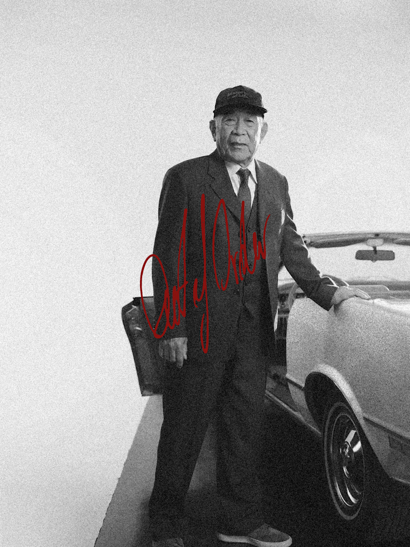
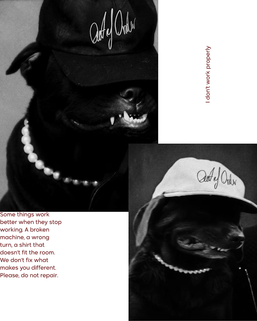
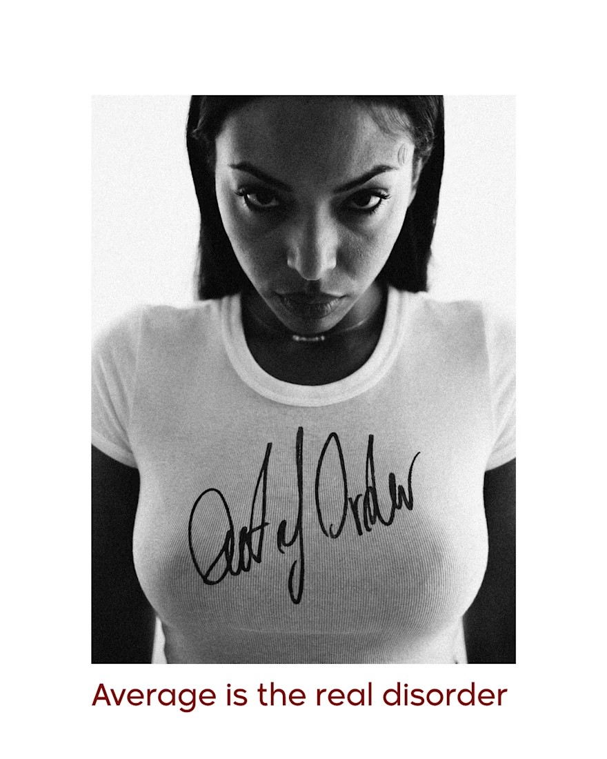
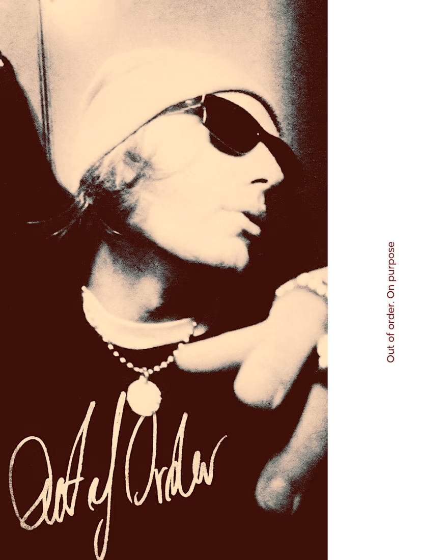

Love the handwritten logo on the tee and cap, it feels real. The aesthetic fits the brief well.


Really nice work. The simplicity works beautifully here.

Designed and developed Brew & Bloom, a specialty coffee shop website concept with a warm visual identity, elegant typography, and engaging interactions.


The warm visual identity and elegant typography feel right for a specialty coffee shop. Those small interactions can add personality without getting in the way of the menu.


