The network for creativity
Join 1.25M professional creatives like you
Connect with clients, get discovered, and run your business 100% commission-free
Creatives on Contra have earned over $150M and we are just getting started
Back to feedPost

The network for creativity
Join 1.25M professional creatives like you
Connect with clients, get discovered, and run your business 100% commission-free
Creatives on Contra have earned over $150M and we are just getting started





Related posts

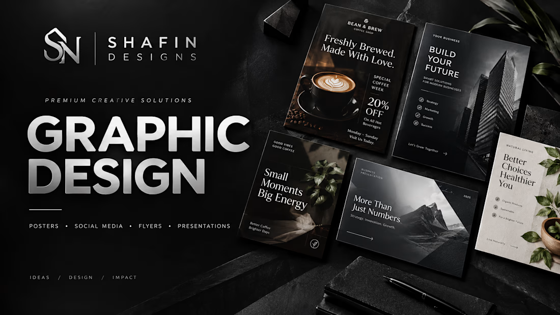
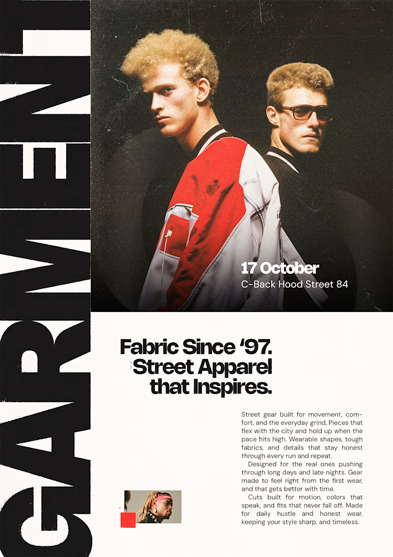
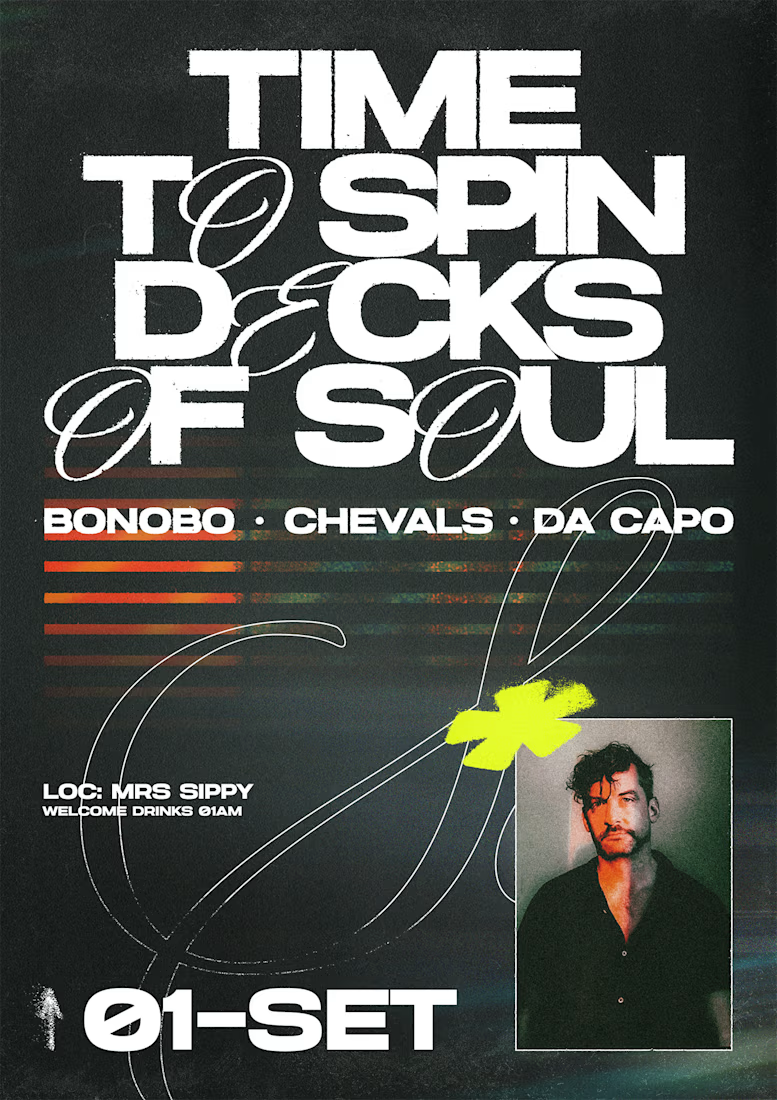
A premium graphic design portfolio concept created for SHAFIN DESIGNS.
Focused on clean typography, strong composition, refined visual hierarchy, and a modern editorial aesthetic.
This project showcases:
• Poster Design
• Social Media Design
• Flyer Design
• Presentation Design
The direction combines minimalism, depth, and sophisticated visual details to create a professional and memorable design system.
Ideas / Design / Impact.

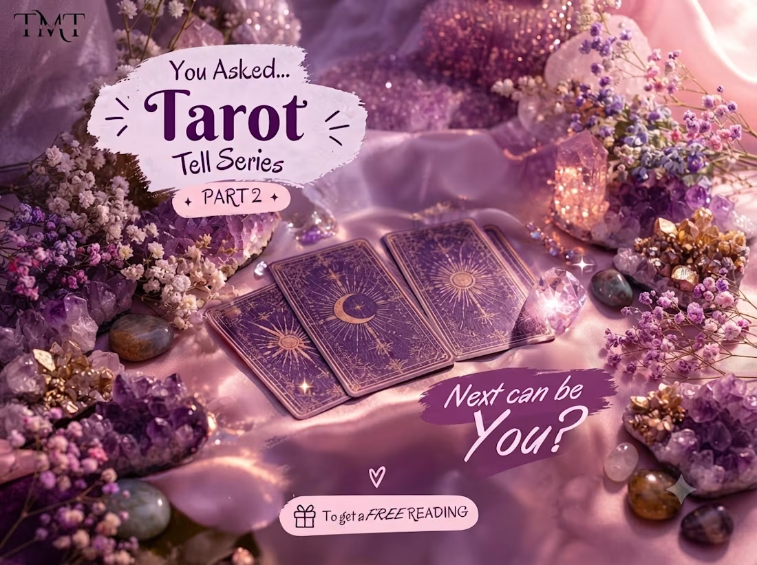
Created an aesthetic and engaging tarot reading graphic designed for social media. The design combines tarot imagery, spiritual elements, and clear typography to create a visually appealing post while keeping the overall look premium and easy to understand.
The graphic was designed to match a spiritual brand identity and encourage audience interaction through an engaging tarot-reading concept.

Looks really good. You really caught the whole whimsical style of tarot and fortune reading. Congrats 🎉

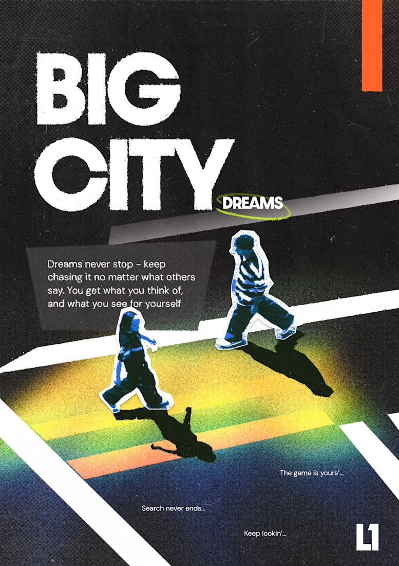
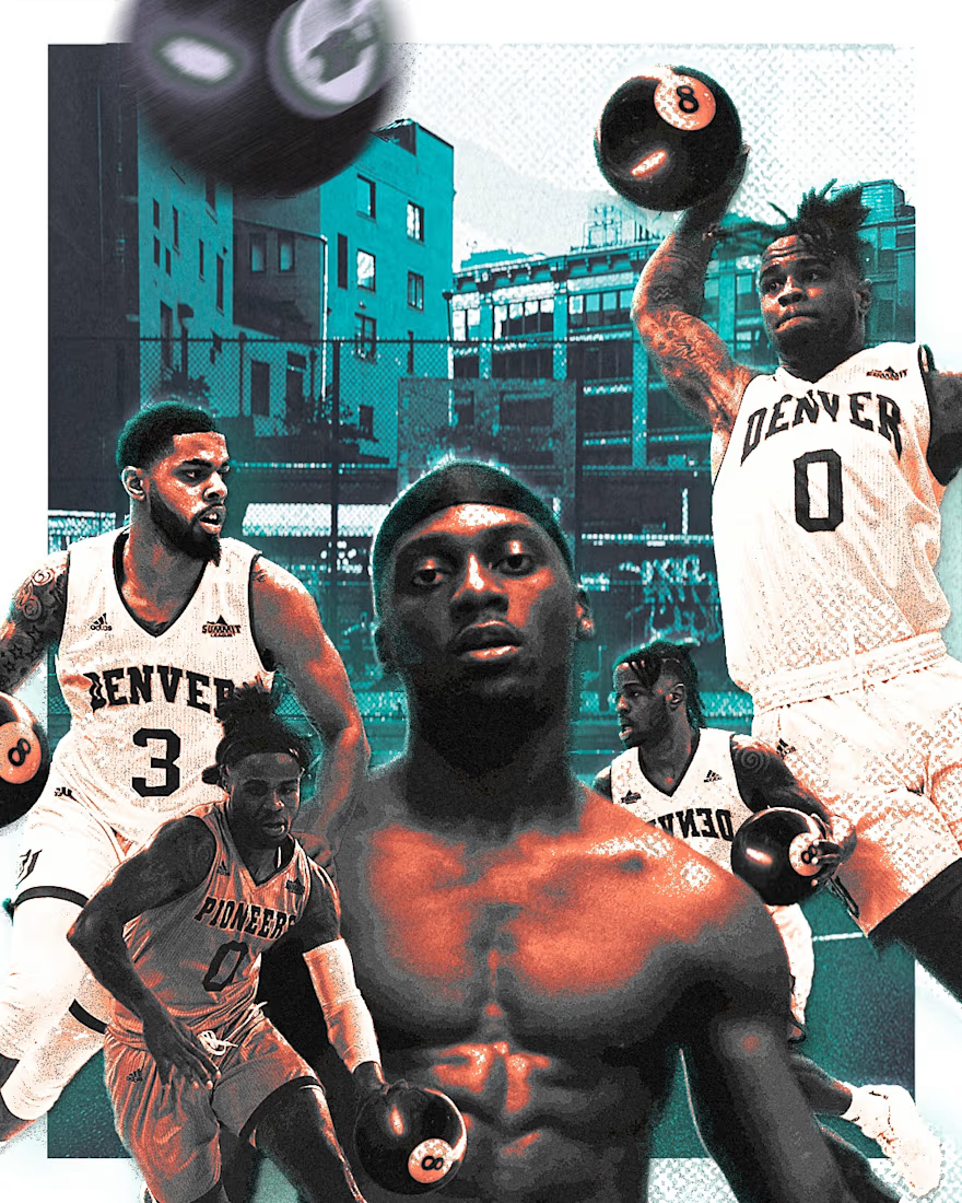

That's feels energetic and wild great job bro 🎉🎉🔥🔥