The network for creativity
Join 1.25M professional creatives like you
Connect with clients, get discovered, and run your business 100% commission-free
Creatives on Contra have earned over $150M and we are just getting started
Back to feedPost
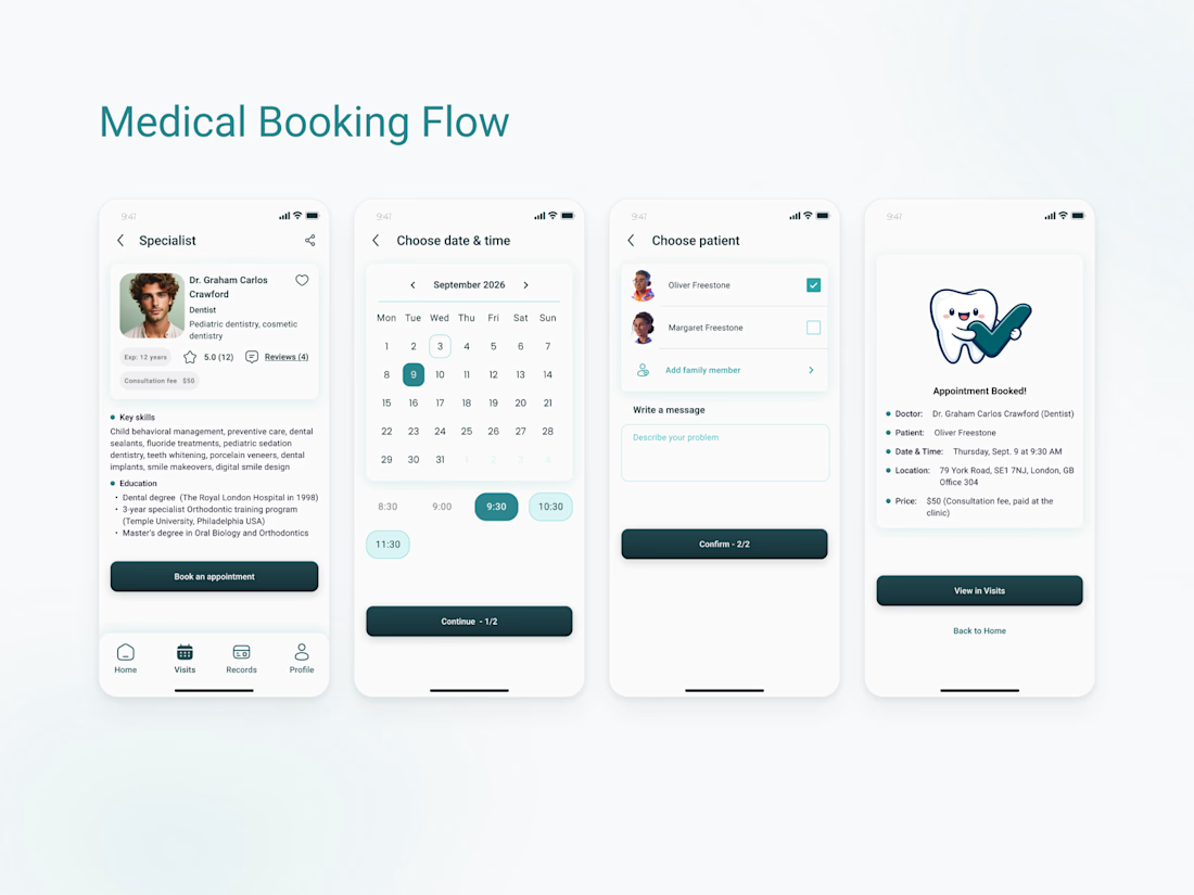
Medical Booking Flow
A streamlined appointment booking flow designed for a local dental clinic. Starting from the specialist profile, patients can quickly schedule a visit, select the patient, add appointment details, and receive instant confirmation.
The design focuses on clarity, transparency, and reducing friction throughout the booking process, making it easy to complete an appointment in just a few simple steps.
#UIUXDesign #MobileAppDesign #HealthcareDesign
#DentalApp #BookingFlow #UXDesign
#ProductDesign #UserExperience
#AppointmentBooking #Figma



Super polished flow! The layout is incredibly sharp, intuitive, and distraction-free. You've managed to make scheduling a doctor's visit feel completely seamless and modern. Great job! 🚀🔥

Thank you 😊

Great work!😍


So clean and professional 🙌

Booking flows always look simple until you have to design one 😅 Love the focus on reducing friction and helping users get from decision to confirmation as quickly as possible.
Totally agree! The main goal was to prevent users from dropping off halfway through the process, so streamlining the step-by-step logic was key. Glad you liked the execution, thanks for stopping by!

Cool work, looks very clean! ✨
Thank you, that was the goal

Clean and logical flow! Minimum steps from the specialist profile to confirmation. I really like it! 🔥
Thank you 🕊️

So smooth and easy to scan👍
Thank you 😊

Really smooth flow — I like how the design makes booking feel simple, clear, and stress-free.
thank you to notice this 🌿

Love how clean and easy this flow feels 👏
Thank you

Thanks, Sajid! Glad you liked the step-by-step focus. Great points! For the duration, I’ll definitely add a small hint (like '9:30 - 10:00 am' or 'approx. 30 min') to the confirmation screen so patients can plan their day. As for cancellation details, I actually keep them on...
The network for creativity
Join 1.25M professional creatives like you
Connect with clients, get discovered, and run your business 100% commission-free
Creatives on Contra have earned over $150M and we are just getting started








Related posts

Post
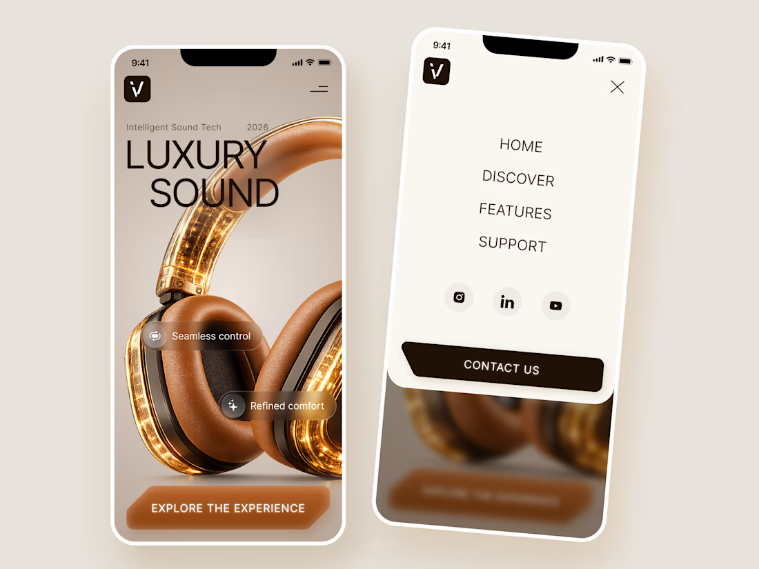
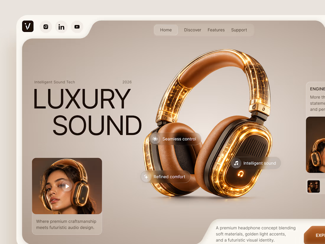
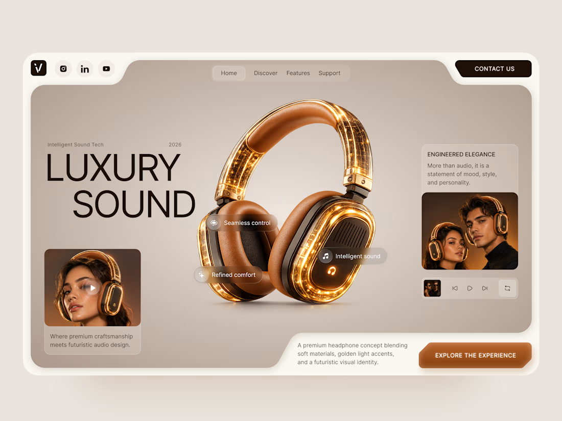
Luxury Sound — Premium Headphones Landing Page 🎧✨
A premium landing page concept for a luxury audio brand, built around a bold headphone design and a refined visual experience
The design combines warm neutral tones, glowing details, oversized product visuals, and minimal typography to create a futuristic yet elegant feel
Special attention was given to:
• Product-first composition
• Premium visual direction
• Feature highlights
• Lifestyle imagery
• Clear CTA placement
• Responsive mobile experience
The result is a clean, immersive product experience that makes the headphones feel like more than tech — they become part of the lifestyle 🔥



The amber glow on the headphones against that warm beige is lovely. How does the mobile menu handle the product image?

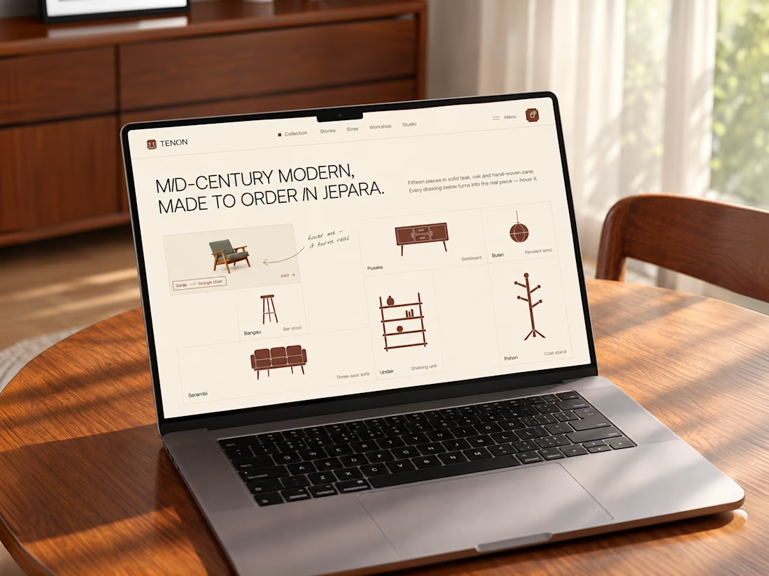
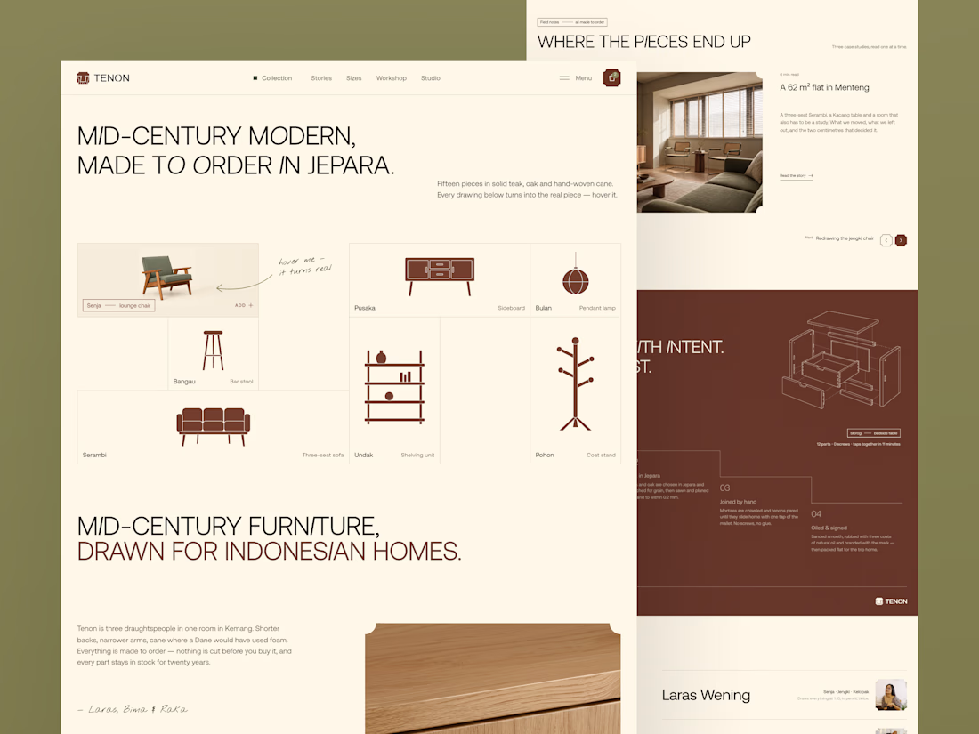
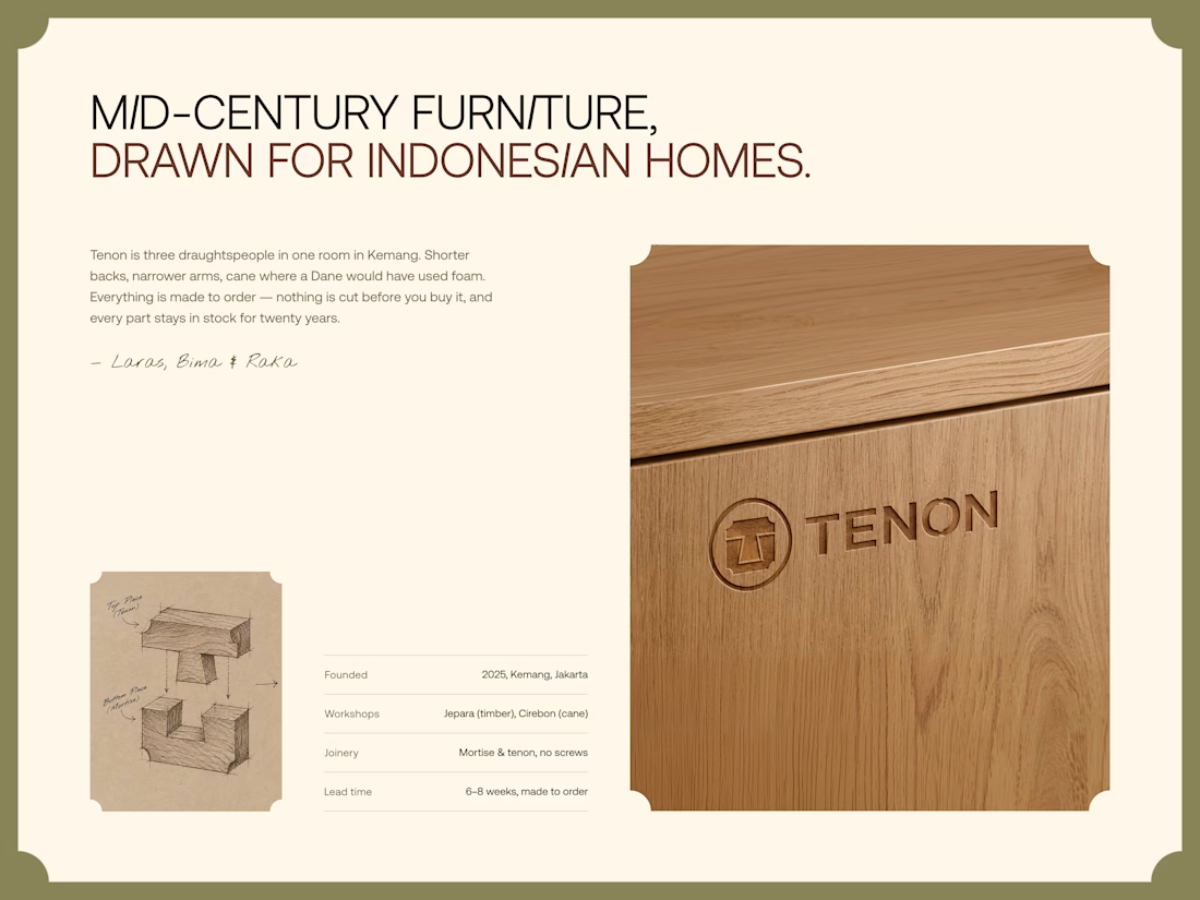
Tenon is Furniture Website Design
Exploring a digital experience for an Indonesian furniture brand inspired by mid-century modern design.
The website brings together product discovery, storytelling, and visual direction to make the digital experience feel as considered as the furniture itself.
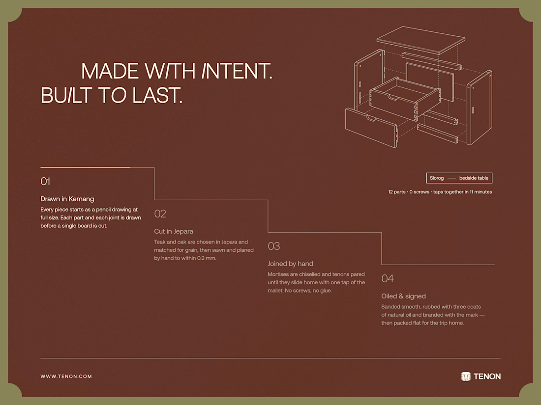
Made to order. Made to last.

Love the color choice used


Built the StupidFish Design System from the ground up and covering everything from color, typography, spacing, and components to comprehensive documentation.
Designed and documented for both web and mobile, creating a consistent, scalable foundation that makes product design and development faster and more cohesive.
Check out the full case study here →


Really thorough system, nice job