The network for creativity
Join 1.25M professional creatives like you
Connect with clients, get discovered, and run your business 100% commission-free
Creatives on Contra have earned over $150M and we are just getting started
Back to feedPost
Taste Test

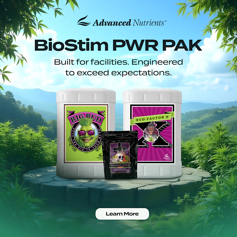
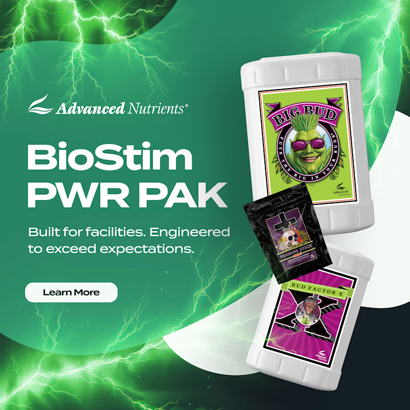
Two social ad directions for Advanced Nutrients’ BioStim PWR PAK. Same product, completely different energy.
Option A: natural landscape background, products centered on a stone pedestal, feels grounded and premium
Option B: electric green lightning background, products fanned at an angle, feels high voltage and aggressive
Which one stops the scroll for a grower? 👇
4 votes
Ends in 1d

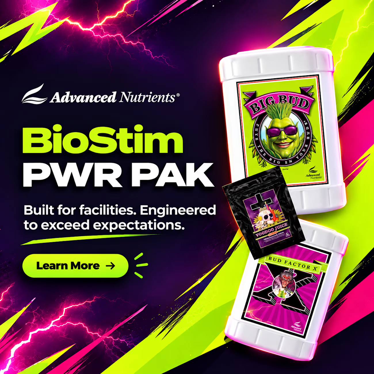
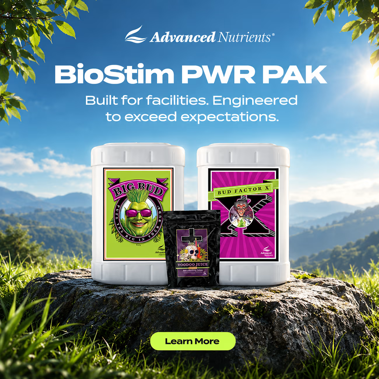
Now you tell me bro which one is looking better 1st or 2nd one
The network for creativity
Join 1.25M professional creatives like you
Connect with clients, get discovered, and run your business 100% commission-free
Creatives on Contra have earned over $150M and we are just getting started











Related posts

Brand identity exploration
Which one do you think it fits better?
36 voted
77%

11 voted
23%

47 votes
Closed

Cobalt is great Gold is unique 🎉🎉🔥🔥

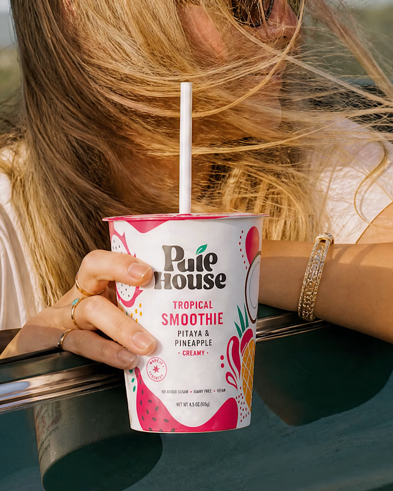
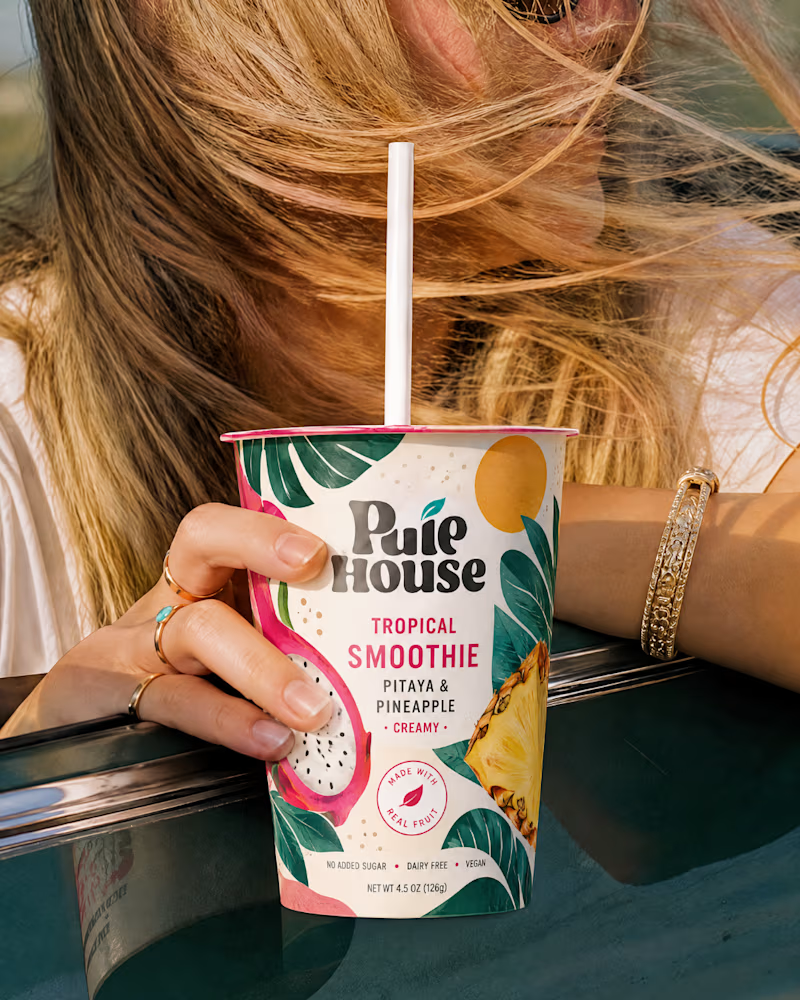
Exploring Two Branding Concepts
I explored two distinct visual directions for Pulp House, focusing on how color, composition, and design elements can shape a brand's identity.
This comparison reflects my approach to creating thoughtful, cohesive visuals that help businesses present their brands with confidence.
1 voted
5%
20 voted
95%
21 votes
Closed

Fun concepts, Mati!


Same brand. Same palette. Two completely different proposals for a real estate developer.
A: An isotype built from blocks. Geometric, precise, the language of construction. It says we build.
B: Custom lettering with movement. Warmer, more editorial. It says we build places you’d want to live in.
36 voted
51%

35 voted
49%

71 votes
Closed

My vote is B, Milagros. Custom lettering with movement has real editorial warmth, which suits a developer selling places people actually want to live in.