The network for creativity
Join 1.25M professional creatives like you
Connect with clients, get discovered, and run your business 100% commission-free
Creatives on Contra have earned over $150M and we are just getting started
Back to feedPost

🚀 I was digging through my project archives and forgot how much fun it was to create this logo animation.
My goal was to make those sharp, blocky transitions feel incredibly smooth and satisfying. There is something so rewarding about morphing simple, rigid shapes into a fluid visual identity.
Sometimes the simple projects are the most fun,.
Always love looking back at older work to see how my animation style and workflow have evolved since then.
💡 Looking to elevate your brand identity with motion?
I am currently taking on new freelance design and animation projects. Drop me a message or check out my services here on Contra.
🔥 Let’s build something cool together!
The network for creativity
Join 1.25M professional creatives like you
Connect with clients, get discovered, and run your business 100% commission-free
Creatives on Contra have earned over $150M and we are just getting started





Related posts

XNOMAD — Brand Identity Design!
XNOMAD is a premium modular camper brand based in Scandinavia, offering both rental experiences and ownership of off-road pickup campers.
The goal was to create an identity that could sit naturally between two worlds:
Scandinavian minimalism + rugged outdoor capability.
Rather than following the typical loud adventure aesthetic, we kept the system clean, modern, and confident, reflecting XNOMAD's idea of quiet luxury and freedom.
The identity was built around a distinctive X, supported by a minimal wordmark, bold blue palette, typography, graphic patterns, and applications across digital and physical touchpoints.
Wake Up Anywhere.
One of those projects where simplicity did most of the talking.


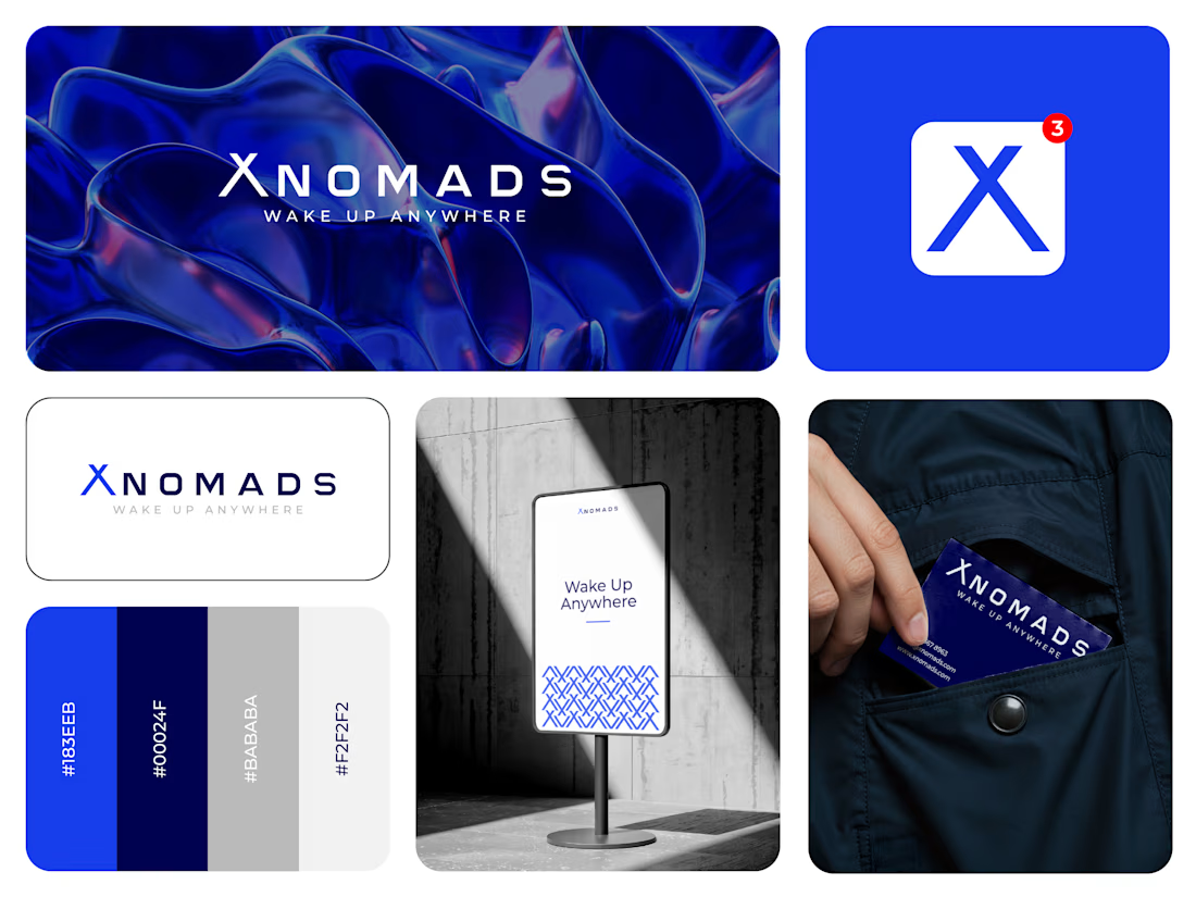

The blue visual system and mockup presentation work so well together.

🚨 NEW STUDIO JUST DROPPED.
No inspirational origin story.
No “we started in a garage.”
Just a bunch of people dangerously obsessed with making cool stuff.
Games. Motion. 3D. Animation. Prototypes. Creatives.
Spikehat Studios is officially on Contra. Got a weird idea?
Perfect. Those are our favourite ones.


games, motion, 3d,, that mix is a strong studio intro


hiring a motion designer to join the effekt team.
Since day one, I've tried to build effekt around one idea: every piece of work has a job to do, and it should link back to what it's doing for our partners' business. Looking good matters, but it's never the only reason behind a design decision.
The team is what keeps that idea alive, and I want whoever joins next to think the same way.
For motion, that means someone who thinks beyond the storyboard; who understands the message, why it matters to our partners, and tells us when a brief needs a change (small or big) so the message lands better.
What matters most to me:
-You understand the goal before you open any tool
-You find a way when a missing asset or a tight timeline gets in the way
-You love what you do and care about the impact it has
You'll work on explainers, product launches and brand motion for companies across MENA and internationally. Jitter and Arabic are a big plus.
Remote, contract, part time.
Apply here: https://effekt.s.gy/motion
If you know someone who'd be a great fit, a tag goes a long way.


Hi @Ahmed Alsayad i just applied.