The network for creativity
Join 1.25M professional creatives like you
Connect with clients, get discovered, and run your business 100% commission-free
Creatives on Contra have earned over $150M and we are just getting started
Back to feedPost
Taste Test

Which booth do you prefer to sit and eat at?
3 voted
50%

3 voted
50%

6 votes
Closed

Leopard booth
The network for creativity
Join 1.25M professional creatives like you
Connect with clients, get discovered, and run your business 100% commission-free
Creatives on Contra have earned over $150M and we are just getting started



Related posts

ONE CRAVING. TWO VERY DIFFERENT EXPERIENCES. 🍔
What if the same food-delivery industry could tell two completely different visual stories?
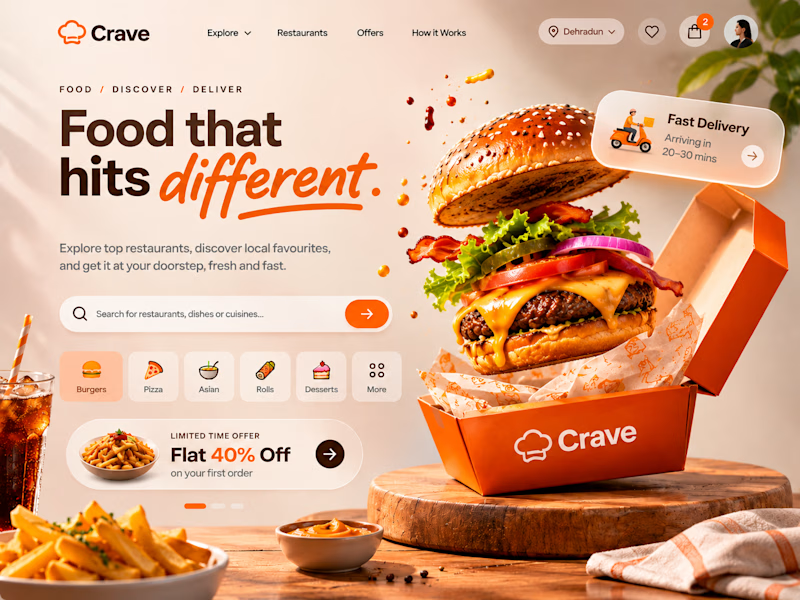
🍊 CRAVE — Made to Tempt
Warm tones, expressive typography, vibrant food photography and playful 3D elements. Designed to make food discovery feel exciting, inviting and full of personality.
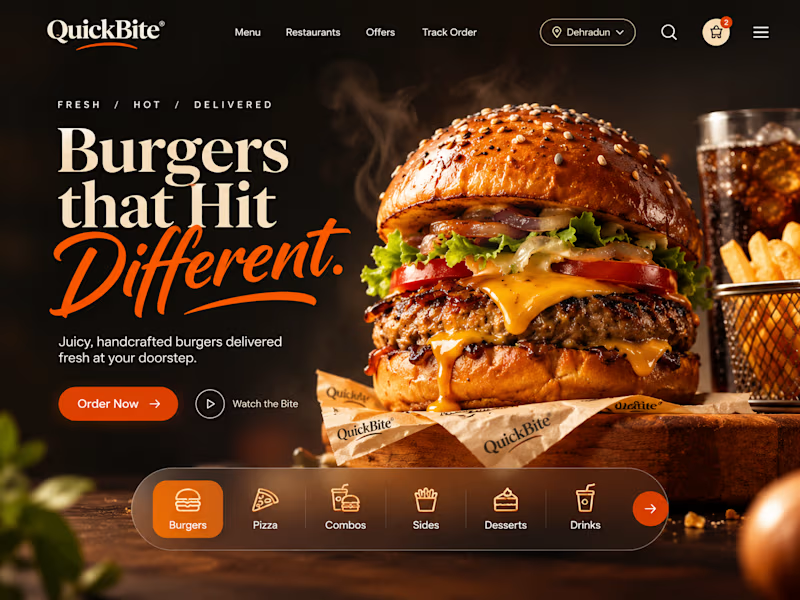
🖤 QUICKBITE — Made to Indulge
A darker, richer visual direction with cinematic burger photography, bold editorial typography and immersive layouts. Designed to put the food front and centre and make every interaction feel intentional.
Two brands. Two moods. Two approaches to the same experience.
Now I'm curious:
Which direction would make YOU stop scrolling and place an order?
Drop your pick below. I'd love to hear the reasoning behind it!
7 votes
Ends in 10h

QuickBite is unique in a good way!



Need a second pair of eyes 👀
I'm designing the online store for FizzPop, a craft soda brand: all-natural sodas, sparkling waters and botanical tonics.
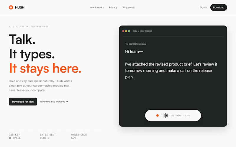
Flower Fizz(A): eggshell, tiger orange and deep ultramarine, with flower shapes and stacked colour swatches for the flavours
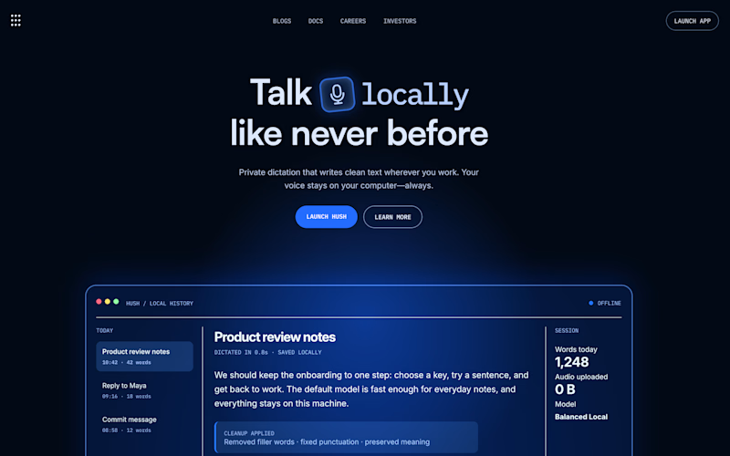
Corner Shop(B): lime, soft blues and navy, editorial layout with a giant wordmark and menu-style flavour tiles
38 voted
44%
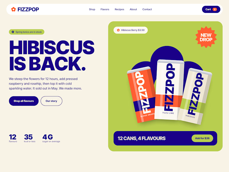
48 voted
56%
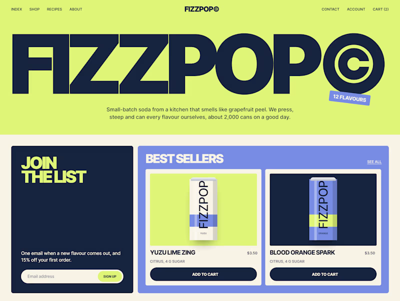
86 votes
Closed
