The network for creativity
Join 1.25M professional creatives like you
Connect with clients, get discovered, and run your business 100% commission-free
Creatives on Contra have earned over $150M and we are just getting started
Back to feedPost
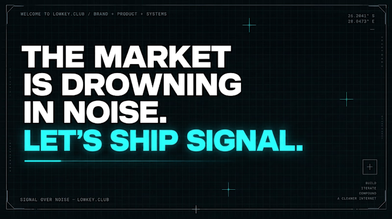
Taste Test

Which Hero do you naturally Gravitate to?
2 voted
33%
4 voted
67%
6 votes
Closed

Static CYAN for me. The big headline lands in a second, and the animated one has the line fighting with the background.

Animated Illustrations

Animated appeals more
The network for creativity
Join 1.25M professional creatives like you
Connect with clients, get discovered, and run your business 100% commission-free
Creatives on Contra have earned over $150M and we are just getting started


Related posts

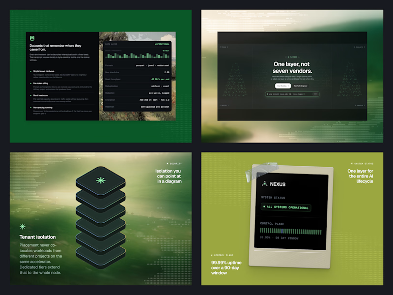
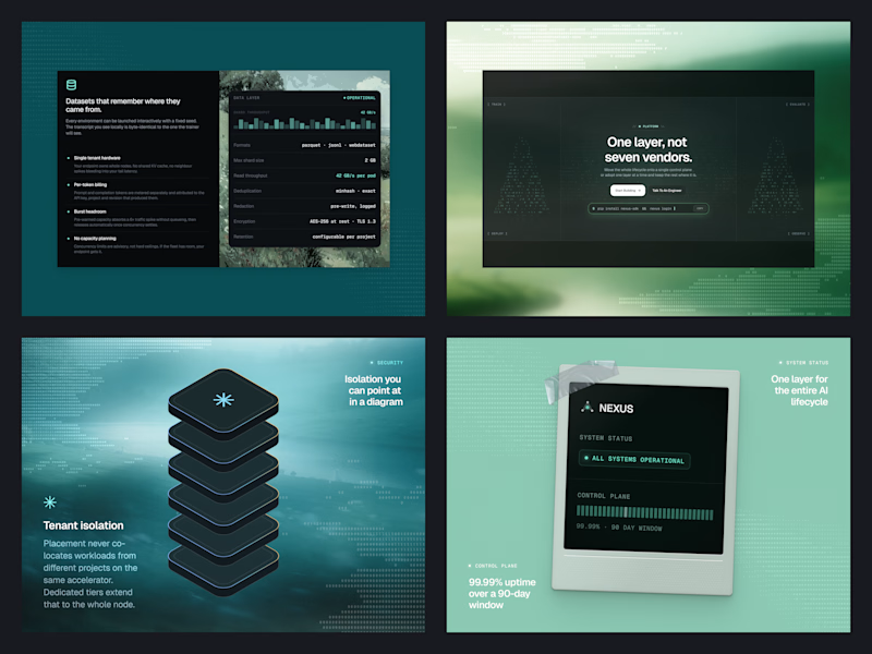
Same Nexus layout, two color moods. 🎨
A: Forest Green 🌿 feels fresh, natural, and calm.
B: Ocean Teal 🌊 feels cool, deep, and techy.
Which one are you picking? Drop A or B below! 👇
#ColorExploration #UIDesign #BrandColor #DesignPoll
0 voted
0%
2 voted
100%
2 votes
Closed
B, Ocean Teal. It sits more calmly against the dark panels, the green gets a bit loud.


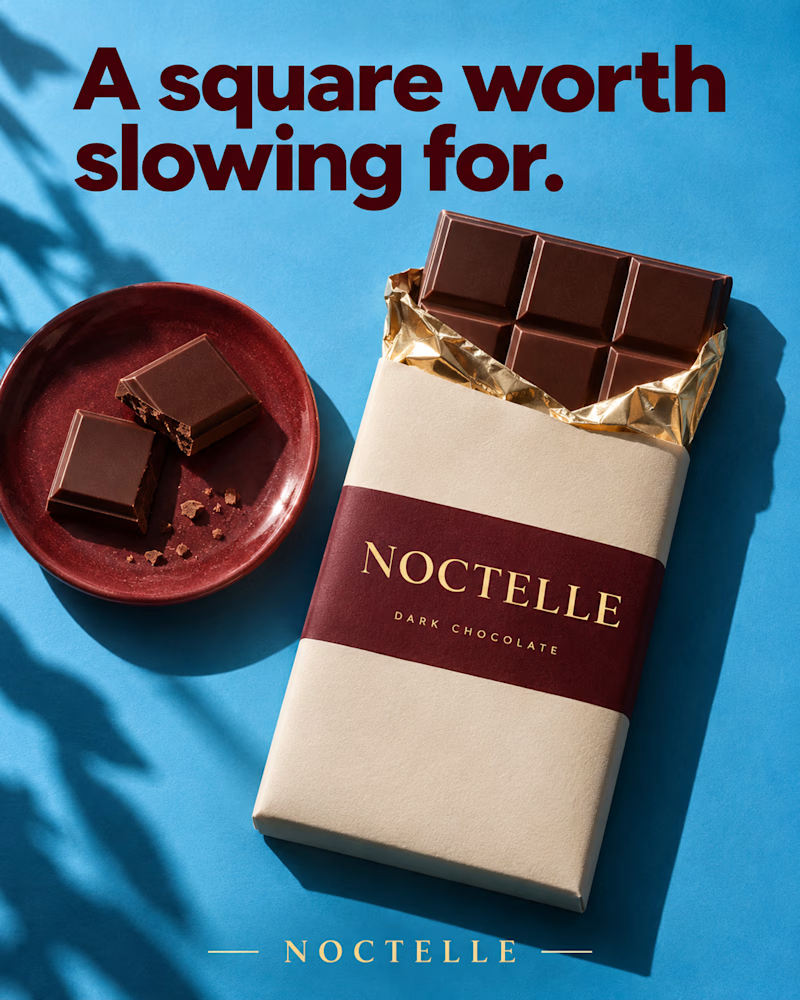
Which one would you put in the gift box?
The first is shot from above on sky blue, a cream wrapper with a wine band and gold type, gold foil peeled back from the bar, two broken squares on a glazed red plate beside it, leaf shadow along the left edge, heavy maroon sans headline.
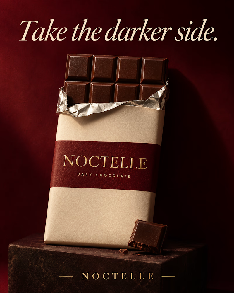
The second is the same bar standing on a dark stone block against deep wine red, silver foil open at the top, one broken square leaning at its base, low warm light, the headline in cream italic serif.
One sells the afternoon. The other sells the indulgence.
👇 #packagingdesign #brandconcept #foodphotography
2 voted
29%
5 voted
71%
7 votes
Closed

Slow Square 🔥


Should a personal brand hero lead with the name or the promise?
A client of ours is a speaking coach. People find her by name: podcasts, stages, word of mouth. Yet her first hero hid that name in the top-left corner.
We tested two directions:
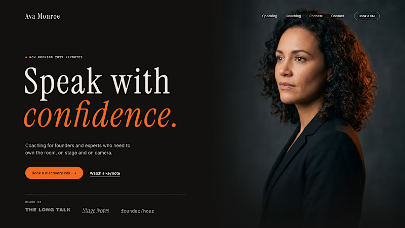
The promise first. "Speak with confidence" in big type, the name small in the nav. Clear, but it could be any coach on the internet.
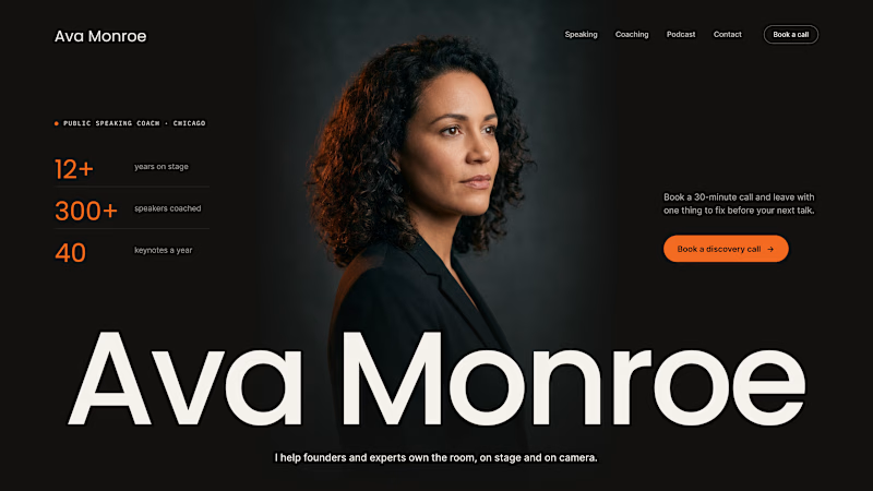
The name first. Her name at billboard scale, the promise in one line above it, her face right behind. Someone arriving from a podcast knows instantly they're in the right place.
When people search for you, your name is the headline.
Which one would you ship for a personal brand?
43 voted
51%
42 voted
49%
85 votes
Closed

Name first — podcast listeners arrive looking for her.