The network for creativity
Join 1.25M professional creatives like you
Connect with clients, get discovered, and run your business 100% commission-free
Creatives on Contra have earned over $150M and we are just getting started
Back to feedPost

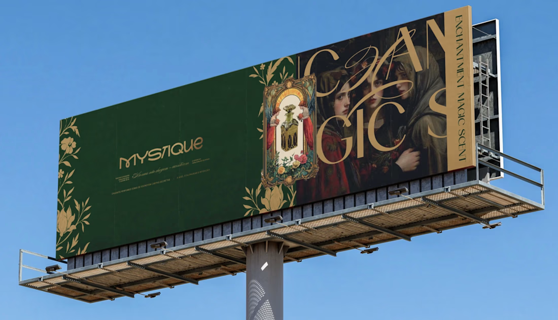
The challenge behind MYSTIQUE was creating a visual identity that could express mystery without sacrificing sophistication.
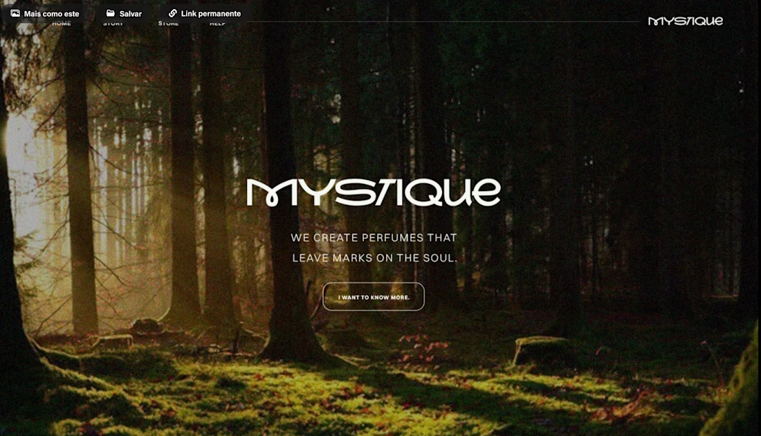
Mystery is often associated with darkness, secrecy, and the unknown. But our intention was to explore something more subtle: the relationship between curiosity, beauty, and the desire to discover what isn't immediately revealed.
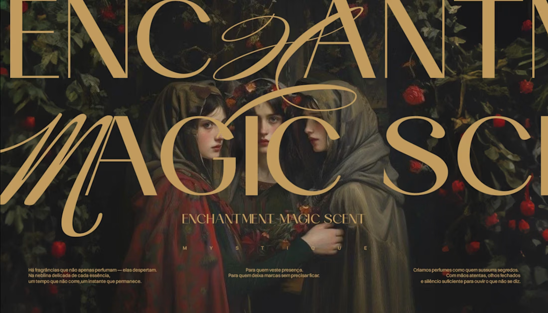
We approached this identity through a careful study of visual symbolism, typography, and composition. Every element needed to communicate a sense of exclusivity while preserving an almost timeless, enigmatic atmosphere.
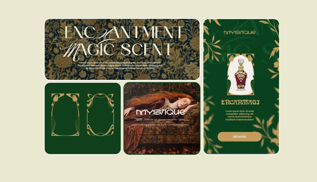
The botanical illustrations introduce an organic contrast to the structured typography, while the deep green and golden tones reinforce the perception of elegance, depth, and refinement.
One of the most important decisions was understanding that mystery doesn't need to be visually complicated. Sometimes, the most sophisticated way to create intrigue is knowing exactly what to reveal and what to leave unsaid.
Rather than relying on excessive ornamentation, we explored the balance between detail and restraint, allowing the identity to communicate through its own visual language.
MYSTIQUE was developed around this principle: a strong identity doesn't always need to explain itself entirely. Sometimes, its greatest strength lies in what it makes us feel before we fully understand it.
#BrandIdentity #Branding #ArtDirection #VisualIdentity #AdobeIllustrator


The network for creativity
Join 1.25M professional creatives like you
Connect with clients, get discovered, and run your business 100% commission-free
Creatives on Contra have earned over $150M and we are just getting started








Related posts

Which ZVEZRA logo direction do you prefer? 👀
I’ve been exploring two variations of the wordmark. Both follow the same visual direction, but each has its own character.
Vote below!
I’d love to hear your thoughts! 👇
39 voted
53%
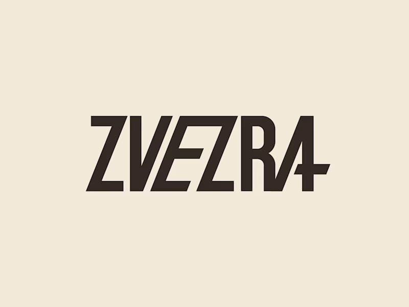
34 voted
47%
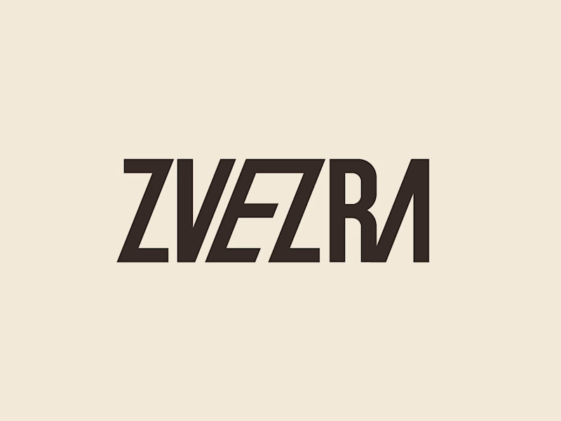
73 votes
Closed

Option 1 for me, it has a bit more personality. Both are strong though, tough call

A SaaS interface can look cinematic. That first impression can make people want to explore the product.
These style frames were designed for Rivet Health’s product video, using light, scale and 3D depth to build emotion around the real UI.


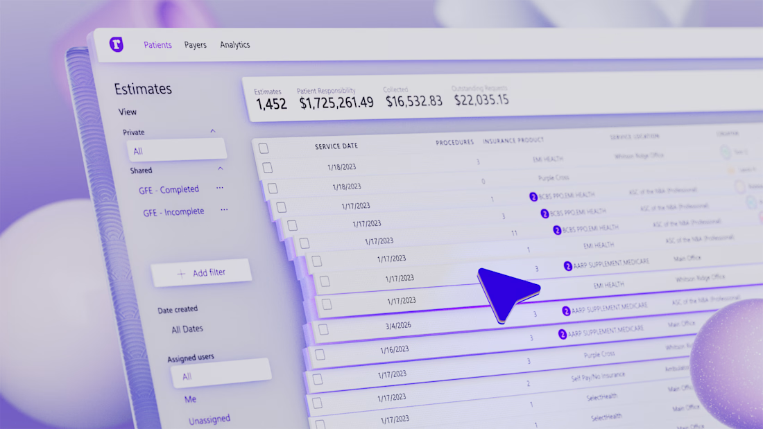
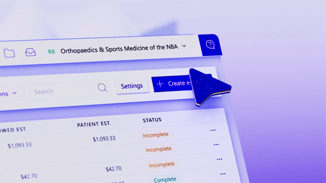
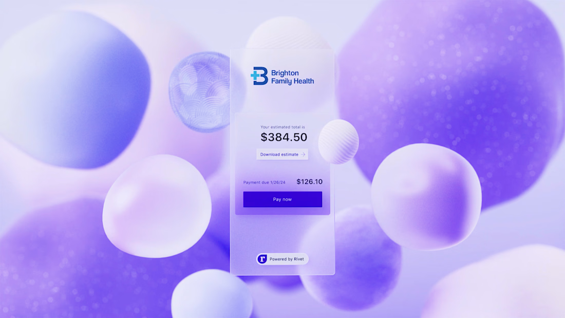
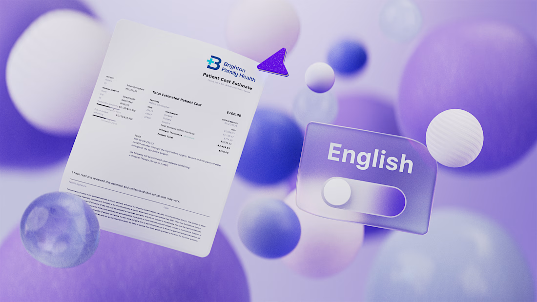


Love how the 3D depth makes the real UI feel cinematic without losing focus on the product.


Super clean work!