The network for creativity
Join 1.25M professional creatives like you
Connect with clients, get discovered, and run your business 100% commission-free
Creatives on Contra have earned over $150M and we are just getting started
Back to feedPost

Lifelink :- A Modern, Trust-Building Healthcare Website
Lifelink is a healthcare-focused website built to do one thing above all build instant trust. In healthcare, visitors decide within seconds whether a platform feels credible, safe, and professional. I designed and developed this site with that exact priority in mind.
The layout focuses on clarity over complexity: clean typography, calming color palette, and a structure that guides visitors naturally from understanding the service to taking action (booking, contacting, or learning more) without overwhelming them with clutter, which is a common problem with a lot of healthcare websites.
Subtle, purposeful animations were used (not flashy or distracting) to keep the experience feeling smooth, modern, and professional the kind of polish that reassures visitors they're dealing with a serious, reliable healthcare provider, not an outdated or generic template site.
Key focus areas:
Trust-first UI/UX clean hierarchy, easy navigation, no clutter
Smooth scroll and subtle motion for a premium, professional feel
Responsive design fully functional across mobile, tablet, and desktop
Clear CTAs (appointment booking, contact, service info) placed for maximum usability
Accessibility-conscious design readable fonts, good contrast, simple navigation for all age groups
Fast performance critical for healthcare sites where users often browse under time pressure
Tools used: Vanilla JavaScript, GSAP, ScrollTrigger, Lenis (smooth scroll)
This project reflects my approach to healthcare and service-based websites specifically motion and design should never come at the cost of clarity or trust. Every animation here serves a purpose: guiding attention, not distracting from it.
[Web Development, Frontend Development, UI/UX Design, Healthcare Website,
GSAP, Web Animation, Responsive Design, JavaScript,
Landing Page Design, Website Design]


The network for creativity
Join 1.25M professional creatives like you
Connect with clients, get discovered, and run your business 100% commission-free
Creatives on Contra have earned over $150M and we are just getting started

Challenges
View all


Related posts

The 404 was treated as a proper page rather than a fallback state.
The number is constructed as an architectural drawing. The 4 and the 0 are formed from walls at true thickness, with furniture laid out inside the resulting rooms and dimension strings running along both edges. It sits inside the same drafting system as the rest of the site rather than borrowing a display typeface.
The error message then repeats. Instead of a single dialog, identical windows cascade back across the canvas, each one carrying the same 404 notice. It reads as a system throwing an unresolved warning over and over, which is the exact behaviour Heron is built to prevent inside a model.
Error pages are never in the brief. They're a good measure of whether a team understood the product or just styled it.


Treating a 404 as an actual page instead of a dead end is such a good instinct, where did the architectural drawing idea come from, personal interest bleeding into the work?

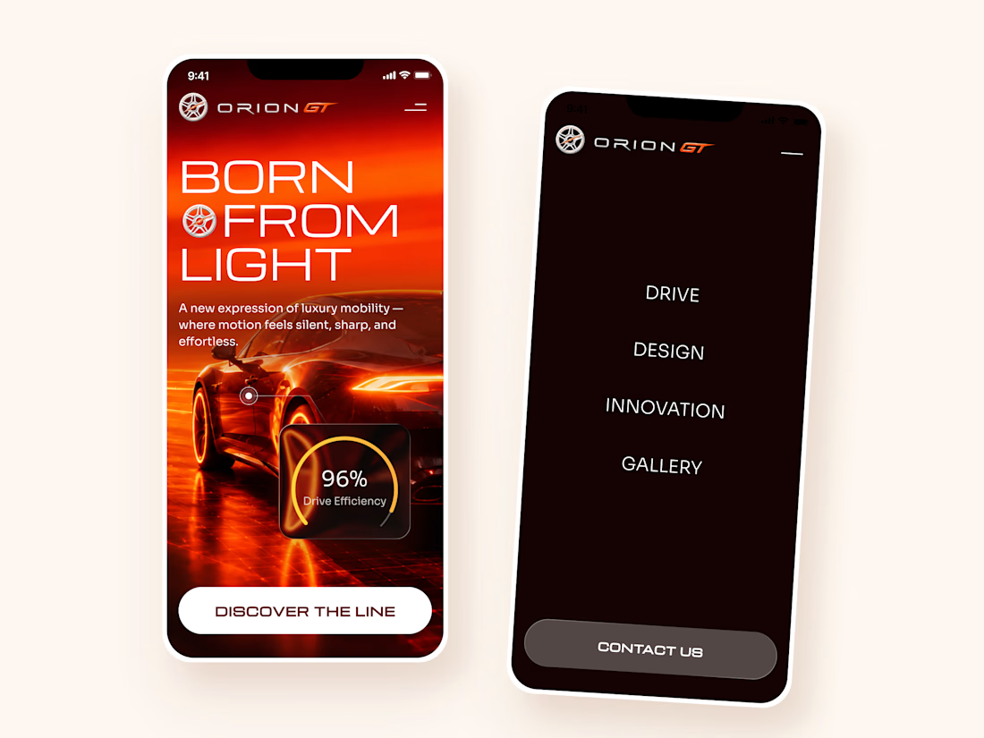
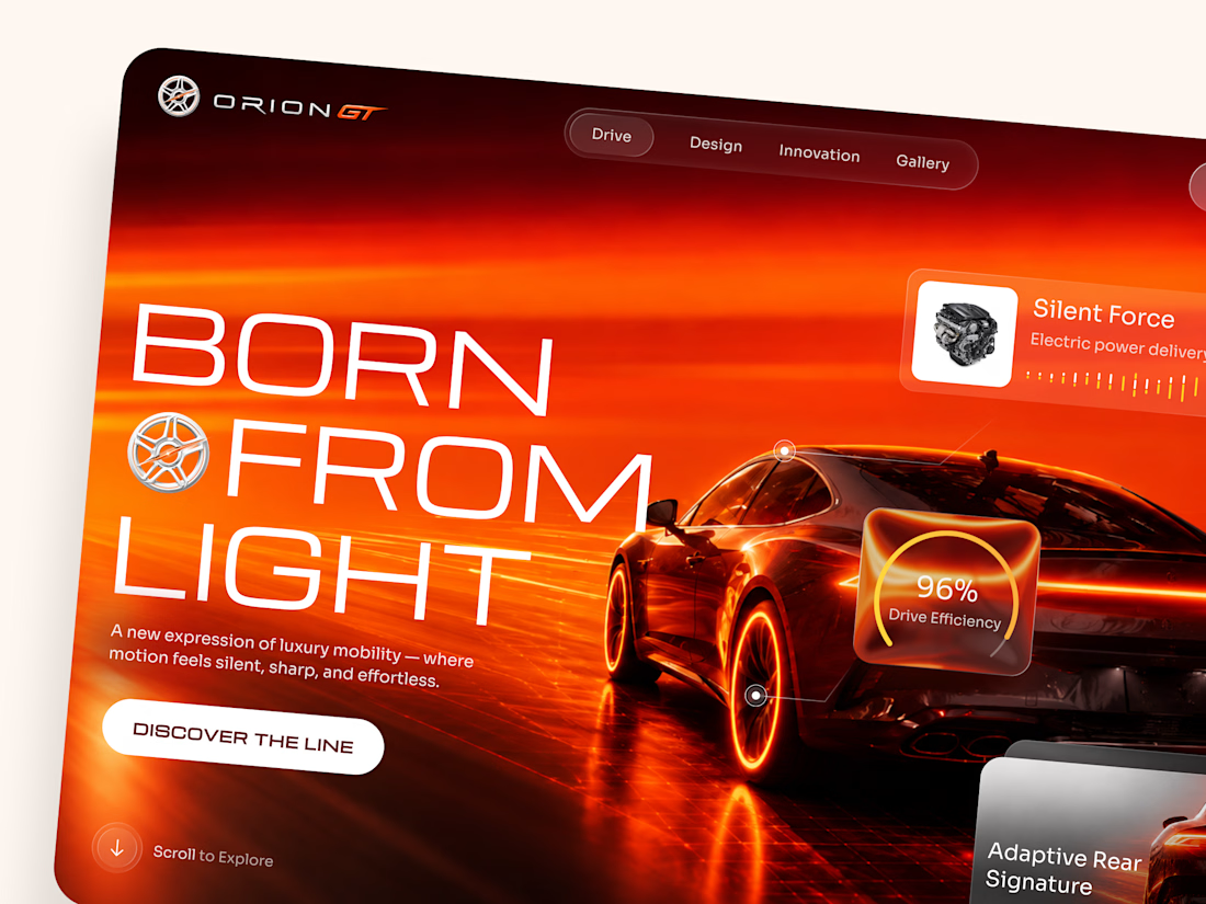
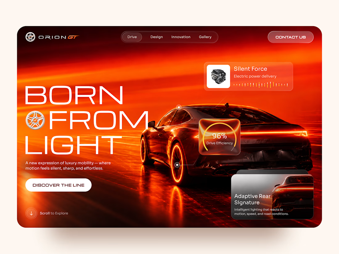
Orion GT — Luxury Automotive Landing Page 🏎️🔥
Orion GT is a landing page concept for a premium performance car brand, built around speed, innovation, and a cinematic digital experience.
The goal was to make the vehicle feel like more than a product — creating an immersive introduction where lighting, motion, typography, and interface details reinforce the feeling of performance and exclusivity.
Special attention was given to:
• a cinematic hero composition that makes the vehicle the main visual focus;
• a high-energy red and orange palette inspired by speed, heat, and light 🔥;
• oversized typography that strengthens the premium, futuristic character;
• floating performance UI elements that communicate features without interrupting the visual experience;
• glass-style interface cards for drive efficiency, electric power delivery, and adaptive lighting;
• a clear “Discover the Line” CTA integrated into the storytelling;
• responsive mobile layouts that preserve the atmosphere while simplifying the composition 📱;
• a minimal mobile navigation designed to keep the experience focused and immersive.
The result is a bold automotive experience that combines luxury presentation with a technology-driven interface — turning the landing page into part of the product experience itself.
Looking to create a premium website for your automotive, mobility, or technology brand? Let’s build something that feels as powerful as the product. ⚡



How did you choose this color direction? 🔥


Konto — Personal finance planner, web dashboard and mobile app
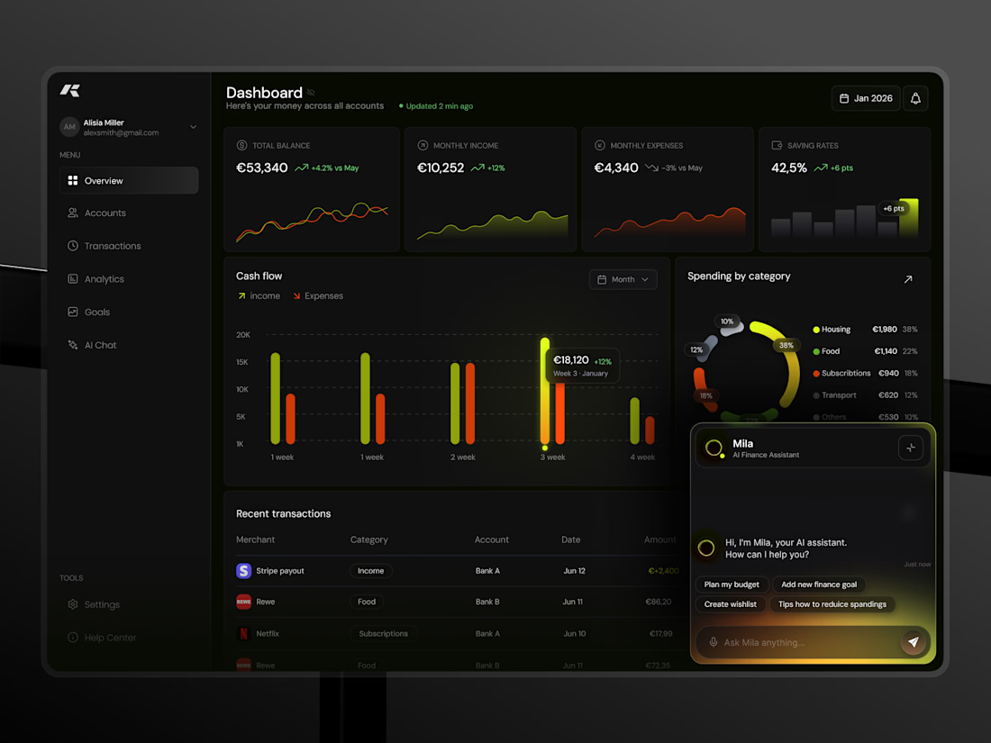
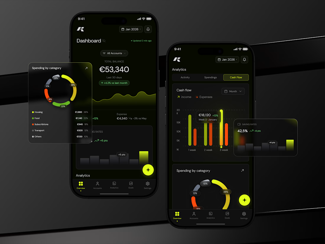
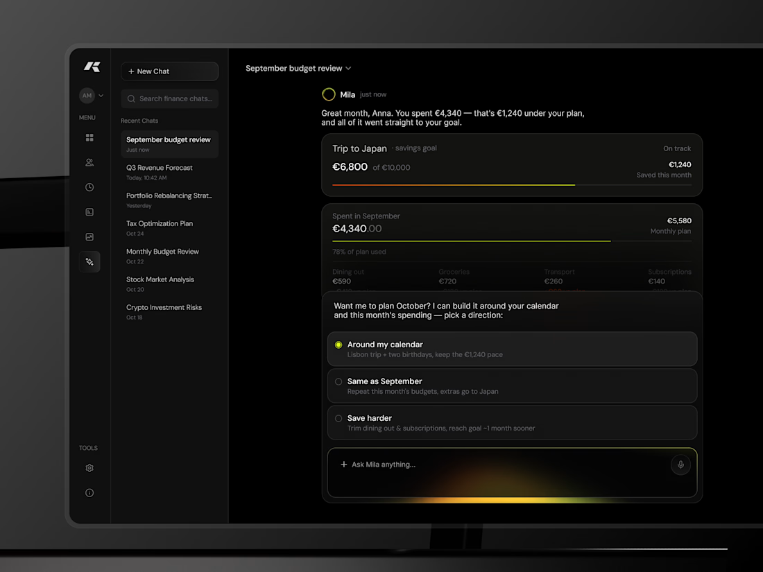
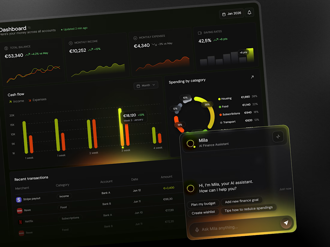
Konto is a personal finance planner concept I designed for both desktop and mobile, sharing one data model and one visual language.
Web dashboard: four KPI cards (balance, income, expenses, saving rate) with mini-charts, a weekly cash-flow chart with income and expenses side by side, spending by category as a segmented ring with a legend, and a recent-transactions table. The AI assistant lives in a docked panel bottom-right.
Mobile: the dashboard leads with total balance and a 30-day trend, then cash flow, saving rate and categories in one scroll. Analytics gets its own tabbed view. A floating action button opens the assistant from anywhere.
The visual system is dark by default with two signal colours: lime for income and growth, orange for spending. Glows are used only on the active data point, so highlights mean something. Numbers use the same layout and spacing on both platforms, so switching devices doesn't require re-learning the app.