The network for creativity
Join 1.25M professional creatives like you
Connect with clients, get discovered, and run your business 100% commission-free
Creatives on Contra have earned over $150M and we are just getting started
Back to feedPost
Excited to share: Odd Pair Brand Identity 🍫
Odd Pair believes the best things happen when unlikely ingredients meet. That idea shaped everything in this brand: familiar, wholesome foods paired with one surprising twist.
The goal was an identity that feels playful and full of personality but stays clean and premium on the shelf. It had to work just as well on a snack pack as on a tote bag.
A chunky, sticker-style logo and a stacked OP logomark
A flavour-led colour palette: Matcha Green, Peanut Yellow, Chilli Red and Blueberry Blue
Hand-drawn iconography with rounded shapes and cheerful details
A cookie mascot who shows up across packaging, digital and merch
Packaging for four flavours, plus photography direction and brand mockups
Big personality, simple words. That's Odd Pair.
More shots and behind-the-scenes coming soon. Let me know what you think! 👇


Love this!

Thank you @Celia Sofia
The network for creativity
Join 1.25M professional creatives like you
Connect with clients, get discovered, and run your business 100% commission-free
Creatives on Contra have earned over $150M and we are just getting started









Related posts

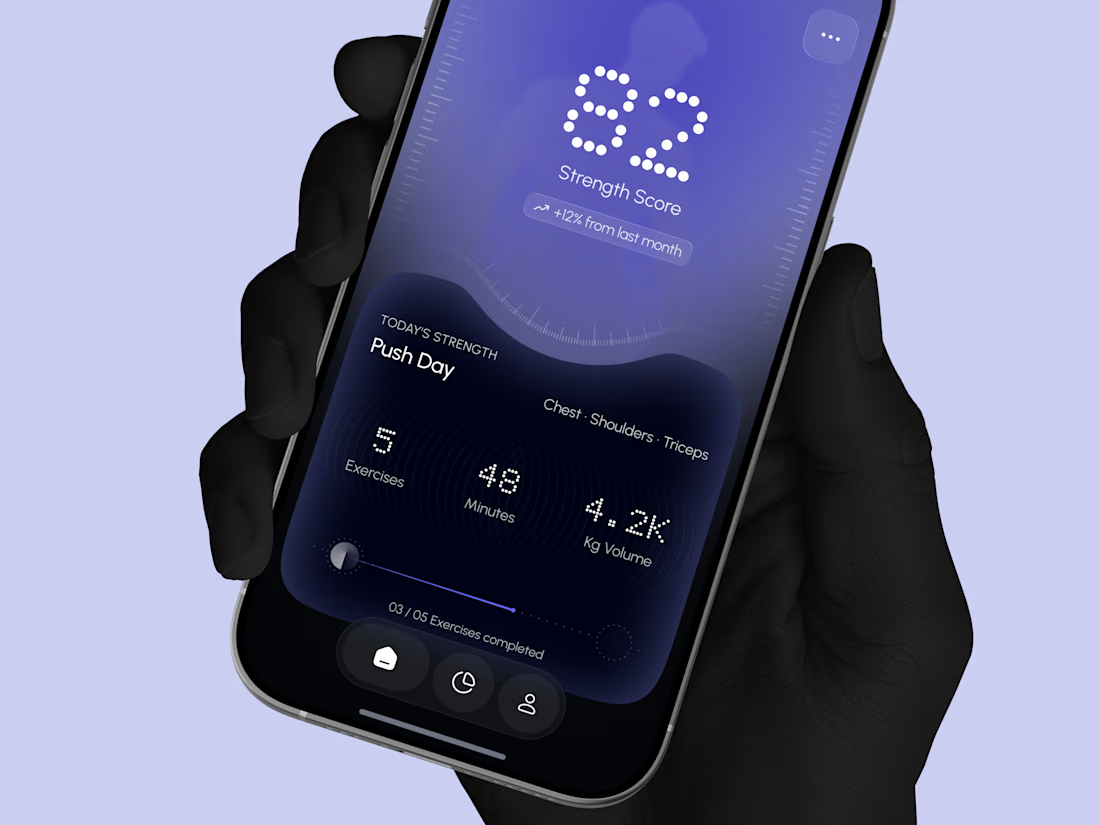
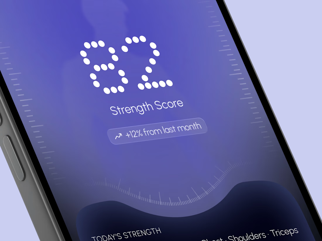
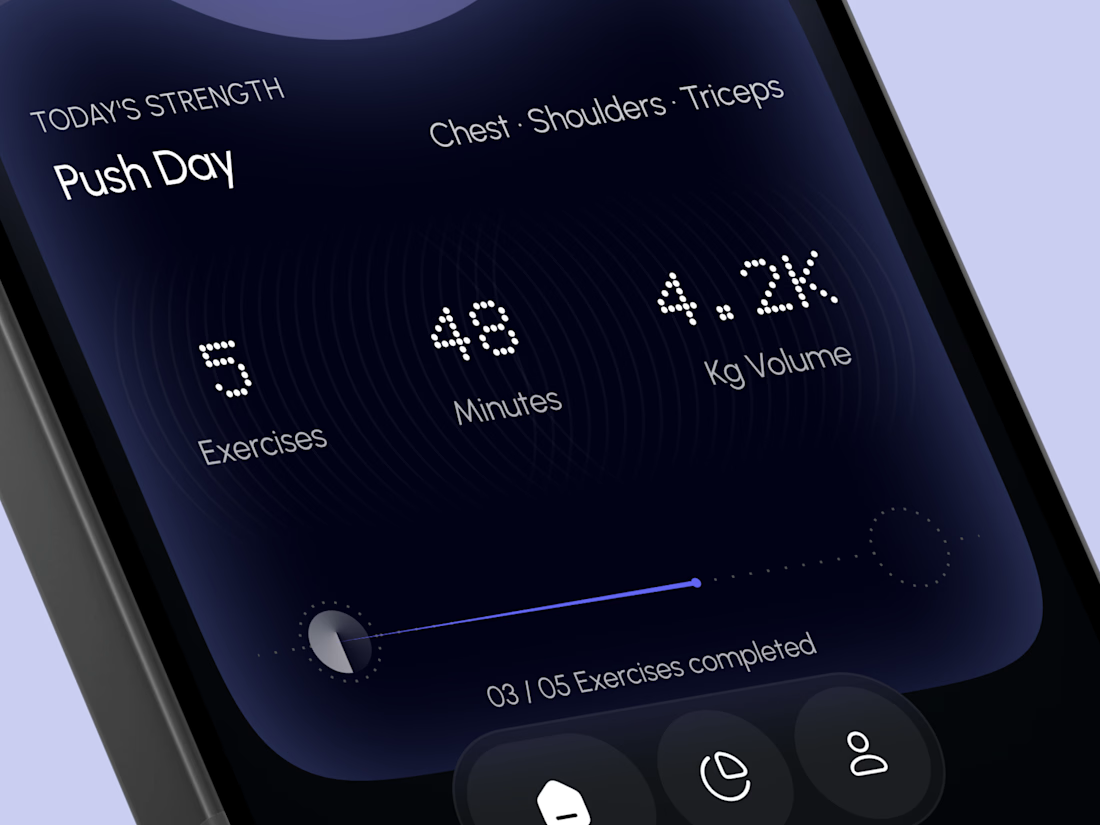
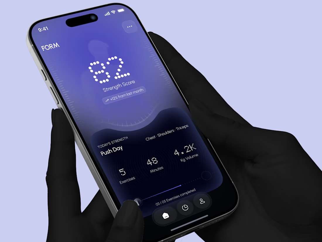
Designed a modern Strength Training Mobile App.
A deep indigo and violet gradient with a soft body silhouette and dotted display numbers for a bold and focused first impression.
A glowing strength score, a clear workout card with exercises, minutes, and volume, plus a simple progress bar make every training session easy to follow. A curved dark panel, fine tick marks, and a floating tab bar keep the whole app sleek, modern, and easy to use.


High end execution

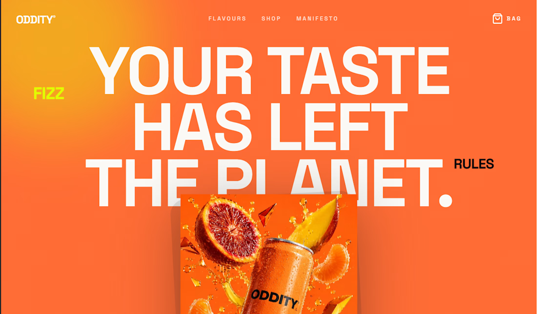
ODDITY® — Bold, Experimental E-Commerce for a Next-Gen Beverage Brand



Really Awesome

Your next client might be one portfolio away. ✨
MyFolio Pro — a premium Framer template for freelancers, UI/UX designers, and creative agencies.
Template link: https://framer.link/E9JSnLX




love this as well man