The network for creativity
Join 1.25M professional creatives like you
Connect with clients, get discovered, and run your business 100% commission-free
Creatives on Contra have earned over $150M and we are just getting started
Back to feedPost
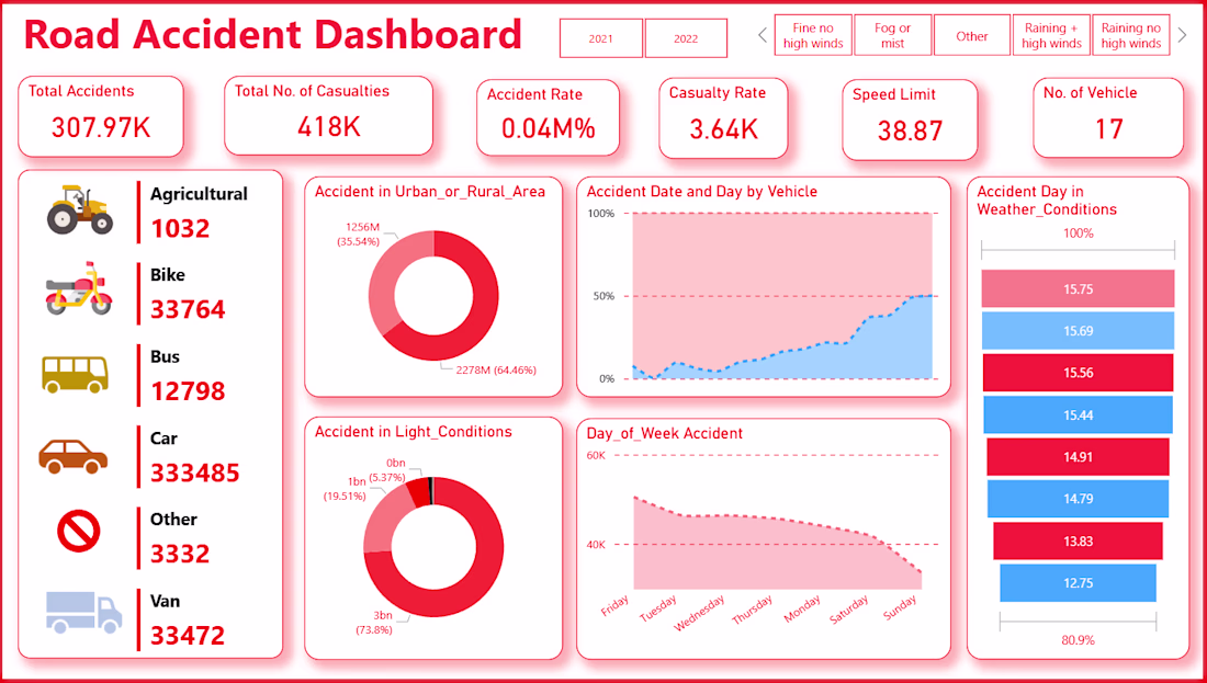
🔥 This "Road Accident Dashboard" suite provides a high-level strategic overview of traffic safety data. To grab a client's attention, we focus on the "The Three Pillars": High-level impact, Environmental triggers, and Temporal patterns.
🧠 The Executive Summary
This is the "pulse" of the operation. It identifies who is involved and where the risks are highest.
Key Insight: Cars are the primary driver of incidents, accounting for a staggering 333,485 accidents—dwarfing all other vehicle types combined.
Location Risk: There is a clear geographical divide, with 64.46% of accidents occurring in Rural Areas compared to 35.54% in Urban settings.
Weekly Trends: Accidents peak on Friday (the highest point on the "Day of Week" chart) and steadily decline as the weekend progresses, reaching their lowest point on Sunday.
Environmental Impact: Interestingly, 73.8% of accidents happen in "Daylight," suggesting that volume and speed—rather than poor visibility—are the primary culprits.
🧠 Seasonal & Daily Velocity
This view shifts the focus to macro-trends, showing how accidents fluctuate over a calendar year.
The "End-of-Year" Spike: The Accident Month by Date chart shows a significant upward trend starting in the second half of the year, peaking sharply before a year-end drop-off.
Accumulated Risk: The Accident Day by Date (lower chart) shows a nearly linear increase in cumulative accidents throughout the period. This visualizes the "compounding" nature of road incidents over time.
Client Value: This helps in resource allocation. It tells a client exactly which months require increased safety campaigns or higher police presence on the roads.
🧠 Granular Periodicity
This dashboard is designed for data analysts to spot micro-patterns and seasonal "heartbeats."
Cyclical Volatility: The bottom area chart reveals a highly consistent, rhythmic "sawtooth" pattern. This indicates that accidents follow a very predictable daily or weekly cycle.
Year-over-Year Comparison: The top chart provides a smoothed trend line that filters out daily "noise" to show the broader health of road safety.
Strategic Takeaway: Because the peaks are so predictable, safety interventions can be proactive rather than reactive. We can predict exactly when the next "surge" will happen based on these historical waves.
The network for creativity
Join 1.25M professional creatives like you
Connect with clients, get discovered, and run your business 100% commission-free
Creatives on Contra have earned over $150M and we are just getting started
Related posts
AXIOM — AI-powered SaaS platform.
Full pricing. FAQ. Dashboard preview.
axiom-eight-rose.vercel.app
Great one
BizPulse — AI-Powered Business Analytics Dashboard
Built for the Anything Ship & Sell Remixathon on Contra.
What is BizPulse?
An AI-powered business analytics tool that transforms messy, raw sales data into a clean professional dashboard instantly — no coding or spreadsheet skills needed.
How it works:
Upload any messy CSV or Excel file
BizPulse auto-cleans your data and maps your columns
Get a full analytics dashboard with KPIs, charts and AI insights
Key Features:
Business Health Score out of 100
KPI scorecards — Revenue, Expenses, Profit Margin, Customers
6 interactive charts with hover tooltips
5 AI-generated plain English business insights
Revenue Goal Tracker with live progress bar
Export as PDF and CSV
No dataset? No problem!
Click "Try Sample Data" on the upload screen to instantly load a realistic fictional dataset and explore the full dashboard.
Try it here: https://bizpulse-879.created.app/
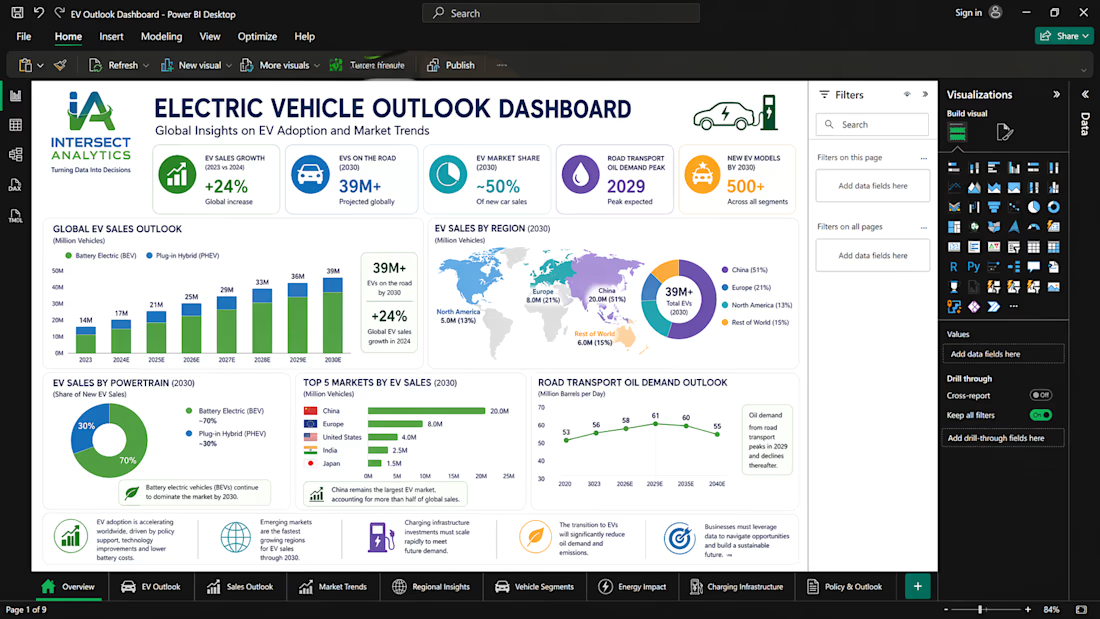
🌍 Electric Vehicle Market Overview & Key Findings
This dashboard presents a comprehensive analysis of the global shift toward electric mobility, highlighting trends in EV adoption, sales growth, and market dynamics across key regions.
📊 Key Findings:
The global EV market is experiencing rapid acceleration, driven by policy support, technological advancements, and increasing environmental awareness.
Asia, particularly China, continues to dominate EV adoption, while Europe and North America show strong and consistent growth.
EV sales are steadily outpacing traditional internal combustion engine (ICE) vehicles, signaling a structural shift in the automotive industry.
Market expansion is supported by improvements in battery technology, cost reductions, and increased investment in charging infrastructure.
🔮 Market Outlook
EV adoption is projected to continue growing significantly over the next decade, with millions of new electric vehicles entering the market annually.
Emerging markets present untapped growth opportunities, although infrastructure and affordability remain key challenges.
The transition to electric mobility is expected to reshape global energy demand, reducing reliance on fossil fuels and accelerating sustainability goals.
Companies that leverage data-driven insights will be better positioned to navigate this evolving landscape and capture market share.
🚀 Powered by Intersect Analytics
At Intersect Analytics, we go beyond dashboards—we deliver actionable intelligence.
We help businesses:
✅ Transform raw data into strategic insights
✅ Build interactive Power BI dashboards
✅ Perform advanced Python data analysis
✅ Develop predictive models & forecasts
✅ Optimize operations through data-driven decision-making
📩 Whether you're in automotive, energy, finance, or consulting, we help you turn complex data into clear, actionable strategies that drive growth.
Let’s unlock the power of your data.
Trending
Claude
Claude has entered the design space. How are you using Claude Design?
Contra University
Learn from expert creatives how to earn more using next-gen AI tools.
creativeaiflow
Creative AI workflows are evolving. What tools do you use, and what are their strengths and weaknesses?
portfolioreview
The best portfolios tell a story, not just show a grid. Share yours for feedback.
freelancerlife
Freelancer life is wins, pivots, and everything in between. What’s yours right now?