The network for creativity
Join 1.25M professional creatives like you
Connect with clients, get discovered, and run your business 100% commission-free
Creatives on Contra have earned over $150M and we are just getting started
Back to feedPost
BizPulse — AI-Powered Business Analytics Dashboard
Built for the Anything Ship & Sell Remixathon on Contra.
What is BizPulse?
An AI-powered business analytics tool that transforms messy, raw sales data into a clean professional dashboard instantly — no coding or spreadsheet skills needed.
How it works:
Upload any messy CSV or Excel file
BizPulse auto-cleans your data and maps your columns
Get a full analytics dashboard with KPIs, charts and AI insights
Key Features:
Business Health Score out of 100
KPI scorecards — Revenue, Expenses, Profit Margin, Customers
6 interactive charts with hover tooltips
5 AI-generated plain English business insights
Revenue Goal Tracker with live progress bar
Export as PDF and CSV
No dataset? No problem!
Click "Try Sample Data" on the upload screen to instantly load a realistic fictional dataset and explore the full dashboard.
Try it here: https://bizpulse-879.created.app/


Thank You 😊

How did you get the 20k credit?
Hi! I was not aware either at first, I thought I had to submit my final project there! But it's just to enter/join the challenge. After you post something there the team will send you 20k free credits via DM on Contra. And if you just signed up to Anything for the first time you...
The network for creativity
Join 1.25M professional creatives like you
Connect with clients, get discovered, and run your business 100% commission-free
Creatives on Contra have earned over $150M and we are just getting started

Challenges
View all


Related posts

I Just Created HYDRUM VEIL 🔥
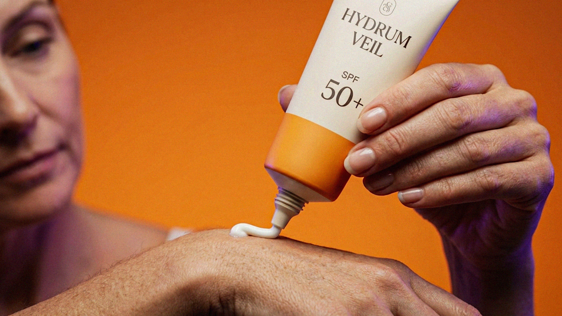
HYDRUM VEIL is a skincare brand built around a premium SPF 50+ sunscreen, developed as a complete brand identity, packaging design, and seasonal advertising campaign.
The project explores a question most seasonal beauty work gets wrong: how do you make a limited-edition campaign feel festive without making it feel cheap?
Instead of stacking decorative props, the campaign holds a strict visual system - vivid pumpkin orange, deep twilight violet, warm cream, and restrained black and lets a single product carry every frame.
Drop your replies in cmnts.....!!!!! 🙌
branddesignertastetestBrand DesignGraphic DesignPackaging DesignAdobe IllustratorAdobe PhotoshopClaude







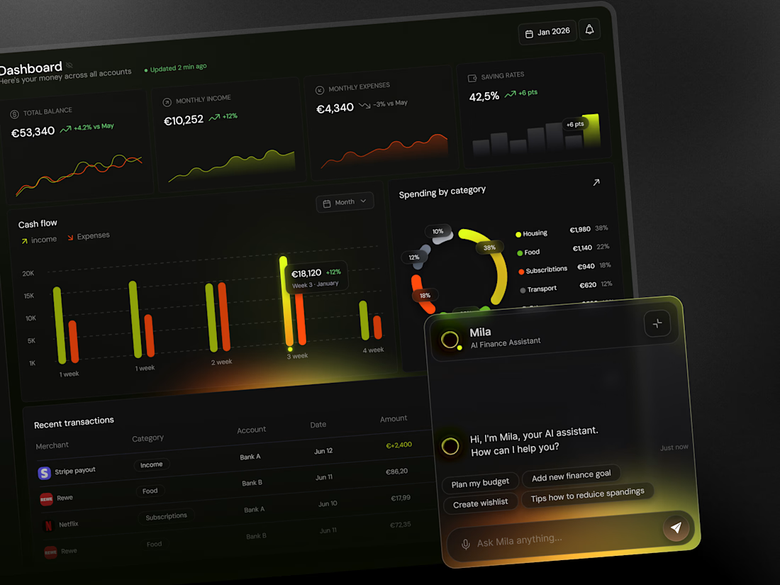
Konto — Personal finance planner, web dashboard and mobile app
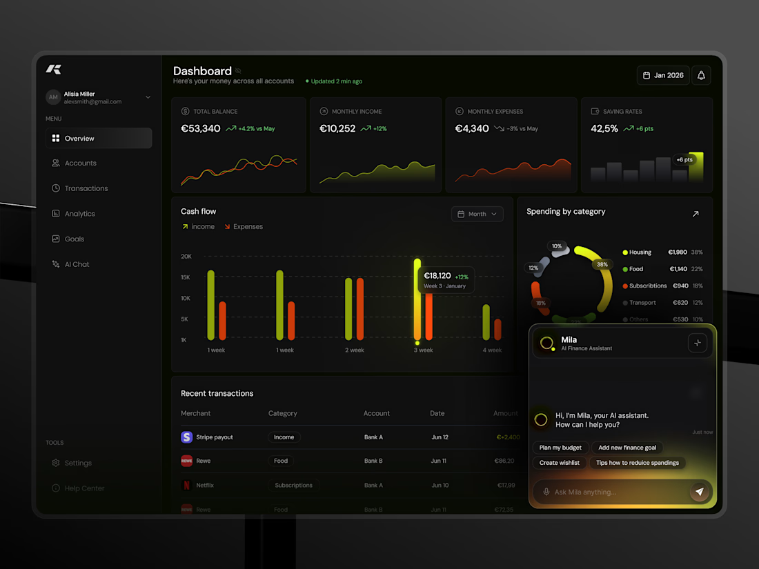
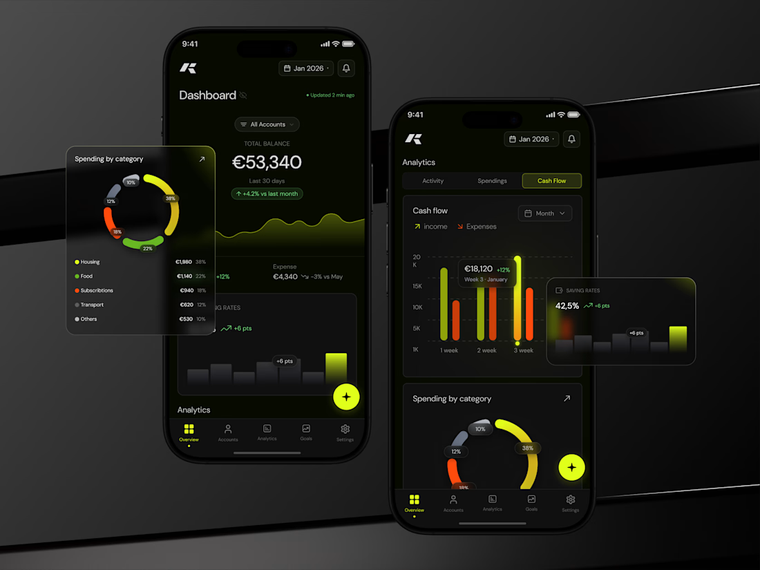
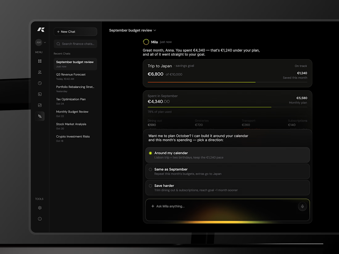
Konto is a personal finance planner concept I designed for both desktop and mobile, sharing one data model and one visual language.
Web dashboard: four KPI cards (balance, income, expenses, saving rate) with mini-charts, a weekly cash-flow chart with income and expenses side by side, spending by category as a segmented ring with a legend, and a recent-transactions table. The AI assistant lives in a docked panel bottom-right.
Mobile: the dashboard leads with total balance and a 30-day trend, then cash flow, saving rate and categories in one scroll. Analytics gets its own tabbed view. A floating action button opens the assistant from anywhere.
The visual system is dark by default with two signal colours: lime for income and growth, orange for spending. Glows are used only on the active data point, so highlights mean something. Numbers use the same layout and spacing on both platforms, so switching devices doesn't require re-learning the app.



I’ve been razzmatazzing and flibbertigibbeting with Claude Code and somehow ended up with a new yels.dev.
It finally feels like me: simple on the surface, slightly complicated underneath, and very much alive.
You can see who I am, what I do, the work behind Herodot, RaptorLabs, CyberLink Security and Solmint, plus a selection of projects I’ve built across AI, cybersecurity, Web3, product systems, education, archives, and experimental digital spaces.
Built to be explored


The simple-on-the-surface, layered-underneath idea comes through so clearly in the presentation. I especially like how the project archive turns the site into something to explore rather than just a résumé of links.