The network for creativity
Join 1.25M professional creatives like you
Connect with clients, get discovered, and run your business 100% commission-free
Creatives on Contra have earned over $150M and we are just getting started
Back to feedPost
Quick case study in why "good enough" isn't: lg.media refresh, 48 hours.
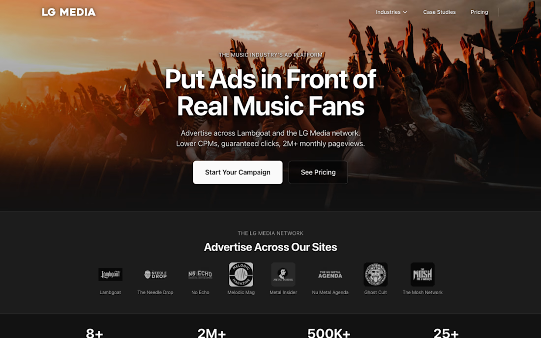
Before: Clean. Pro ...And completely forgettable.
Three moves:
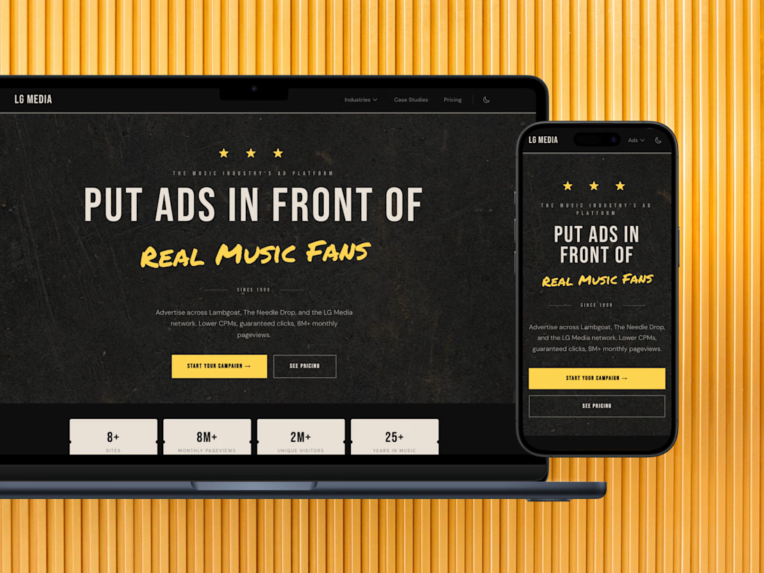
1) Color + Type w/ teeth
Swapped whites and grays for high-contrast yellow/black. Palette now hits more like a headline. Variation to the typography helps drive the point home, real music fans is what we're selling.
2) Stats you can hold
Turned stats into tickets. Numbers have weight. Physical objects feel more real than abstract metrics. Subtle, yet effective in communicating beyond what words can say.
3) Texture grounded in reality
Added grit to the bg. Looks like we've been around. 25+ years in we should look more weathered than polished. Before, we used generic photography, now the message does the talking.
After: On brand, delivers the message, harder to ignore.

Heres the old hero so you can see what I mean...
The network for creativity
Join 1.25M professional creatives like you
Connect with clients, get discovered, and run your business 100% commission-free
Creatives on Contra have earned over $150M and we are just getting started





Related posts

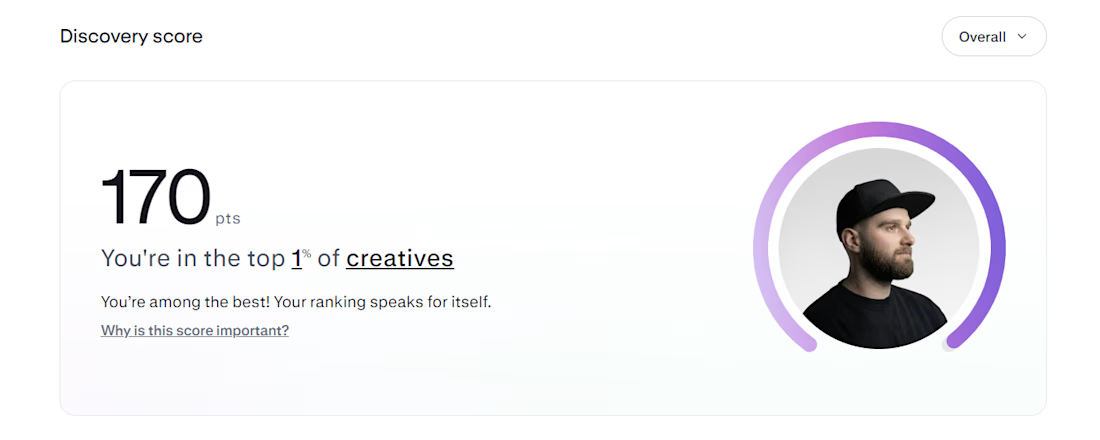
Top 1% on Contra. 🎉
A little milestone, but a reminder that showing up and doing good work consistently actually pays off.
If you're just starting out and wondering if it's worth it: it is. Keep going.
Thanks to all my clients and everyone here who's been so supportive.


That's Legendary bro congrats 🔥🔥🔥🔥


Your homepage should answer one question: what do you do? If a visitor can't answer that in five seconds, everything below the fold doesn't matter.
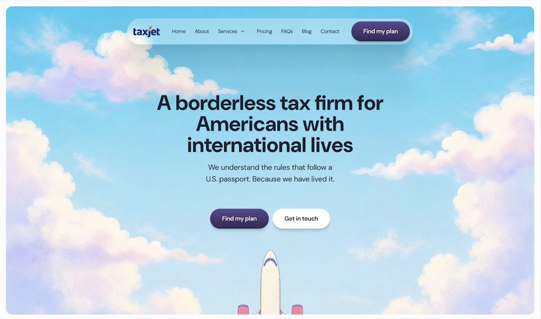

I just saw Bright Studios’ new website. You guys nailed it! Really like it.

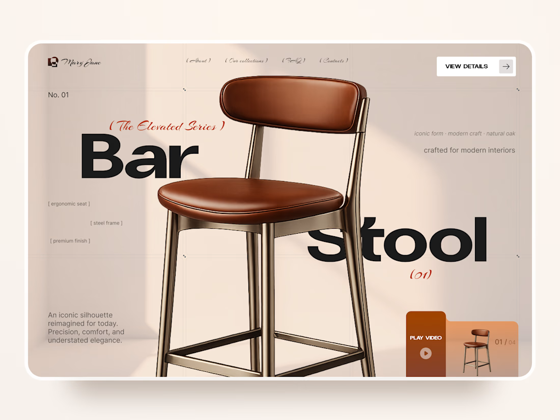
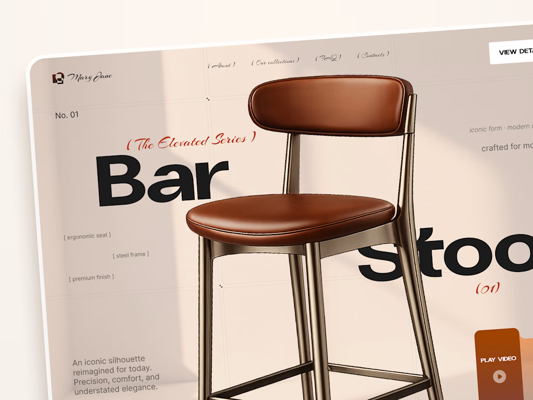
Mary Jane — Bar Stool Product Landing Page 🪑✨
A refined product landing page concept for a modern furniture brand, built around one statement piece
The design combines warm neutral tones, oversized typography, and editorial layouts to give the bar stool a premium, design-focused feel
Special attention was given to:
• Product-first composition
• Clean editorial typography
• Warm premium aesthetic
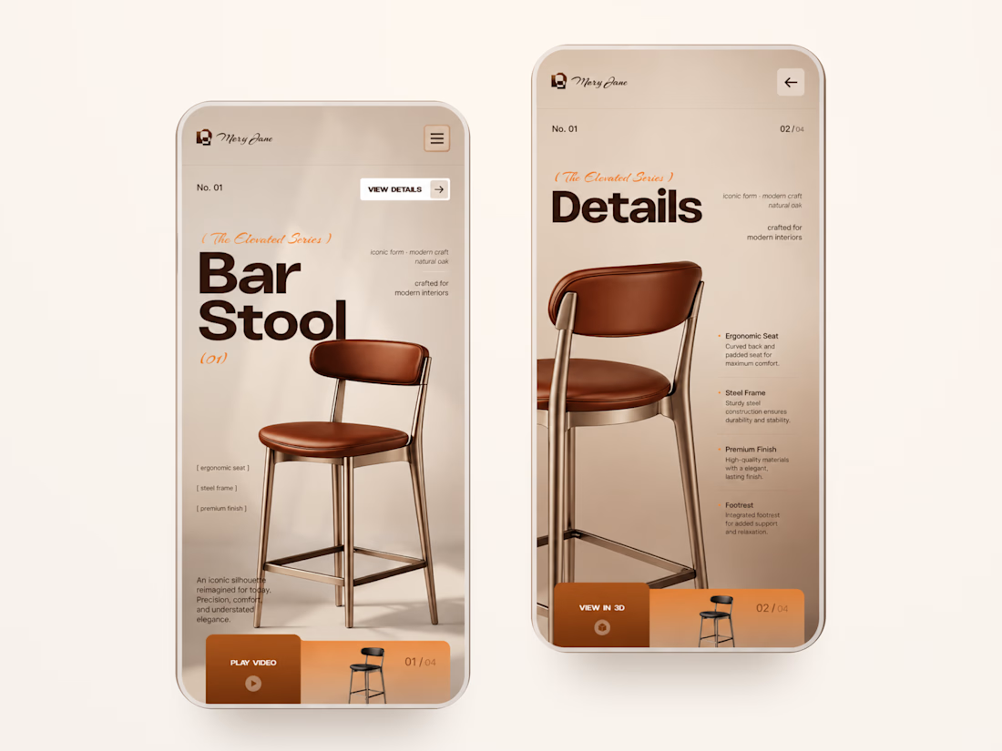
• Product details and features
• Video and 3D presentation
• Responsive mobile layout
The result is a simple, elegant experience that keeps the product at the center while giving the brand a distinctive visual character 🤎



Nice work