The network for creativity
Join 1.25M professional creatives like you
Connect with clients, get discovered, and run your business 100% commission-free
Creatives on Contra have earned over $150M and we are just getting started
Back to feedPost

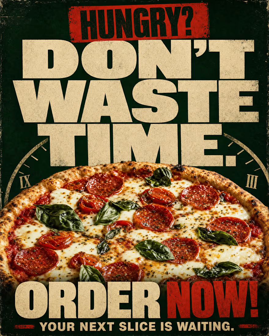
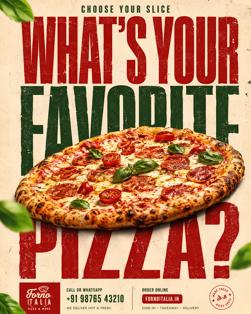
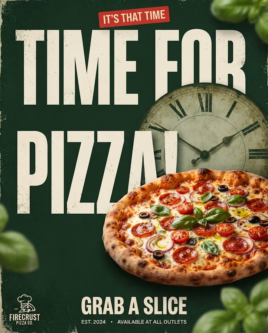
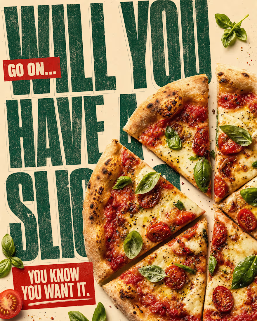
Drafting a bold visual identity campaign for a local pizzeria! 🍕
The goal was simple: turn scrollers into hungry customers. I paired high-contrast, distressed typography with rich color framing (basil greens & rich tomato reds) and subtle urgency prompts ("Don't waste time", "Will you have a slice?") to drive immediate action.
What are your thoughts on using bold woodblock typography for food branding?


The network for creativity
Join 1.25M professional creatives like you
Connect with clients, get discovered, and run your business 100% commission-free
Creatives on Contra have earned over $150M and we are just getting started
Trending
retrofuturism
Share your favorite designs from the past exploring the distant future. Or your own take on the aesthetic 🚀
halftone
Dots. Texture. Grain. Let's see your designs using the halftone technique.

Midjourney
Creatives are showing off what they're making with Midjourney.
colorgrade
Video editors sound off: How do you enhance the mood of your video in color grading?
Related posts

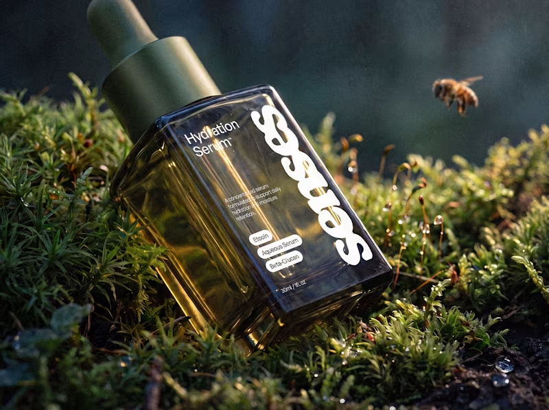
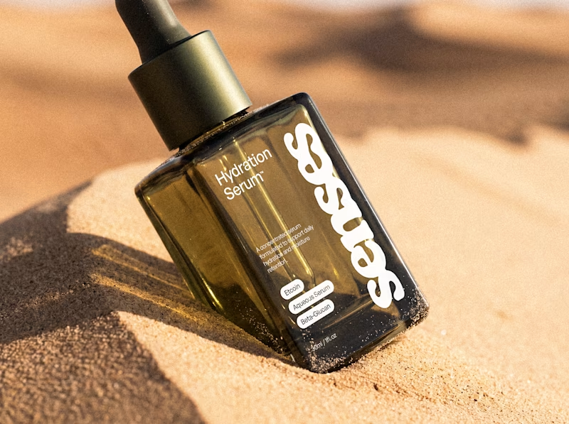
An early taste of Senses, a skincare identity built around the shift from overstimulation to comfort. The system pairs a fluid wordmark with clinical typography and an olive-glass form designed to feel precise, tactile, and quietly luxurious.
For this Hydration Serum study, I placed the same object between two sensory extremes: humid moss and sun-warmed sand. One speaks to replenishment; the other, to the need for it. Which world draws you in?


63 voted
59%
44 voted
41%
107 votes
Closed

both are lovely, but the desert image provides a beautiful contrast!



They are awesome

Hello! I'm new to this platform, so I'm not really sure what people usually post here. I'll just share some of my favorite projects that I'm proud to have been a part of.

Really like this approach. As a UI/UX designer, I think keeping the familiar structure while improving the experience makes the redesign feel much more intentional and user-focused. Great work 👏