The network for creativity
Join 1.25M professional creatives like you
Connect with clients, get discovered, and run your business 100% commission-free
Creatives on Contra have earned over $150M and we are just getting started
Back to feedPost
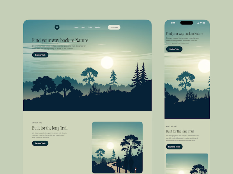
Taste Test
While i was working on Refined Wilderness, one question that kept nagging at me was contrast ratio for the H1 Hero Copy
Given the background illustration, I couldn't mathematically test which color (White or black) had the better contrast ratio so I had to make the decision based on optics
And the decision I made was Black but i'm not convinced so i am passing the question on to you. Which do you think is better?
3 voted
50%

3 voted
50%
6 votes
Closed
Nice!
Thank you Madob
yh bro, black hero copy works🔥 but the sun the shinning so bright, its kinda hard to focus on other stuff on the hero page.
Thank you prosper
The network for creativity
Join 1.25M professional creatives like you
Connect with clients, get discovered, and run your business 100% commission-free
Creatives on Contra have earned over $150M and we are just getting started
Related posts
Not every visual needs to be loud to be powerful.👀
This one is all about mood, motion, and emotion, using light, colour, and texture to create a feeling before anything else.
What's your take on it?
That is so true! Loud doesn't always mean impact!
Introducing the ASCII Art component for Framer 💥
Turn images into beautifully styled ASCII art with full control over detail, character sets, color, contrast, and rendering.
→ Get it for $0 here: https://www.framer.com/marketplace/components/ascii-art/
Challenges
View allFuser Co-create
$5K9h 27m left344 participants
Morphic Workflows
$10K3d left266 participants
Zo Computer Challenge
$10K3d left558 participants
Anything Ship & Sell Remixathon
$10K10d left179 participants
Impossible UI with Rive
$10K10d left114 participants
Runway $100k Big Pitch Challenge
$100K10d left188 participants
Trending
Runway
AI video generation is exploding. What are you dreaming up in Runway?
Contra University
Learn from expert creatives how to earn more using next-gen AI tools.
creativeaiflow
Creative AI workflows are evolving. What tools do you use, and what are their strengths and weaknesses?
portfolioreview
The best portfolios tell a story, not just show a grid. Share yours for feedback.
freelancerlife
Freelancer life is wins, pivots, and everything in between. What’s yours right now?