The network for creativity
Join 1.25M professional creatives like you
Connect with clients, get discovered, and run your business 100% commission-free
Creatives on Contra have earned over $150M and we are just getting started
Back to feedPost

The parts of a project most people never see.
A lot of reading, problem-solving, testing, and decisions happening behind the scenes.
It may not be the most exciting part of the process, but it’s where some of the most important work happens. Good design goes well beyond what you see on the screen.

The network for creativity
Join 1.25M professional creatives like you
Connect with clients, get discovered, and run your business 100% commission-free
Creatives on Contra have earned over $150M and we are just getting started





Related posts

Ever postponed delivering to a client because you couldn’t figure out what was missing in your designs? 🥹
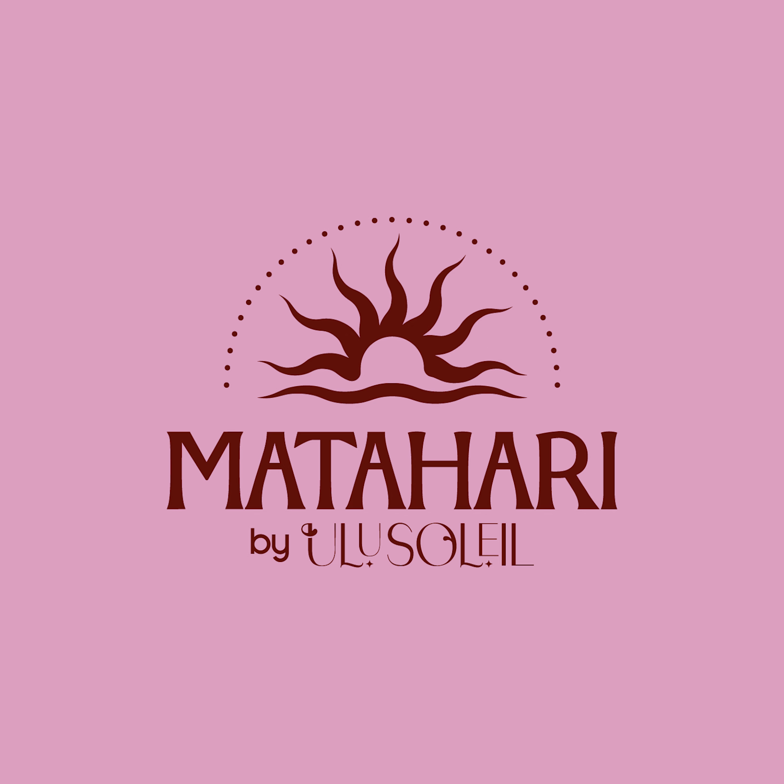
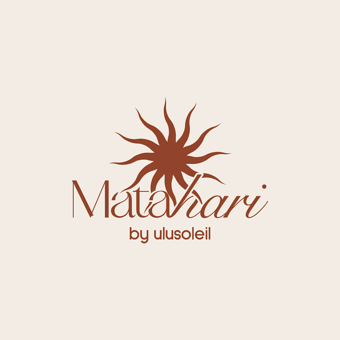
Earlier this year, I worked on Matahari, a secondary brand under Ulu Soleil. Every direction looked good, but none of them felt right, and I was getting frustrated. 😩
I stepped away.
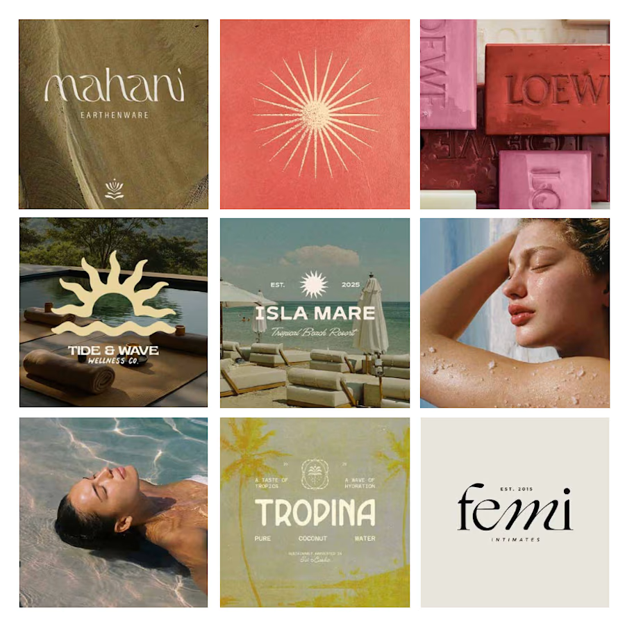
Coming back with fresh eyes, I stopped trying to rescue every original idea and started a moodboard from scratch focused on what was ACTUALLY working.
What started as a few logo explorations turned into testing typefaces, adjusting letterforms and refining proportions to find the balance between personality and simplicity.
Here’s where it started vs. where it ended up.
What’s the hardest part of logo design for you: the initial concept or the final refinements?

Starting the moodboard from scratch instead of rescuing every original direction is such a good call. The letterform refinements on Matahari show that patience paid off.

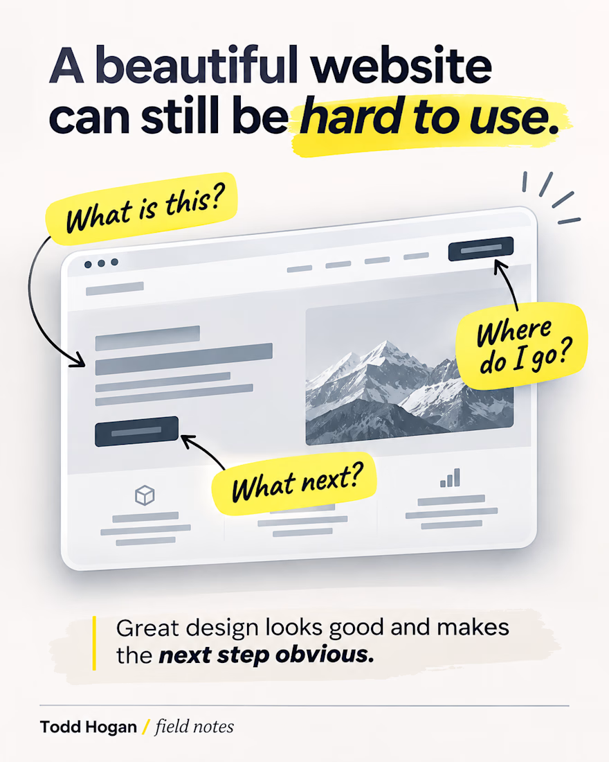
A website can look great and still make people work way too hard.
Sometimes the problem isn't the design style at all. It's that there are too many things competing for attention, the navigation doesn't match how visitors think, or the next step is buried.
One simple test I like: look at the first screen and ask whether a new visitor can tell what this business does and where to go next.
If they can't, that's usually where I'd start before worrying about the smaller visual details.
What's the first thing you check when you land on a website you've never seen before?

Built the AI Design Engine inside Rumor, the Forbes-featured event platform used by McLaren, Guess and Revolve: hosts describe their event and get studio-grade invite designs in under 30 seconds. Bench-marked the image models, built the pipeline and shipped it live in 5 days.


Shipped in five days! Nice work.


