The network for creativity
Join 1.25M professional creatives like you
Connect with clients, get discovered, and run your business 100% commission-free
Creatives on Contra have earned over $150M and we are just getting started
Back to feedPost

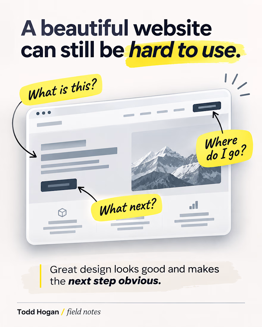
A website can look great and still make people work way too hard.
Sometimes the problem isn't the design style at all. It's that there are too many things competing for attention, the navigation doesn't match how visitors think, or the next step is buried.
One simple test I like: look at the first screen and ask whether a new visitor can tell what this business does and where to go next.
If they can't, that's usually where I'd start before worrying about the smaller visual details.
What's the first thing you check when you land on a website you've never seen before?

The first screen test is such a good gut check, most redesign requests I see are really clarity problems dressed up as style problems.

"The navigation doesn't match how visitors think" is the one I see most. Menus get named after the company's departments, not after what the visitor came to do. Renaming three menu items has fixed more for our clients than a redesign.

The first-screen test is a great filter because it exposes the exact gap between what a business wants to say and what a visitor needs to decide. The thing I check first is whether the headline answers what the business does and for whom — if that isn't clear in five seconds,...
The network for creativity
Join 1.25M professional creatives like you
Connect with clients, get discovered, and run your business 100% commission-free
Creatives on Contra have earned over $150M and we are just getting started


Related posts

Which one could win here?
A/B testing for a Landing page for B2B search analytics platform.
For startups, converting users is extremely crucial.
Rather than judging on your own, let the numbers tell you which one can help you get more users.
#landingpage #abtesting #b2b #aisearch #businessanalytics
19 voted
44%
24 voted
56%
43 votes
Closed
Light blue. For a B2B analytics tool, showing the actual dashboard in the hero does the selling before anyone reads the copy. “Win in AI search” lands better with the product right beside it. Would be curious to see a second test on the CTA too, “Start Free Analysis” vs something tied to a result.



I love it!

Best message I got today:
"You have 27 new followers on Contra!"
🙏 welcome everybody - new project are on the way!


Congrats, well deserved. That ESC keycap field alone is worth the follow, and the glassy CapCut cubes are a close second. Looking forward to the new projects.