The network for creativity
Join 1.25M professional creatives like you
Connect with clients, get discovered, and run your business 100% commission-free
Creatives on Contra have earned over $150M and we are just getting started
Back to feedPost


Creative Design 😍
The network for creativity
Join 1.25M professional creatives like you
Connect with clients, get discovered, and run your business 100% commission-free
Creatives on Contra have earned over $150M and we are just getting started
Challenges
View all


Related posts



A desktop-only interactive portfolio landing page featuring monochrome visual artwork, circular image compositions, cursor-reactive movement, and a subtle WebGL water-wave background. Selected images can break into falling fragments, creating a tactile digital-gallery experience.


The monochrome gallery direction feels very intentional—especially the circular image treatment and fragment effect, which make the portfolio feel tactile rather than static. The restrained palette gives the motion room to carry the experience.


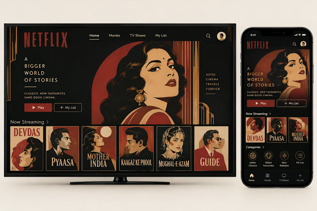
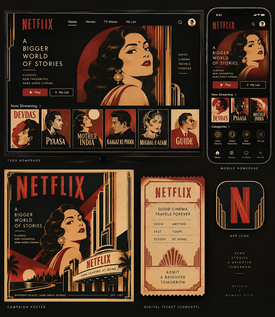
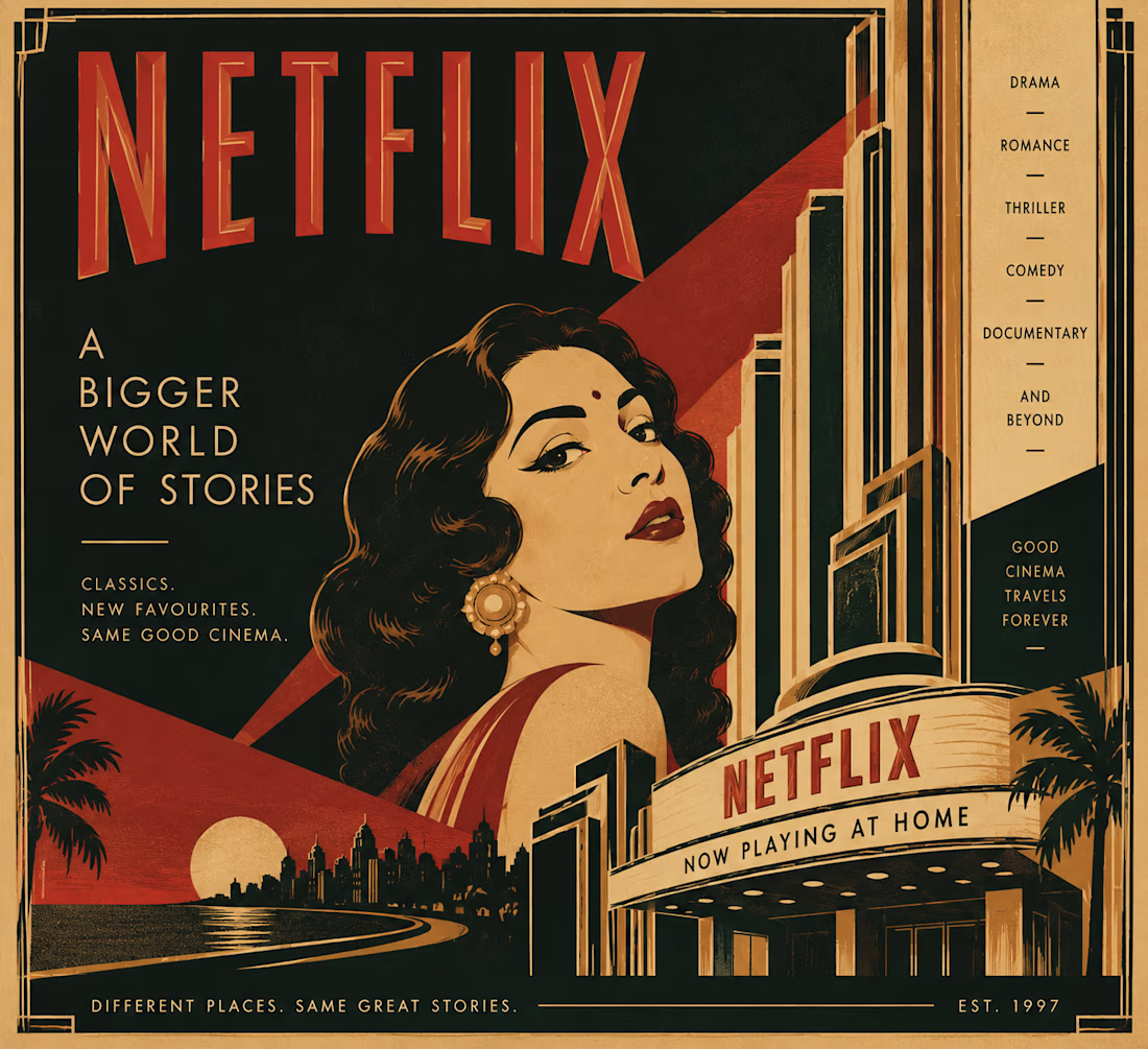
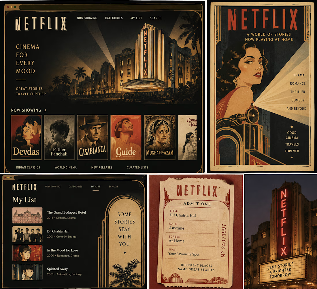
What if Netflix had grown out of Bombay’s golden age of cinema?
I’ve always loved the idea that design can tell you where something comes from, so I wanted to imagine a version of Netflix that didn’t come from Silicon Valley, but from Bombay’s Art Deco cinema culture of the 1930s and 40s.
That meant looking beyond the obvious visual treatment and asking what the experience itself might have been.
The homepage becomes a cinema program.
The mobile app becomes a pocket guide.
Film recommendations become show listings.
And suddenly, even a “My List” feels a little more like something you’d keep in your ticket stub collection.
I kept the visual language rooted in Bombay Deco: geometric typography, symmetry, strong verticals, stepped forms, warm reds and creams, and the kind of theatrical graphic language you’d find around the city’s cinema halls.
The fun part was imagining how a product built for infinite scrolling might feel if it had inherited the sense of occasion that came with going to the cinema.
What modern product would you love to reimagine through the visual language of its own place and time?

looking soo esthetic... great work!!