The network for creativity
Join 1.25M professional creatives like you
Connect with clients, get discovered, and run your business 100% commission-free
Creatives on Contra have earned over $150M and we are just getting started
Back to feedPost
Taste Test


Clean & Informative for me.
The information hierarchy feels much stronger. My eye naturally moves from the headline to the key stats, then into the player and match data without feeling overwhelmed.
The Premium & Immersive version looks impressive and definitely creates a stronger...
Really appreciate this breakdown. You’re right: clarity and quick scanning should lead, with the heavier visuals reserved for more advanced or highlight views.

Going for the first design on the left
Thanks for checking it out! Glad you liked the first design 🙌
The network for creativity
Join 1.25M professional creatives like you
Connect with clients, get discovered, and run your business 100% commission-free
Creatives on Contra have earned over $150M and we are just getting started











Related posts

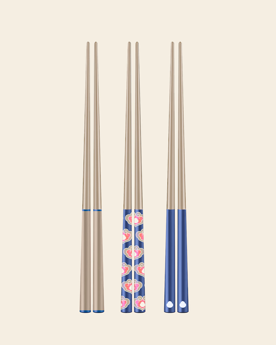
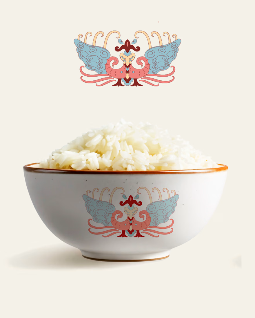
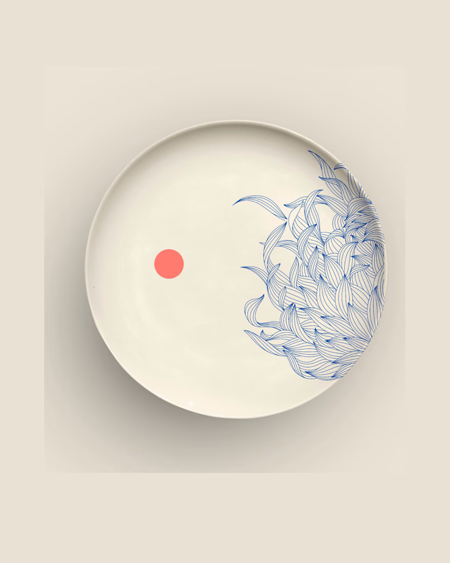
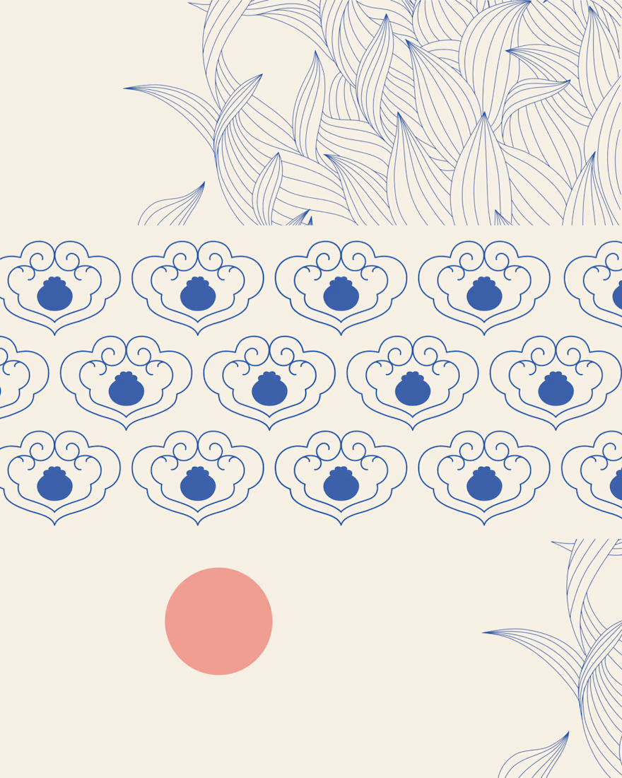
A closer look at The Art of Dining, a collection of original illustrations, decorative patterns, and product designs inspired by traditional Chinese dining culture


Great design it feels soft❤️
Great job Anja🎉🎉🔥🔥

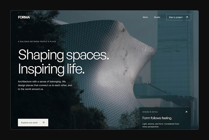
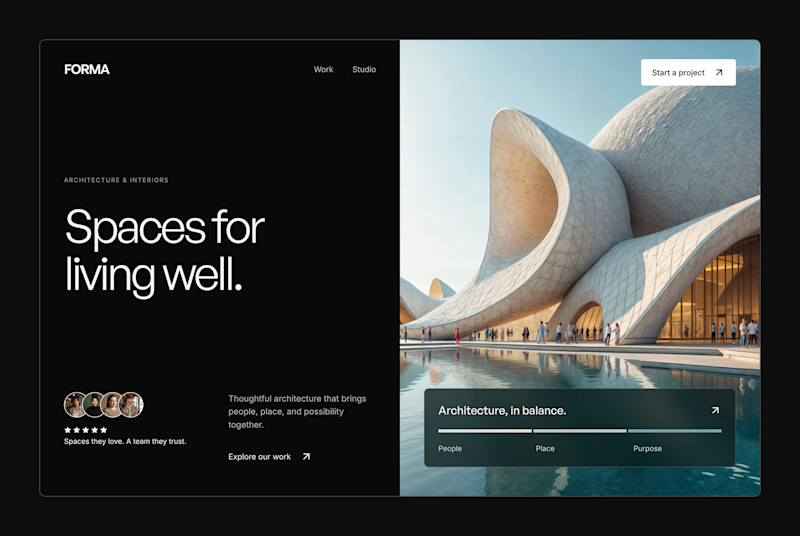
Design Exploration: Hero Section of Architecture Website. Which one do you think much better?


12 voted
43%
16 voted
57%
28 votes
Closed


